Finally, a reasonable version of Canvas Collections and associated support materials is ready to announce. Following will eventually form the content of a blog post posted to the Canvas community space.
Introduction
Canvas Collections is an open source tool that helps to transform the Canvas modules index page by adding structure, visuals, and context. This can help you improve the organisation, aesthetics, usability, and findability of your Canvas course. Improvements known to enhance student self-efficacy, motivation, and retention.
The following offers a summary of how you use it and what you can do with Canvas Collections. See the Canvas Collections’ site for more. Questions and suggestions welcome, here on the Collections’ site.
How do you use it?
Collections is most useful when installed institutionally. But you need to be an administrator to do that. That might not be an option for you.
The following image is an example (vanilla) Canvas modules index page. Showing the standard linear structure with a visually limited interface and little contextual information visible.
From what you see here, can you identify the three driving questions behind the design of this course?
Add live (dynamic) Canvas Collections
The following image is the same course. However, the Canvas Collections code is live and is dynamically modifying the Canvas modules index page to add
Structure – modules have been allocated to four collections with only the modules belonging to the currently selected collection visible at any one time.
Visuals – each collection is using a different representation (and also including content from a Canvas page) which allows direct navigation to a module.
Context – additional contextual data (e.g. description, banner image/iframe, date etc.) is visible for each module. (What isn’t shown is that this data can include requirements completion)
Can you identify the three driving questions behind the design of this course from this view?
Create a Claytons (static) Canvas Collections page
Live Collections requires installing the Canvas Collections code (institutionally or individually). If installed individually, then you probably can’t use live Collections with students (each student would have to install Collections individually).
As an alternative, you can use your individual installation of Collections to create a Canvas page that contains a static (Claytons) version of Canvas Collections. Echoing the common Canvas community practice of creating a visual home page for a Canvas course. The difference being that Collections does the design work for you.
The following demonstrates a Claytons Collections version of the live Collections above. Same (similar) collections, representations, and contextual data. However, all saved onto a Canvas page that is being used as the course home page.
(NOTE: Due to limitations of the Canvas RCE at least one of the current representations shown does require external CSS to work.)
Contemporary higher education appears to have a scale problem.
Ellis & Goodyear (2019) explain in some detail Bain’s and Zundans-Fraser’s (2017) diagnosis of why attempts by universities to improve learning and teaching rarely scale, including the observation that L&T centers try to “influence learning and teaching through elective, selective, and exemplary approaches that are incompatible with whole-organizational change” (Bain & Zundans-Fraser, 2017, p. 12). While most universities offer design support services the combination of high demand and limited resources mean that many academics are left to their own devices (Bennet, Agostinho & Lockyer, 2017). Moving from working at scale across an institution, Ryan et al (2021) suggest that maintaining the quality of L&T while teaching at scale is a key issue for higher education. Massification brings both increased numbers and diversity of learners creating practical and pedagogical challenges for educators having to teach at scale.
Attempts to address the challenge of scale (e.g. certain types of MOOC, course site templates) tend to strike me as limited. Why?
Perhaps it is because…
A Typology of Scale
Morel et al (2019) argue that there is a lack of conceptual clarity around scale. In response, they offer a typology of scale, very briefly summarised in the following table.
Concept of scale
Description
Adoption
Widespread use of an innovation – market share. Limited conceptualisation of expected use.
Replication
Widespread implementation with fidelity will produce expected outcomes.
Adaptation
Widespread use of an innovation that is modified in response to local needs.
Reinvention
Intentional and systematic experimentation with an innovation. Innovation as catalyst for further innovation.
The practice of scale
Most institutional attempts at scale I’ve observed appear to fall into the first two conceptualisations.
MOOCs – excluding Connectivist MOOCs – aimed to scale content delivery through scale as replication. Institutional practice around the use of an LMS is increasingly driven by consistency in the form of templates. Leading to exchanges like that shared by Macfarlan and Hook (2022)
‘Can I do X?’ or ‘How would I do Y?’, until the ED said, ‘You can do anything you like, as long as you use the template.’ With a shrug the educator indicated their compliance. The ironic surrender was palpable.
At best, templates fall into the replication conception of scale. Experts produce something which they think will be an effective solution to a known problem. A solution that – if only everyone would just use as intended – will generate positive outcomes for learners. Arguments could be made that it quickly devolves into the adoption category. Others may claim their templates support adaptation, but only “as long as you use the template”?
Where do other institutional attempts fit on this typology?
Institutional learning and teaching frameworks, standards, plans and other abstract approaches? More adoption/replication?
The institutional LMS and the associated ecosystem of tools? The assumption is probably adaptation. The tools can be creatively adapted to suit whatever design intent would be the argument. However, for adaptation to work (see below) the relationship between the users and the tools needs to offer the affordance for customisation. I don’t think the current tools help enough with that.
Which perhaps explains why use of the LMS and associated tools is so limited/time consuming. But the current answer appears to be templates and consistency.
Education’s diversity problem
The folk who conceive of scale as adaptation, like Clark and Dede (2009) argue that
One-size-fits-all educational innovations do not work because they ignore contextual factors that determine an intervention’s efficacy in a particular local situation (p. 353)
Morel et al (2019) identify that this adaptation does assume/require the capacity from users to make modifications in response to contextual requirements. This will likely require more work from both the designers and the users. Which, for me, raises the following questions
Does the deficit model of educators (they aren’t trained L&T professionals) held by some L&T professionals limit the ability to conceive of/adopt this type of scale?
Does the difficulty of institutions face in customising contemporary digital learning environment (i.e. the LMS) – let alone enabling learners and teachers to do that customisation – limit the ability to conceive of/adopt this type of scale?
For me, this also brings in the challenge of the iron triangle. How to (cost) efficiently scale learning and teaching in ways that respond effectively to the growing diversity of learners, teachers, and contexts?
Bennett, S., Agostinho, S., & Lockyer, L. (2017). The process of designing for learning: Understanding university teachers’ design work. Educational Technology Research & Development, 65(1), 125–145. https://doi.org/10.1007/s11423-016-9469-y
Clarke, J., & Dede, C. (2009). Design for Scalability: A Case Study of the River City Curriculum. Journal of Science Education and Technology, 18(4), 353–365. https://doi.org/10.1007/s10956-009-9156-4
Ellis, R. A., & Goodyear, P. (2019). The Education Ecology of Universities: Integrating Learning, Strategy and the Academy. Routledge.
Ryan, T., French, S., & Kennedy, G. (2021). Beyond the Iron Triangle: Improving the quality of teaching and learning at scale. Studies in Higher Education, 46(7), 1383–1394. https://doi.org/10.1080/03075079.2019.1679763
Macfarlan, B., & Hook, J. (2022). ‘As long as you use the template’: Fostering creativity in a pedagogic model. ASCILITE Publications, Proceedings of ASCILITE 2022 in Sydney, Article Proceedings of ASCILITE 2022 in Sydney. https://doi.org/10.14742/apubs.2022.34
Morel, R. P., Coburn, C., Catterson, A. K., & Higgs, J. (2019). The Multiple Meanings of Scale: Implications for Researchers and Practitioners. Educational Researcher, 48(6), 369–377. https://doi.org/10.3102/0013189X19860531
Henry Cook, Steven Booten and I gave the following presentation at the THETA conference in Brisbane in April 2023.
Below you will find
Summary – a few paragraphs summarising the presentation.
Slides – copies of the slides used.
Software – some of the software produced/used as part of the work.
References – used in the summary and the slides.
Abstract – the original conference abstract.
Summary
The presentation used our experience as part of a team migrating 1500+ course sites from Blackboard to Canvas to explore a broader challenge. A challenge recently expressed in the Productivity Commission’s “Advancing Prosperity” report with its recommendations to grow access to tertiary education while containing cost and improving quality. This challenge to maximise all cost efficiency and quality and access (diversity & scale) is seen as a key issue for higher education (Ryan et al., 2021). It has even been labelled the “Iron Triangle” because – unless you change the circumstances and conditions – improving one indicator will almost inevitably lead to deterioration in the other indicators (Mulder, 2013). The pandemic emergency response being the most recent example of this. Necessarily rapid changes to access (moving from face-to-face to online) required significant costs (staff workload) to produce outcomes that are perceived to be of questionable quality.
Leading to the question we wanted to answer:
How do you stretch the iron triangle? (i.e. maximise cost efficiency, quality, and accessibility)?
In the presentation, we demonstrated that the fundamental tasks (gather and weave) of an LMS migration are manual and repetitive. Making it impossible to stretch the iron triangle. We illustrated why this is the case, demonstrated how we addressed this limitation, and proposed three principles for broader application. We argue that the three principles can be usefully applied beyond LMS migration to business as usual.
Gatherers and weavers – what we do
Our job is to help academic staff design, implement, and maintain quality learning tasks and environments. We suggest that the core tasks required to do this is to gather and weave disparate strands of knowledge, ways of knowing (especially various forms of design and contextual knowledge and knowing), and technologies (broadly defined). For example, a course site is the result of gathering and weaving together such disparate strands as: content knowledge (e.g. learning materials); administrative information (e.g. due dates, timetables etc); design knowledge (e.g. pedagogical, presentation, visual etc); and information & functionality from various technologies (e.g. course profiles, echo360, various components of the LMS etc).
An LMS migration is a variation on this work. It has a larger (all courses) and more focused purpose (migrate from one LMS to another). But still involves the same core tasks of gathering and weaving. Our argument is that to maximise the cost efficiency, accessibility, and quality of this work you must do the same to the core tasks of gathering and weaving. Early in our LMS migration it was obvious that this was not the case. The presentation included a few illustrative examples. There were many more that could’ve been used. Both from the migration and business as usual. All illustrating the overly manual and repetitive nature of gathering and weaving required by contemporary institutional learning environments.
Three principles for automating & augmenting gathering & weaving – what we did
Digital technology has long been seen as a key enabler for improving productivity through its ability to automate processes and augment human capabilities. Digital technology is increasingly pervasive in the learning and teaching environment, especially in the context of an LMS migration. But none of the available technologies were actively helping automate or augment gathering and weaving. The presentation included numerous examples of how we changed this. From this work we identified three principles.
On-going activity focused (re-)entanglement.
Our work was focused on high level activities (e.g. analysis, migration, quality assurance, course design of 100s of course sites). Activities not supported by any single technology, hence the manual gathering and weaving. By starting small and continually responding to changes and lessons learned, we stretched the iron triangle by digitally gathering and weaving disparate component technologies into assemblages that were fit for the activities.
Contextual digital augmentation.
Little to none of the specific contextual and design knowledge required for these activities was available digitally. We focused on usefully capturing this knowledge digitally so it could be integrated into the activity-based assemblages.
Meso-level focus.
Existing component technologies generally provide universal solutions for the institution or all users of the technology. Requiring manual gathering and weaving to fit contextual needs for each individual variation. By leveraging the previous two principles we were able to provide “technologies that were fit for meso-level solutions. For example, all courses for a program or a school. All courses, that use a complex learning activity like interactive orals.
Connections with other work
Much of the above is informed by or echoes related research and practice in related fields. It’s not just we three. The presentation made explicit connections with the following:
Learning and teaching;
Fawns’ (2022) work on entangled pedagogy as encapsulating the mutual shaping of technology, teaching methods, purposes, values and context (gathering and weaving). Dron’s (2022) re-definition of educational technology drawing on Arthur’s (2009) definition of technology. Work on activity centered design – which understands teaching as a distributed activity – as key to both good learning and teaching (Markauskaite et al, 2023), but also key to institutional management (Ellis & Goodyear, 2019). Lastly – at least in the presentation – the nature and need for epistemic fluency (Markauskaite et al, 2023)
Digital technology; and,
Drawing on numerous contemporary practices within digital technology that break the false dilemma of “buy or build”. Such as the project to product movement (Philip & Thirion, 2021); Robotic Process Automation; Citizen Development; and the idea of lightweight IT development (Bygstad, 2017)
Leadership/strategy.
Briefly linking the underlying assumptions of all of the above as examples of the move away from corporate and reductionist strategies that reduce people to “smooth users” toward possible futures that see us as more “collective agents” (Macgilchrist et al, 2020). A shift seen as necessary to more likely lead – as argued by Markauskaite et al (2023) – to the “even richer convergence of ‘natural’, ‘human’ and ‘digital’ required to respond effectively to global challenges.
There’s much more.
Slides
The presentation does include three videos that are available if you download the slides.
Related Software
Canvas QA is a Python script that will perform Quality Assurance checks on numerous Canvas courses and create a QA Report web page in each course’s Files area. The QA Report lists all the issues discovered and provides some scaffolding to address the issues.
Canvas Collections helps improve the visual design and usability/findability of the Canvas modules page. It is Javascript that can be installed by institutions into Canvas or by individuals as a userscript. It enables the injection of design and context specific information into the vanilla Canvas modules page.
Word2Canvas converts a Word document into a Canvas module to offer improvements to the authoring process in some contexts. At Griffith University, it was used as part of the migration process where Blackboard course site content was automatically converted into appropriate Word documents. With a slight edit, these Word documents could be loaded directly into Canvas.
References
Arthur, W. B. (2009). The Nature of Technology: What it is and how it evolves. Free Press.
Bessant, S. E. F., Robinson, Z. P., & Ormerod, R. M. (2015). Neoliberalism, new public management and the sustainable development agenda of higher education: History, contradictions and synergies. Environmental Education Research, 21(3), 417–432. https://doi.org/10.1080/13504622.2014.993933
Bygstad, B. (2017). Generative Innovation: A Comparison of Lightweight and Heavyweight IT. Journal of Information Technology, 32(2), 180–193. https://doi.org/10.1057/jit.2016.15
Ellis, R. A., & Goodyear, P. (2019). The Education Ecology of Universities: Integrating Learning, Strategy and the Academy. Routledge.
Fawns, T. (2022). An Entangled Pedagogy: Looking Beyond the Pedagogy—Technology Dichotomy. Postdigital Science and Education, 4(3), 711–728. https://doi.org/10.1007/s42438-022-00302-7
Macgilchrist, F., Allert, H., & Bruch, A. (2020). Students and society in the 2020s. Three future ‘histories’ of education and technology. Learning, Media and Technology, 45(0), 76–89. https://doi.org/10.1080/17439884.2019.1656235
Markauskaite, L., Carvalho, L., & Fawns, T. (2023). The role of teachers in a sustainable university: From digital competencies to postdigital capabilities. Educational Technology Research and Development, 71(1), 181–198. https://doi.org/10.1007/s11423-023-10199-z
Mulder, F. (2013). The LOGIC of National Policies and Strategies for Open Educational Resources. International Review of Research in Open and Distributed Learning, 14(2), 96–105. https://doi.org/10.19173/irrodl.v14i2.1536
Philip, M., & Thirion, Y. (2021). From Project to Product. In P. Gregory & P. Kruchten (Eds.), Agile Processes in Software Engineering and Extreme Programming – Workshops (pp. 207–212). Springer International Publishing. https://doi.org/10.1007/978-3-030-88583-0_21
Ryan, T., French, S., & Kennedy, G. (2021). Beyond the Iron Triangle: Improving the quality of teaching and learning at scale. Studies in Higher Education, 46(7), 1383–1394. https://doi.org/10.1080/03075079.2019.1679763
Schmidt, A. (2017). Augmenting Human Intellect and Amplifying Perception and Cognition. IEEE Pervasive Computing, 16(1), 6–10. https://doi.org/10.1109/MPRV.2017.8
The pandemic reinforced higher educations’ difficulty responding to the long-observed challenge of how to sustainably and at scale fulfill diverse requirements for quality learning and teaching (Bennett et al., 2018; Ellis & Goodyear, 2019). Difficulty increased due to many issues, including: competition with the private sector for digital talent; battling concerns over the casualisation and perceived importance of teaching; and, growing expectations around ethics, diversity, and sustainability. That this challenge is unresolved and becoming increasingly difficult suggests a need for innovative practices in both learning and teaching, and how learning and teaching is enabled. Starting in 2019 and accelerated by a Learning Management System (LMS) migration starting in 2021 a small group have been refining and using an alternate set of principles and practices to respond to this challenge by developing reusable orchestrations – organised arrangements of actions, tools, methods, and processes (Dron, 2022) – to sustainably, and at scale, fulfill diverse requirements for quality learning and teaching. Leading to a process where requirements are informed through collegial networks of learning and teaching stakeholders that weigh their objective strategic and contextual concerns to inform priority and approach. Helping to share knowledge and concerns and develop institutional capability laterally and in recognition of available educator expertise.
The presentation will be structured around three common tasks: quality assurance of course sites; migrating content between two LMS; and, designing effective course sites. For each task a comparison will be made between the group’s innovative orchestrations and standard institutional/vendor orchestrations. These comparisons will: demonstrate the benefits of the innovative orchestrations; outline the development process; and, explain the three principles informing this work – 1) contextual digital augmentation, 2) meso-level automation, and 3) generativity and adaptive reuse. The comparisons will also be used to establish the practical and theoretical inspirations for the approach, including: RPA and citizen development; and, convivial technologies (Illich, 1973), lightweight IT development (Bygstad, 2017), and socio-material understandings of educational technology (Dron, 2022). The breadth of the work will be illustrated through an overview of the growing catalogue of orchestrations using a gatherers, weavers, and augmenters taxonomy.
References
Bennett, S., Lockyer, L., & Agostinho, S. (2018). Towards sustainable technology-enhanced innovation in higher education: Advancing learning design by understanding and supporting teacher design practice. British Journal of Educational Technology, 49(6), 1014–1026. https://doi.org/10.1111/bjet.12683
Bygstad, B. (2017). Generative Innovation: A Comparison of Lightweight and Heavyweight IT: Journal of Information Technology. https://doi.org/10.1057/jit.2016.15
Dron, J. (2022). Educational technology: What it is and how it works. AI & SOCIETY, 37, 155–166. https://doi.org/10.1007/s00146-021-01195-z
Ellis, R. A., & Goodyear, P. (2019). The Education Ecology of Universities: Integrating Learning, Strategy and the Academy. Routledge.
Illich, I. (1973). Tools for Conviviality. Harper and Row.
This work arose from the depths of an institutional LMS migration (Blackboard Learn to Canvas). In particular, the observation that the default migration processes required an awful lot of low level manual labour. Methods that appeared to reduce the quality of the migration process and increase the cost. Hence we started developing different methods. As the migration project unfolded we kept developing and refining. Building on what we’d done before and further decreasing the cost of migration, increasing the quality of the end result, and increasing the scale and diversity of what we could migrate.
We were stretching the iron triangle (Ryan et al, 2021). Since stretching the iron triangle a key strategic issue for higher education (Ryan et al, 2021), questions arose, including:
What was different between the two sets of orchestrations? Why are our orchestrations better than the default at stretching the iron triangle?
Might those differences help stretch the iron triangle post-migration (i.e. business as usual – BAU)?
Can we refine and improve those differences?
The work here is an initial exploration into answering the first question.
And finally a couple of reference lists, including those for the poster and the abstraction.
Abstract
A key strategic issue for higher education is how to maximise the accessibility, quality, and cost efficiency of learning and teaching (Ryan et al., 2021). Higher education’s iron triangle literature (Daniel et al, 2009; Mulder, 2013; Ryan et al, 2021) argues that effectively addressing this challenge is difficult, if not impossible, due to the “iron” connections between the three qualities. These iron connections mean maximising one quality will inevitably result in reductions in the other qualities. For example, the rapid maximisation of accessibility required by the COVID-19 pandemic resulted in a reduction in cost efficiency (increased staff costs) and a reduction in the perceived quality of learning experiences (Martin, 2020). These experiences illustrate higher education’s on-going difficulties in creating orchestrations that stretch the iron triangle by sustainably and at scale fulfilling diverse requirements for quality learning, (Bennett et al., 2018; Ellis & Goodyear, 2019). This exploratory case study aims to help reduce this difficulty by answering the question: What characteristics of orchestrations help to stretch the iron triangle?
An LMS migration is an effective exploratory case for this research question since it is one of the most labour-intensive and complex projects undertaken by universities (Cottam, 2021). It is a project commonly undertaken with the aim of stretching the iron triangle. Using a socio-material perspective (Ellis & Goodyear, 2019; Fawns, 2022) and drawing on Dron’s (2022) definition of educational technology the poster examines three specific migration tasks: migrating lecture recordings; designing quality course sites; and, performing quality assurance checks. For each task, two different orchestrations – organized arrangements of actions, tools, methods, and processes (Dron, 2022) – are described and analysed. The institutional orchestrations developed by the central project organising the migration of an institution’s 4500+ courses, and the group orchestrations developed, due to perceived limitations of the institutional orchestrations, by a sub-group directly migrating 1700+ courses.
Descriptions of the orchestrations are used to identify their effectiveness in sustainably and at scale satisfying diverse quality requirements – stretching the iron triangle. Analysis of these orchestrations identified three characteristics that are more likely to stretch the iron triangle: contextual digital augmentation; meso-level automation; and, generativity and adaptive reuse. Each of these characteristics, their presence in each orchestration, the relationships between these characteristics; linkages with existing literature and practice; and their observed impact on the iron triangle qualities is described. These descriptions are used to illustrate the very different assumptions underpinning the two sets of orchestrations. Differences in relationships evident in the orchestrations and which mirror the distinctions between ‘smooth users’ and ‘collective agency’ (Macgilchrist et al., 2020); and, industrial and convivial tools (Illich, 1973). The characteristics identified by this exploratory case study suggest that an approach that is less atomistic and industrial, and more collective and convivial may help reconnect people with educational technology more meaningfully and sustainably. Consequently this shift may also help increase higher education’s ability to maximise the accessibility, quality, and, cost efficiency of learning and teaching.
Poster
The postere is embedded below and also available directly from Google slides. The Enter full screen option available from the “three dots” button at the bottom of the poster embed is useful for viewing the poster.
Comparing orchestrations
The core of this exploratory case study is the comparison of two sets of orchestrations and how they seek to fulfill the same three tasks.
echo360 migration
Course site QA
Course site usability
About the orchestrations
The orchestrations discussed typically rely on software that we’ve developed by building on the shoulders of other giants of open source software. Software that we’re happy to share with others.
Course Analysis Report (CAR) process
The CAR process started as an attempt to make it easier for migration staff to understand what was in a Blackboard course site. It started with a gather that extract the contents of each Blackboard course site into an offline data structure. A data structure that provided a foundation for much, much more.
The echo360 migration video offers some more detail. The following image is from that video. It shows the CAR folder for a sample Blackboard course. Generated by the CAR script this folder contains
A folder (contentCollection) containing copies of all the files uploaded to the Blackboard course site.
The files are organised in two ways to help the migration:
Don’t migrate files that are no longer used in the course site; and,
Files are placed into an attached or unattached folder depending on whether they are still used by the Blackboard course site.
Don’t migrate all the files in one single unorganised folder.
A folder (coursePages) containing individual Word documents containing the content of course site pages.
A CAR report.
A Word document that summarises the content, structure and features used in a course site.
A pickle file.
Contains a copy of all the course site details and content in a machine readable format.
While the CAR code is not currently publicly available we are happy to share.
Word2Canvas
Word2Canvas is Javascript which modifies the modules page on a Canvas course site. It provides a button that allows you to convert a specially formatted Word document into Canvas module.
The coursePages folder produced by the CAR process generates these specially formatted Word documents. Enabling migration to consist largely of minor edits of a Word document and using word2canvas to create a Canvas module.
The echo360 migration video offers some more detail, including an example of using the CAR. The Word2Canvas to site provides more detail again, including how to install and use word2canvas.
Canvas Collections
Canvas Collections is also Javascript which modifies the Canvas modules page. However, Canvas Collections’ modifications seek to improve the usability and visual design of the modules page. In doing so it addresses long known limitations of the Modules page, as the following table summarises.
No way to add narrative or additional contextual information about modules to the modules page.
Ability to transform vanilla Canvas modules into contextual objects by adding additional properties (information) for modules that are used in representations and other functionality.
Arthur, W. B. (2009). The Nature of Technology: What it is and how it evolves. Free Press.
Bygstad, B. (2017). Generative Innovation: A Comparison of Lightweight and Heavyweight IT: Journal of Information Technology, 32(3), 180-193. https://doi.org/10.1057/jit.2016.15
Cottam, M. E. (2021). An Agile Approach to LMS Migration. Journal of Online Learning Research and Practice, 8(1). https://doi.org/10.18278/jolrap.8.1.5
Ellis, R. A., & Goodyear, P. (2019). The Education Ecology of Universities: Integrating Learning, Strategy and the Academy. Routledge.
Fawns, T. (2022). An Entangled Pedagogy: Looking Beyond the Pedagogy—Technology Dichotomy. Postdigital Science and Education, 4(3), 711–728. https://doi.org/10.1007/s42438-022-00302-7
Goodhue, D., & Thompson, R. (1995). Task-technology fit and individual performance. MIS Quarterly, 19(2), 213–236.
Illich, I. (1973). Tools for Conviviality. Harper and Row.
Jones, D., & Clark, D. (2014). Breaking BAD to bridge the reality/rhetoric chasm. In B. Hegarty, J. McDonald, & S. Loke (Eds.), Rhetoric and Reality: Critical perspectives on educational technology. Proceedings ascilite Dunedin 2014 (pp. 262–272). http://ascilite2014.otago.ac.nz/files/fullpapers/221-Jones.pdf
Macgilchrist, F., Allert, H., & Bruch, A. (2020). Students and society in the 2020s. Three future ‘histories’ of education and technology. Learning, Media and Technology, 45(0), 76–89. https://doi.org/10.1080/17439884.2019.1656235
Mulder, F. (2013). The LOGIC of National Policies and Strategies for Open Educational Resources. International Review of Research in Open and Distributed Learning, 14(2), 96–105. https://doi.org/10.19173/irrodl.v14i2.1536
Ryan, T., French, S., & Kennedy, G. (2021). Beyond the Iron Triangle: Improving the quality of teaching and learning at scale. Studies in Higher Education, 46(7), 1383–1394. https://doi.org/10.1080/03075079.2019.1679763
References – Abstract
Bennett, S., Lockyer, L., & Agostinho, S. (2018). Towards sustainable technology-enhanced innovation in higher education: Advancing learning design by understanding and supporting teacher design practice. British Journal of Educational Technology, 49(6), 1014–1026. https://doi.org/10.1111/bjet.12683
Cottam, M. E. (2021). An Agile Approach to LMS Migration. Journal of Online Learning Research and Practice, 8(1). https://doi.org/10.18278/jolrap.8.1.5
Dron, J. (2022). Educational technology: What it is and how it works. AI & SOCIETY, 37, 155–166. https://doi.org/10.1007/s00146-021-01195-z
Ellis, R. A., & Goodyear, P. (2019). The Education Ecology of Universities: Integrating Learning, Strategy and the Academy. Routledge.
Fawns, T. (2022). An Entangled Pedagogy: Looking Beyond the Pedagogy—Technology Dichotomy. Postdigital Science and Education. https://doi.org/10.1007/s42438-022-00302-7
Illich, I. (1973). Tools for Conviviality. Harper and Row.
Macgilchrist, F., Allert, H., & Bruch, A. (2020). Students and society in the 2020s. Three future ‘histories’ of education and technology. Learning, Media and Technology, 45(0), 76–89. https://doi.org/10.1080/17439884.2019.1656235
Ryan, T., French, S., & Kennedy, G. (2021). Beyond the Iron Triangle: Improving the quality of teaching and learning at scale. Studies in Higher Education, 46(7), 1383–1394. https://doi.org/10.1080/03075079.2019.1679763
All university strategies for learning and teaching seek to maximise: accessibility (as many people as possible can participate – feel the scale – in as many ways as possible); quality (it’s good); and, cost effectiveness (it’s cheap to produce and offer). Ryan et al (2021) argue that this is a “key issue for contemporary higher education” (p. 1383) due to inevitable cost constraints, the benefits of increased access to higher education, and requirements to maintain quality standards. However, the literature on the “iron triangle” in higher education (e.g. Daniel et al, 2009; Mulder, 2013; Ryan et al, 2021) suggests that maximising all three is difficult, if not impossible. As illustrated in Figure 1 (adapted from Mulder, 2013, p. 100) the iron triangle suggests that changes in one (e.g. changing accessibility from on-campus to online due to COVID) will have negatively impact at least one, but probably both, of the other qualities (e.g. the COVID response involving increase in workload for staff and resulting in less than happy participants).
Figure 1: Illustrating the iron triangle (adapted from Mulder, 2013, p. 100)
Much of the iron triangle literature identifies different strategies that promise to break the iron triangle. Mulder (2013) suggests open educational resources (OER). Daniel et al (2009) suggest open and distance eLearning. Ryan et al (2021) suggest high-quality large group teaching and learning; alternative curriculum structures; and automation of assessment and feedback.
I’m not convinced that any of these will break the iron triangle. Not due to the inherent validity of the specific solutions (though there are questions). Instead my doubts arise from how such suggestions would be implemented in contemporary higher education. Each would be implemented via variations on common methods. My suspicion is that these methods are likely to limit any attempts to break the iron triangle because they are incapable of effectively and efficiently orchestrating the entangled relations that are inherent to learning and teaching.
Largely because existing methods are based on atomistic, and deterministic understandings of education, technology, and organisations. The standard methods – based on practices like stepwise refinement and loose coupling – may be necessary but aren’t sufficient for breaking the iron triangle. These methods decompose problems into smaller black boxes (e.g. pedagogy before technology; learning and teaching, requirements and implementation; enrolment, finance, and HR; learning objects etc.) making it easier to solve the smaller problem within the confines of its blackbox. The assumption is that solving larger problems (e.g. designing a quality learning experience or migrating to a new LMS) is simply a matter of combining different black boxes like lego blocks to provide a solution. The following examples illustrate how this isn’t reality.
Entangled views of pedagogy (Fawns, 2022), educational technology (Dron, 2022), and associated “distributed” views (Jones and Clark, 2014) argue that atomistic views are naive and simply don’t match the reality of learning and teaching. As Parrish (2004) argued almost two decades ago in the context of learning objects, decontextualised black boxes place an increased burden on others to add the appropriate context back in. To orchestrate the entangled relations between and betwixt the black boxes and the context in which they are used. As illustrated in the examples below, current practice relies on this orchestration being manual and time consuming. I don’t see how this foundation enables the iron triangle to be broken.
Three examples from an LMS migration
We’re in the process of migrating from Blackboard Learn to Canvas. I work with one part of an institution and we’re responsible for migrating some 1400 courses (some with multiple course sites) over 18 months. An LMS migration “is one of the most complex and labor-intensive initiatives that a university might undertake” (Cottam, 2021, p. 66). Hence much of the organisation is expending effort to make sure it succeeds. This includes enterprise information technology players such as the new LMS vendor, our organisational IT division, and various other enterprise systems and practices. i.e. there are lots of enterprise black boxes available. The following seeks to illustrate the mismatch between these “enterprise” practices and what we have to actually do as part of an LMS migration.
In particular, three standard LMS migration tasks are used as examples, these are:
The sections below describe the challenges we faced as each of these standardised black boxes fell short. Each were so disconnected from our context and purpose to require significant manual re-entanglement to even approach being fit-for-purpose. Rather than persevere with an inefficient, manual approach to re-entanglement we did what many, many project teams have done before. We leveraged digital technologies to help automate the re-entanglement of these context-free and purposeless black boxes into fit-for-purpose assemblages that were more efficient, effective, and provided a foundation for on-going improvement and practice. Importantly, a key part of this re-entanglement was injecting some knowledge of learning design. Our improved assemblages are described below.
1. Connect the LMS with an ecosystem of tools using the LTI standard
Right now we’re working on migrating ~500 Blackboard course sites. Echo360 is used in these course sites for lecture capture and for recording and embedding other videos. Echo360 is an external tool, it’s not part of the LMS (Blackboard or Canvas). Instead, the Learning Tools Interoperability (LTI) standard is used to embed and link echo360 videos into the LMS. LTI is a way to provide loose coupling between the separate black boxes of the LMS and other tools. It makes it easy for the individual vendors – both LMS and external tools – to develop their own software. They focus on writing software to meet the LTI standard without a need to understand (much of) the internal detail of each other’s software. Once done, their software can interconnect (via a very narrow connection). For institutional information technology folk the presence of LTI support in a tool promises to make it easy to connect one piece of software to another. i.e. it makes it easy to connect the Blackboard LMS and Echo360; or, to connect the Canvas LMS and Echo360.
From the teacher perspective, one practice LTI enables is a way for an Echo360 button to appear in the LMS content editor. Press that button and you access your Echo360 library of videos from which you select the one you wish to embed. From the student perspective, the echo360 video is embedded in your course content within the LMS. All fairly seamless.
Wrong purpose, no relationship, manual assemblage
Of the ~500 course sites we’re currently working on there are 2162 echo360 embeds. Those are spread across 98 of the course sites. Those 98 course sites have on average 22 echo360 videos. 62 of the course sites have 10 or more echo360 embeds. One course has 142 echo360 embeds. The ability to provide those statistics is not common. We can do that because of the orchestration we’ve done in the next example.
The problem we face in migrating these videos to Canvas is that our purpose falls outside the purpose of LTI. Our purpose is not focused on connecting an individual LMS to echo360. We’re moving from one LMS to another LMS. LTI is not designed to help with that purpose. LTI’s purpose (one LMS to echo360) and how it’s been implemented in Blackboard creates a problem for us. The code to embed an echo360 video in Blackboard (via LTI) is different to the code to embed the same video in Canvas (via LTI). If I use Blackboard’s Echo360 LTI plugin to embed an echo360 video into Blackboard the id will be f34e8a01-4f72-46e1-XXXX-105XXXXXf75f. If I use the Canvas Echo360 LIT plugin to embed the very same video into Canvas it will use a very different id (49dbc576-XXXX-4eb0-b0d6-6bXXXXX0707). This means that to migrate from Blackboard to Canvas each of the 2162 echo360 videos in our 500+ courses we will need to regenerate/identify a new id.
The initial solution to this problem was:
A migration person manually searches a course site and generates a list of names for all the echo360 videos.
A central helpdesk uses that list to manually use the echo360 search mechanism to find and generate a new id for each video and update the list
Necessary because in echo360 only the owner of the video or the echo360 “root” user can access/see the video. So either the video owner (typically an academic) or the “root” user generate the new ids. From a risk perspective, only a very small number of people should have root access, it can’t be given to all the migration people.
The migration person receives the list of new video ids and manually updates the new Canvas course site.
…and repeat that for thousands of echo360 videos.
It’s evident that this process involves a great deal of manual work and a bottleneck in terms of “root” user access to echo360.
Orchestrating the relationships into a semi-automated assemblage
A simple improvement to this approach would be to automate step #2 using something like Robotic Process Automation. With RPA the software (i.e. the “robot”) could step through a list of video names, login to the echo360 web interface, search for the video, find it, generate a new echo360 id for Canvas, and write that id back to the original list. Ready for handing back to the migration person.
A better solution would be to automate the whole process. i.e. have software that will
Search through an entire Blackboard course site and identify all the echo360 embeds.
Use the echo360 search mechanism to find and generate a new id for each video.
Update the Canvas course site with the new video ids.
That’s basically what we did with some Python code. The Python code helps orchestrate the relationship between Blackboard, Canvas, and Echo360. It helps improve the cost effectiveness of the process though doesn’t shift the dial much on access or quality.
But there’s more to this better solution than echo360. Our Python code needs to know what’s in the Blackboard course site and how to design content for Canvas. The software has to be more broadly connected. As explained in the next example.
Moving content from one LMS to another using the common cartridge standard
Common Cartridge provides “a standard way to represent digital course materials”. Within the context of an LMS migration, common cartridge (and some similar approaches) provide the main way to migrate content from one LMS to another. It provides the black box encapsulation of LMS content. Go to Blackboard and use it to produce a common cartridge export. Head over to the Canvas and use its import feature to bring the content in. Hey presto migration complete.
If only it were that simple.
2. Migrating content without knowing anything about it or how it should end up
Of course it’s not as simple as that, there are known problems, including:
Not all systems are the same so not all content can be “standardised”.
Vendors of different LMS seek to differentiate themselves from their competitors. Hence they tend to offer different functionality, or implement/label the same functionality differently. Either way there’s a limit to how standardised digital content can be and not all LMS support the same functionality (e.g. quizzes). Hence a lot of manual work arounds to identify and remedy issues (orchestrating entangled relations).
Imports are ignorant of learning design in both source and destination LMS.
Depending on the specific learning design in a course, the structure and nature of the course site can be very different. Standardised export formats – like common cartridge – use standardised formats. They are ignorant of the specifics of course learning design as embodied in the old LMS. They are also ignorant of how best to adapt the course learning design to the requirements of the new LMS.
Migrating information specific to the old LMS.
Since common cartridge just packages up what is in the old LMS, detail specific to the old LMS gets ported to the new and has to be manually changed. e.g. echo360 embeds as outlined above, but also language specific to the old lms (e.g. Blackboard) but inappropriate to the new.
Migrating bad practice.
e.g. it’s quite common for the “content collection” area of Blackboard courses to collect a large number of files. Many of these files are no longer used. Some are mistaken left overs, some are just no longer used. Most of the time the content collection is one long list of files with names like lecture 1.pptx, lecture 1-2019.pptx, lectures 1a.pptx. The common cartridge approach to migration packages up all that bad practice and ports it to the new LMS.
All these problems contribute to the initial migration outcome not being all that good. For example, the following images. Figure 2 is the original Blackboard course site. A common cartridge of that Blackboard course site was created and imported into Canvas. Figure 3 is the result.
It’s a mess and that’s just the visible structure. What were separate bits of content are now all combined together, because common cartridge is ignorant of that design. Some elements that were not needed in Canvas have been imported. Some information (Staff Information) was lost. And did you notice the default “scroll of death” in Canvas (Figure 3)?
Figure 2: Source LMS Figure 3: Destination LMS
The Canvas Files area is even worse off. Figure 4 shows the files area of this same course after common cartridge import. Only the first four or five files were in the Blackboard course. All the web_content0000X folders are added by the common cartridge import.
Figure 4: Canvas files area – common cartridge import
You can’t leave that course in that stage. The next step is to manually modify and reorganise the Canvas site into a design that works in Canvas. This modification relies on the Canvas web interface. Not the most effective or efficient interface for that purpose (e.g. the Canvas interface still does not provide a way to delete all the pages in a course). Importantly, remember that this manual tidy up process has to be performed for each of the 1400+ course sites we’re migrating.
The issue here is the common cartridge is a generic standard. Its purpose (in part) is to take content from any LMS (other other tool) and enable it to be imported into another LMS/tool. It has no contextual knowledge. We have to manually orchestrate that back in.
Driving the CAR: Migration scaffolded by re-entangling knowledge of source and destination structure
On the other hand, our purpose is different and specific. We know we are migrating from a specific version of Blackboard to a specific version of Canvas. We know the common approaches used in Blackboard by our courses. We eventually developed the knowledge of how what was common in Blackboard must be modified to work in Canvas. Rather than engage in the manual, de-contextualised process above, a better approach would leverage our additional knowledge and use it to increase the efficiency and the effectiveness of the migration.
To do this we developed the Course Analysis Report (CAR) approach. Broadly this approach automates the majority of the following steps:
Pickle the Blackboard course site.
Details of the structure, make up, and the HTML content of the Blackboard course site is extracted out of Blackboard and stored into a file. A single data structure (residing in a shared network folder) that contains a snapshot of the Blackboard course site.
Analyse the pickle and generate a CAR.
Perform various analysis and modifications to the pickle file (e.g. look for Blackboard specific language, modify echo360 embeds, identify which content collections files are actually attached to course content etc.) stick that analysis into a database, and generate a Word document providing a summary of the course site.
Download the course files and generate specially formatted Word documents representing course site content.
Using our knowledge of how our Blackboard courses are structured and the modifications necessary for an effective Canvas course embodying a similar design intent create a couple of folders in the shared course folder containing all of the files and Word documents containing the web content of the Blackboard course. Format these files, folders, and documents to scaffold modification (using traditional desktop tools). For example, separate out the files from the course into those that were actually used in the current course site and those that aren’t. Making it easy to decide not to migrate unnecessary content.
Upload the modified files and Word documents directly into Canvas as mostly completed course content.
Step #3 is where almost all the design knowledge necessary gets applied to the migrate the course. All that’s left is to upload it into Canvas. Uploading the files is easy and supported by Canvas. Uploading the Word documents into Canvas as modules is done via word2Canvas a semi-automated tool.
Steps #1 and #2 are entirely automatic as is the download of course content and generation of the Word documents in step #3. These are stored in shared folders available to the entire migration team (the following table provides some stats on those folders). From there the migration is semi-automated. People leveraging their knowledge to make decisions and changes using common desktop tools.
Development Window
# course sites
# of files
Disk Usage
1
219
15,213
1633Gb
2
555
2531
336Gb
Figures 5 and 6 show the end result of this improved migration process using the same course as the Figures 3 and 4. Figure 5 illustrates how the structure of “modules” in the Blackboard site has been recreated using the matching Canvas functionality. What the figures don’t show is that Step 3 of the CAR process has removed or modified Blackboard practices to fit the capabilities of Canvas.
Figure 6 illustrates a much neater Files area compared to Figure 4. All of the unnecessary common cartridge crud is not there. Figure 5 also illustrates Step 3’s addition of structure to the Files area. The three files shown are all within a Learning Module folder. This folder was not present in the Blackboard course site’s content collection. It’s been added by the CAR to indicate where in the course site structure the files were used. These images were all used within the Learning Modules content area in the Blackboard course site (Figure 2). In a more complex course site this additional structure makes it easier to find the relevant files.
Figure 5 still has a pretty significant whiff of the ‘scroll of death’. In part because the highly visual card interface used in the Blackboard course site is not available in Blackboard. This is a “feature” of Canvas and how it organises learning content in a long, visually boring scroll of death. More on that next.
Figure 5: Canvas site via CAR| Figure 6: Canvas files via CAR
3. Making teaching and learning easier/better using a vanilla LMS
There’s quite a bit of literature and other work arguing about the value to learning and the learning experience of the aesthetics, findability, and usability of the LMS and LMS courses. Almost as much as there is literature and work expounding on the value of consistency as a method for addressing those concerns (misguided IMHO). Migrating to a new LMS typically includes some promise of making the experience of teaching and learning easier, better, and more engaging. For example, one of the apparent advantages of Canvas is it reportedly looks prettier than the competitors. People using Canvas generally report the user interface as feeling cleaner. Apparently it “provides students with an accessible and user-friendly interface through which they can access course learning materials”.
Using a overly linear, visually unappealing, context-free, generic tool constrained by the vendor
Of course beauty is in the eye of the beholder and familiarity can breed contempt. Some think Canvas “plain and ugly”. As illustrated above by Figures 2 and 4 the Canvas Modules view – the core of how students interact with study material – is known widely (e.g. University of Oxford) to be overly linear, involve lots of vertical scrolling, and not be very visually appealing. Years of experience has also shown that the course navigation experience is less than stellar for a variety of reasons.
There are common manual workarounds that are widely recommended to teaching staff. There is also a community of third party design tools intended to improve the Canvas interface and navigation experience. As well as requests to Canvas to respond to these observations and improve the system. Some examples include: a 2015 request; a suggestion from 2016 to allow modules within modules; and another grouping modules request in 2019. The last of which includes a comment touching on the shortcomings of most of the existing workarounds. The second of which includes comment from the vendor explaining there are no plans to provide this functionality.
As Figure 2 demonstrates, we’ve been able to do aspects of this since 2019 in Blackboard Learn, but we can’t in the wonderful new system we’re migrating to. We’ll be losing functionality (used in hundreds of courses.
Canvas Collections: Injecting context, visual design, and alternatives into the Canvas’ modules page
Canvas Collections is a work-in-progress designed to address the shortcomings of the current Canvas modules page. We’re working through the prevailing heavyweight umwelt in attempt to move it into production. For now, it’s working as a userscript. Illustrating the flexibility of light-weight approach, it’s currently updated to semi-automate the typical Canvas workaround for creating visual home pages. Canvas Collections is inspired by related approaches within the Canvas Community, including: CSS-based approaches to creating interactive cards; and, Javascript methods for inserting cards into Canvas which appears to have gone into production at the University of Oxford. But also draw upon the experiences of developing and supporting the use of the Card Interface in Blackboard.
Canvas Collections is Javascript to modify the Canvas modules view by adding support for three new abstractions. Each of the abstractions represent different ways to orchestrate entangled relations. The three abstractions are:
Collections;
Rather than a single, long list of modules. Modules can be grouped into collections that align with the design intent of the course. Figures 7 and 8 illustrate a common use of two collections: course content and assessment. A navigation bar is provided to switch between the two collections. When viewing a collection you only see the modules that belong to that collection.
Representations; and,
Each collection can be represented in different ways. No longer limited to a text-based list of modules and their contents. Figures 7 and 8 demonstrate use of a representation that borrows heavily from the Card Interface. Such representations – implemented in code – can perform additional tasks to further embed context and design intent.
Additional module “metadata”.
Canvas stores a large collection of generic information about Modules. However, as you engage in learning design you assign additional meaning and purpose to modules, which can’t be stored in Canvas. Canvas Collections supports additional design-oriented metadata about modules. Figures 7 and 8 demonstrate the addition to each module of: a description or driving question to a module to help learners understand the module’s intent; a date or date period when learners should pay attention to a module; a different label to a module to further refine its purpose; and, a picture to visually representation ([dual-coding](https://en.wikipedia.org/wiki/Dual-coding_theory) anyone?).
Figures 7 and 8 illustrate each of these abstractions. The modules for this sample course have been divided into two collections: Course Content (Figure 7) and Assessment (Figure 8). Perhaps not very creative, but mirroring common organisational practice. Each Canvas module is represented by a card, which includes the title (Canvas), a specific image, a description, relevant dates, and a link to the module.
The dates are a further example of injecting context into a generic tool to save time and manual effort. The provision of specific dates (e.g. July 18, Friday, September 2) would require manual updating every time a course site was rolled over to a new offering (at a new time). Alternatively, Canvas Collections Griffith Cards representation knows both the Griffith University calendar and how Griffith’s approach to Canvas course ids specify the study period for a course. This means dates can be specific in a generic study period format (e.g. Week 1, or Friday Week 11) and the representation can figure out the actual date.
Not only does Canvas Collections improve the aesthetics of a Canvas course site it improves the findability of information within the course site by making it possible to explicitly represent the information architecture. Research (Simmunich et al, 2015) suggests that course sites with higher findability lead to increases in student reported self-efficacy and motivation, and a better overall experience. Experience with the Card Interface and early experience with Canvas Collections suggest that it is just not the students which benefit. Being able to improve a course site using Canvas Collections appears to encourage teaching staff to think more explicitly about the design of their course sites. Being asked to consider questions like: What are the core objects/activities in your course? How should they be explained? Visually represented?
The argument here is that more effective orchestration of entangled relations will be a necessary (though not sufficient) enabler for breaking the iron triangle in learning and teaching. On-going reliance on manual orchestration of entangled relations necessary to leverage the black-boxes of heavyweight IT will be a barrier to breaking the iron triangle. In terms of efficiency, effectiveness, and novelty. Efficiency because manual orchestration requires time-consuming human intervention. Effectiveness, at least because the time requirement will either prevent it from being done or, if one, increase significantly the chance of human error. Novelty because – as defined by Arthur (2019) – technological evolution comes from combining technologies where technology is “the orchestration of phenomena for some purpose” (Dron, 2021, p. 155). It’s orchestration all the way down. The ability to creatively orchestrate the entangled relations inherent to learning and teaching will be a key enabler to developing new learning and teaching practices.
What we’re doing is not new. In the information systems literature it has been labelled light-weight Information Technology (IT) development defined as “a socio-technical knowledge regime driven by competent users’ need for solutions, enabled by the consumerisation of digital technology, and realized through innovation processes” (Bygstad, 2017, p. 181). Light-weight IT development is increasingly how people responsible for solving problems with the black boxes of heavyweight IT (a different socio-technical knowledge regime) leverage technology to orchestrate the necessary entangled relations into contextually appropriate assemblages to solve their own needs. It is how they do this in ways that save time and enable new and more effective practice. The three examples above illustrate how we’ve done these in the context of an LMS migration and the benefits that have arisen.
These “light-weight IT” practices aren’t new in universities or learning and teaching. Pre-designed templates for the LMS (Perämäki, 2021) are an increasingly widespread and simple example. The common practice within the Canvas community of developing and sharing userscripts or sharing Python code are examples. More surprising examples is the sheer number of Universities which have significant enterprise projects in the form of Robotic Process Automation (RPA) (e.g. the University of Melbourne, the Australian National University, Griffith University, and the University of Auckland). RPA is a poster child example of lightweight IT development. These significant enterprise RPA projects are designed to develop the capability to more efficiently and effectively re-entangle the black boxes of heavyweight IT. But to date universities appear to be focusing RPA efforts on administrative processes such as HR, Finance, and student enrolment. I’m not aware of any evidence of institutional projects explicitly focused on applying these methods to learning and teaching. In fact, enterprise approaches to the use of digital technology appear more interested in increasing the use of outsourced, vanilla enterprise services. Leaving it to us tinkerers.
A big part of the struggle is that lightweight and heavyweight IT are different socio-technical knowledge regimes (Bygstad, 2017). They have different umwelten and in L&T practice the heavyweight umwelten reigns supreme. Hence, I’m not sure if I’m more worried about the absence of lightweight approaches to L&T at universities, or the nature of the “lightweight” approach that universities might develop given their current knowledge regimes. On the plus side, some really smart folk are starting to explore the alternatives.
References
Arthur, W. B. (2009). The Nature of Technology: What it is and how it evolves. Free Press.
Bygstad, B. (2017). Generative Innovation: A Comparison of Lightweight and Heavyweight IT: Journal of Information Technology. https://doi.org/10.1057/jit.2016.15
Cottam, M. E. (2021). An Agile Approach to LMS Migration. Journal of Online Learning Research and Practice, 8(1). https://doi.org/10.18278/jolrap.8.1.5
Daniel, J., Kanwar, A., & Uvalić-Trumbić, S. (2009). Breaking Higher Education’s Iron Triangle: Access, Cost, and Quality. Change: The Magazine of Higher Learning, 41(2), 30–35. https://doi.org/10.3200/CHNG.41.2.30-35
Fawns, T. (2022). An Entangled Pedagogy: Looking Beyond the Pedagogy—Technology Dichotomy. Postdigital Science and Education. https://doi.org/10.1007/s42438-022-00302-7
Jones, D., & Clark, D. (2014). Breaking BAD to bridge the reality/rhetoric chasm. In B. Hegarty, J. McDonald, & S. Loke (Eds.), Rhetoric and Reality: Critical perspectives on educational technology. Proceedings ascilite Dunedin 2014 (pp. 262–272). http://ascilite2014.otago.ac.nz/files/fullpapers/221-Jones.pdf
Mulder, F. (2013). The LOGIC of National Policies and Strategies for Open Educational Resources. International Review of Research in Open and Distributed Learning, 14(2), 96–105. https://doi.org/10.19173/irrodl.v14i2.1536
Perämäki, M. (2021). Predesigned course templates: Helping organizations teach online [Masters, Tampere University of Applied Sciences]. http://www.theseus.fi/handle/10024/496169
Ryan, T., French, S., & Kennedy, G. (2021). Beyond the Iron Triangle: Improving the quality of teaching and learning at scale. Studies in Higher Education, 46(7), 1383–1394. https://doi.org/10.1080/03075079.2019.1679763
The following illustrates how the game Number Scrabble and Herb Simon’s thoughts on the importance of design representation appears likely to help with migration of 1000s of course sites from Blackboard Learn (aka Blackboard Original) to another LMS. Not to mention becoming useful post-migration.
Number Scrabble
Number Scrabble is a game I first saw described in Simon’s (1996) book Sciences of the Artificial. I used it in a presentation from 2004 (the source of the following images).
Number Scrabble is a game played between two players. The players are presented with nine cards. The players take turns selecting one card at a time. The aim being to get three cards which add up to 15 (aka a “book”). The first player to obtain a book wins. If no player gets a book, the game is a draw.
Making the solution transparent
Simon (1996) argues that problem representation is an important part of problem solving and design. He identifies the extreme (perhaps not always possible) version of this view as
Solving a problem simply means representing it so as to make the solution transparent.
He uses the example of Number Scrabble to illustrate the point.
How much easier would you find it to pay Number Scrabble if the cards were organised in the following magic square?
Would it help any if I mentioned another game, tic-tac-toe?
With this new representation Number Scrabble becomes a game of tic-tac-toe. No arithmetic required and tactics and strategies most are familiar with become applicable.
My Problem: Course Migration – Understand what needs migrating
Over the next two years my colleagues and I will be engaged in the process of migrating University courses from the Blackboard Learn (aka Blackboard Original) LMS to another LMS. Our immediate problem is to understand what needs migrating and identifying if and how that should/can be migrated to the new LMS.
I’ve actually grown to quite like Blackboard Learn. But it’s old and difficult to use (well). It’s very hard to fully understand the purpose and design of a course site by looking at and navigating around it. A course site is likely to have a handful of areas curated by the teaching staff. Each with a collection of different tools and content organised according to various schemes. There are another handful of areas for configuring the course site.
To make things more difficult a Blackboard course site has a modal interface. Meaning the course site will look different for different people at different times.
In addition, using Dron’s (2021) definition, Blackboard Learn is a very soft technology, which makes it hard to use. As a soft technology, Blackboard Learn provides great flexibility in how it is used. Flexibility when applied across 1000s of course sites will reveal many interesting approaches.
Attempting to understand the design, purpose and requirements of a Blackboard course site by looking at it is a bit like playing Number Scrabble with a single line of cards. A game we have to play 1000s of times.
Can we make the migration problem (more) transparent? How we’re trying
I wondered if the design problem of if/what/how to migrate a course site would be simpler if we were able to change the representation of the course site. Could we develop a representation that would make the solution (more) transparent?
COuld we develop a representation we designers could use to gain an initial understanding of the intent and method of a course site. A representation we could use during collaboration with the teaching staff and other colleagues to refine that understanding and plan the migration. A representation that could scaled for use across 1000s of course sites and perhaps lay the foundation for business as usual post-migration.
What I currently have is a collection of Python code that given a URL for a Blackboard course site will:
Scrape the course site and store a data structure representing the site, it’s content and configuration.
Perform various forms of analysis and modeling with this data to reveal important features.
Generate a Word document summarising the course and hopefully providing the representation we need.
The idea is that given a list of 1000s of Blackboard courses. The code can quickly perform these steps and provide a more transparent representation of the problem.
But is it useful? Is it making solutions transparent? Yes
The script is not 100% complete. But it’s already proving useful.
Yesterday I was helping a teacher with one task on their course site (a story for another blog post). The teacher mentioned in passing another problem from earlier in the course. A problem that has been worked around, but for which the cause remains mysterious. It was quite a strange problem. Not one I’d encountered before. I had some ideas but confirmation would require further digging into the complexity of a Blackboard course site. Who has the time?!
As I’m also currently working on the “representation” script I thought I’d experiment with this course. Mainly to test the script, but maybe to reveal some insights.
I ran the script. Skimmed the resulting Word document and bingo there’s the cause. A cause I would never have considered. But it is understandable how it came about.
The different representation made the solution transparent!!
References
Dron, J. (2021). Educational technology: What it is and how it works. AI & SOCIETY. https://doi.org/10.1007/s00146-021-01195-z
Simon, H. (1996). The sciences of the artificial (3rd ed.). MIT Press.
Pre-COVID the role of technology in learning and teaching in higher education was important. However, in 2020 it became core as part of the COVID response. Given the circumstances it is no surprise that chunks of that response were not that great. There was some good work. There was a lot of a “good enough for the situation” work. There was quite a bit that really sucked. For example,
Arugably, I’m not sure there’s much difference from pre-COVID practice. Yes, COVID meant that the importance and spread of digital technology use was much, much higher. But, rapid adoption whilst responding to a pandemic was unlikely to be better (or as good?) qualitatively than previous practice. There just wasn’t time for many to engage in the work required to question prior assumptions and redesign prior practices to suit the very different context and needs. Let alone harness technology transformatively.
It is even less likely if – as I believe – most pre-COVID individual and organisational assumptions and practices around learning, teaching and technology were built on fairly limited conceptual foundations. Building a COVID response on that sandy foundation was never going to end well. As individuals, institutions, and vendors (thanks Microsoft?) begin to (re-)imagine what’s next for learning and teaching in higher education, it is probably a good time to improve those limited conceptual foundations.
That’s where this post comes in. It is an attempt to explore in more detail Dron’s (2021) definition of educational technology and how it works. There are other conceptual/theoretical framings that could be used. For example, postdigital (Fawns, 2019). That’s for other posts. The intent here it to consider Dron’s definition of educational technology and if/how it might help improve the conceptual foundations of institutional practices with educational technology.
After writing this post, I’m seeing some interesting possible implications. For example:
Another argument for limitations in the “pedagogy before technology” argument (pedagogy is technology, so this is an unhelpful tautology).
A possible explanation for why most L&T professional development is attended by the “usual suspects” (it’s about purpose).
Thoughts on the problems created by the separation of pedagogy and technology into two organisational universities (quality of learning experience is due to the combination of these two, separate organisational units, separate purposes, focused on their specific phenomena).
One explanation why the “blank canvas” (soft) nature of the LMS (& why the NGDLE only makes this worse) is a big challenge for quality learning and teaching (soft is hard).
Why improving digital fluency or the teaching qualifications of teaching staff are unlikely to address this challenge (soft is hard and solutions focused on individuals don’t adress the limitations in the web of institutional technologies – in the broadest Dron sense).
Analysing a tutorial room
Imagine you’re responsible for running a tutorial at some educational institution. You’ve rocked up to the tutorial room for the first time and you’re looking at one of the following room layouts: computer lab, or classroom. How does Dron’s definition of educational technology help understand the learning and teaching activity and experience you and your students are about to embark upon? How might it help students, teachers, and the people from facilities management and your institution’s learning and teaching centre?
What technology do you see in the rooms above (imagine you can see a tutorial being run in both)?
What is the nature of the work you and your students do during the tutorial?
Which of the rooms above would be “best” for your tutorial? Why?
How could the rooms above be modified to be better for tutorials? Why?
What is the (educational) technology in the room?
Assuming we’re looking at a tutorial being carried out in both images. What would be on your list of technology being used?
A typical list might include chairs, tables, computers, whiteboards (interactive/smart and static), clock, notice boards, doors, windows, walls, floors, cupboards, water bottles, phones, books, notepads etc.
You might add more of the technologies that you and your students brought with you. Laptops, phones, backpacks etc. What else?
How do you delineate between what is and isn’t technology? How would you define technology?
Defining technology
Dron (2021) starts by acknowledging that this is difficult. That most definitions of technology are vague, incomplete, and often contradictory. He goes into some detail why. Dron’s definition draws on Arthur’s (2009) definition of technlogy as (emphasis added)
the orchestration of phenomena for some purpose (Dron, 2021, p. 1)
Phenomena includes stuff that is “real or imagined, mental or physical, designed or existing in the natural world” (Dron, 2021, p. 2). Phenomena can be seen as belonging to physics (materials science for table tops), biology (human body climate requirements), chemistry etc. Phenomena can be: something you touch (the book you hold); another technology (the book you hold); a cognitive practice (reading); and, partially or entirely human enacted (think/pair/share, organisational processes etc).
For Arthur, technological evolution comes from combining technologies. The phenomena being orchestrated in a technology can be another technology. Writing (technology) orchestrates language (technology) for another purpose. A purpose Socrates didn’t much care for. Different combinations (assemblies) of technologies can be used for different purposes. New technologies are built using assemblies of existing technologies. There are inter-connected webs of technologies orchestrated by different people for different purposes.
For example, in the classrooms above manufacturers of furniture orchestrated various physical and material phenomena to produce the chairs, desks and other furniture. Some other people – probably from institutional facilities management – orchestrated different combinations of furniture for the purpose of designing cost efficient and useful tutorial rooms. The folk designing the computer lab had a different purpose (provide computer lab with desktop computers) than the folk designing the classroom (provide a room that can be flexibly re-arranged). Those different purposes led to decisions about different approaches to orchestration of both similar and different phenomena.
When the tutorial participants enter the room they start the next stage of orchestration for different, more learning and teaching specific purposes. Both students and teachers will have their own individual purposes in mind. Purposes that may change in respone to what happens in the tutorial. Those diverse purposes will drive them to orchestrate different phenomena in different ways. To achieve a particular learning outcome, a teacher will orchestrate different phenomena and technology. They will combine the technologies in the room with certain pedagogies (other technologies) to create specific learning tasks. The students then orchestrate how the learning tasks – purposeful orchestrations of phenomena – are adapted to serve their individual purposes.
Some assemblies of technologies are easier to orchestrate than others (e.g. the computers in a computer lab can be used to play computer games, rather than “learning”). Collaborative small group pedagogies would probably be easier in the classroom, than the computer lab. The design of the furniture technology in the classroom has been orchestrated with the purpose of enabling this type of flexibility. Not so the computer lab.
For Dron, pedagogies are a technology and education is a technology. For some,
What is educational technology?
Dron (2021) answers
educational technology, or learning technology, may tentatively be defined as one that, deliberately or not, includes pedagogies among the technologies it orchestrates.
Consequently, both the images above are examples of educational technologies. The inclusion of pedagogies in the empty classroom is more implicit than in the computer lab which shows people apparently engaged in a learning activity. The empty classroom implicitly illustrates some teacher-driven pedagogical assumptions in terms of how it is laid out. With the chairs and desks essentially in rows facing front.
The teacher-driven pedagogical assumptions in the computer lab are more explicit and fixed. Not only because you can see the teacher up the front and the students apparently following along. But also because the teacher-driven pedagogical assumptions are enshrined in the computer lab. The rows in the computer lab are not designed to be moved (probably because of the phenomena associated with desktop computers, not the most moveable technologies). The seating positions for students are almost always going to be facing toward the teacher at the front of the room. There are even partitions between each student making collaboration and sharing more difficult.
The classroom, however, is more flexible. It implicitly enables a number of different pedagogical assumptions. A number of different orchetrations of different phenomena. The chairs and tables can be moved. They could be pushed to sides of the room to open up a space for all sorts of large group and collaborative pedagogies. The shapes of the desks suggest that it would be possible to push four of them together to support small group pedagogies. Pedagogies that seek to assemble or orchestrate a very different set of mental and learning phenomena. The classroom is designed to be assembled in different ways.
But beyond that both rooms appear embedded in the broader assembly of technology of formal education. They appear to be classrooms within the buildings of an educational institution. Use of these classrooms are likely scheduled according to a time-table. Scheduled classes are likely led by people employed according to specific position titles and role descriptions. Most of which are likely to make some mention of pedagogies (e.g. lecturer, tutor, teacher).
Technologies mediate all formal education and intentional learning
Dron’s (2021) position is that
All teachers use technologies, and technologies mediate all formal education (p. 2)
Everyone involved in education has to be involved in the orchestration of new assemblies of technology. e.g. as you enter one of the rooms above as the teacher, you will orchestrate the available technologies including your choice of explicit/implicit pedagogical approaches into a learning experience. If you enter one of the rooms as the learner, you will orchestrate the assembly presented to you by the teacher and institution with your technologies, for your purpose.
Dron does distinguish between learning and intentional learning. Learning is natural. It occurs without explicit orchestration of phenomena for a purpose. He suggests that babies and non-human entities engage in this type of learning. But when we start engaging in intentional learning we start orchestrating assemblies of phenomena/technologies for learning. Technologies such as language, writing, concepts, models, theories, and beyond.
Use and particpation: hard and soft
For Dron (2021) students and teachers are “not just users but participants in the orchestration of technologies” (p. 3).
The technology that is the tutorial you are running, requires participation from both you and the students. For example, to help organise the room for particular activities, use the whiteboard/projector to show relevant task information, use language to share a particular message, and use digital or physical notebooks etc. Individuals perform these tasks in different ways, with lesser or greater success, with different definitions of what is required, and with different preferences. They don’t just use the technology, the participate in the orchestration.
Some technologies heavily pre-deterimine and restrict what form that participation takes. For example, the rigidity of the seating arrangements in the computer lab image above. There is very limited capacity to creatively orchestrate the seating arrangement in the computer lab. The students participation is largely (but not entirely) limited to sitting in rows. The constraints this type of technology places on our behaviour leads Dron to label them as hard technologies. But even hard technologies can orchestrated in different ways by coparticipants. Which in turn lead to different orchestrations.
Other technologies allow and may require more active and creative orchestration. As mentioned above, the classroom image includes seating that can be creatively arranged in different ways. It is a soft technology. The additional orchestration that soft technologies require, requires from us additional knowledge, skills, and activities (i.e additional technology) to be useful. Dron (2021) identifies “teaching methods, musical instruments and computers” as further examples of soft technologies. Technologies that require more from us in terms of orchestration. Soft technologies are harder to use.
Hard is easy, soft is hard
Hard technologies typically don’t require additional knowledge, processes and techniques to achieve their intended purpose. What participation hard technologies require is constrained and (hopefully) fairly obvious. Hard technologies are typically easy to use (but perhaps not a great fit). However, the intended purpose baked into the hard technology may not align with your purpose.
Soft technologies require additional knowledge and skills to be useful. The more you know the more creatively you can orchestrate them. Soft technologies are hard to use because they require more of you. However, the upside is that there is often more flexibility in the purpose you can achieve with soft technologies.
For example, let’s assume you want to paint a picture. The following images show two technologies that could help you achieve that purpose. One is hard and one is soft.
Softness is not universally available. It can only be used if you have the awareness, permission, knowledge, and self-efficacy necessary to make use of it. Since I “know” I “can’t paint”, I’d almost certainly never even think of using of a blank canvas. But then if I’m painting by numbers, then I’m stuck with producing whatever painting has been embedded in this hard technology. At least as long as I expect the hardness. Nor is hard versus soft a categorisation, it’s a spectrum.
As a brand new tutor entering the classroom shown above, you may not feel confident enough to re-arrange the chairs. You may also not be aware of certain beneficial learning activites that require moving the chairs. If you’ve never taught a particular tutorial or topic with a particular collection of students, you may not be aware that different orchestrations of technologies may work better.
Hard technologies are first and structural
Harder technologies are structural. They funnel practice in certain ways. Softer technologies tend to adapt to those funnels, some won’t be able to adapt. The structure baked into the hard technology of the computer lab above makes it difficult to effectively use a circle of voices activity. The structure created by hard technologies may mean you have to consider a different soft technology.
This can be difficult because hard technologies become part of the furniture. They become implicit, invisible and even apparently natural parts of education. The hardness of the computer lab above is quite obvious, especially the first time you enter the room for a tutorial. But what about the other invisible hard technologies embedded into the web technologies that is formal education.
You assemble the tutorial within a web of other technologies. As the number of hard technologies and interconnections between hard technologies increases, the web in which you’re working becomes harder to change. Various policies, requirements and decisions are made before you start assembling the tutorial. You might be a casual paid for 1 hour to take a tutorial in the computer lab shown above on Friday at 5pm. You might be required to use a common, pre-determined set of topics/questions. To ensure a common learning experience for students across all tutorials you might be required to use a specific pedagogical approach.
While perhaps not as physically hard as the furniture in the computer lab, these technologies tend to funnel practice toward certain forms.
Education is a coparticipative technological process
For Dron (2021) education is a coparticipative technological process. Education – as a technology – is a complex orchestration of different nested phenomena for diverse purposes.
How it is orchestrated and for what purposes are inherently situated, socially constructed, and ungeneralizable. While the most obvious coparticipants in education are students and teachers there are many others. Dron (2021) provides a sample, including “timetablers, writers, editors, illustrators of textbooks, creators of regulations, designers of classrooms, whiteboard manufacturers, developers and managers of LMSs, lab technicians”. Some of a never ending list of roles that orchestrate some of the phenomena that make up the technologies that teachers and students then orchestrate to achieve their diverse purposes.
Dron (2021) argues that how the coparticipants orchestrate the technologies is what is important. That the technologies of education – pedagogies, digital technologies, rooms, policies, etc. – “have no value at all without how we creatively and responsively orchestrate them, fuelled by passion for the subject and process, and compassion for our coparticipants” (p. 10). Our coparticipative orchestration is the source of the human, socially constructed, complex and unique processes and outcomes of learning. More than this Dron (2021) argues that the purpose of education is to both develop our knowledge and skills and to encourge the never-ending development of our ability to assemble our knowledge and skills “to contribute more and gain more from our communities and environments” (p. 10)
Though, as a coparticipant in this technological process, I assume I could orchestrate that particular technology with other phenemona to achieve a different purpose. e.g. if I were a particular type of ed-tech bro, then profit might be my purpose of choice.
Possible questions, applications, and implications
Dron (2021) applies his definition of educational technology to some of the big educational research questions including: the no significant different phenomena; learning styles; and the impossibility of replication studies for educational interventions. This produces some interesting insights. My question is whether or not Dron’s definition can be usefully applied to my practitioner experience with educational technology within Australian Higher Education. This is a start.
At this stage, I’m drawn to how Dron’s definition breaks down the unhelpful duality between technology and pedagogy. Instead, it positions pedagogy and technology as “just” phenomena that the coparticipants in education will orchestrate for their purposes. Echoing the sociomaterial and postdigital turns. The notions of hard and soft technologies and what they mean for orchestration also seem to offer an interesting lens to understand and guide institutional attempts to improve learning and teaching.
Pulling apart Dron’s (2021) definition
the orchestration of phenomena for some purpose (Arthur, 2009, p. 51)
seems to suggest the following questions about L&T as being important
1. Purpose: whose purpose and what is the purpose?
2. Orchestration: how can orchestration happen and who is able orchestrate?
3. Phenomena: what phenomena/assemblies are being orchestrated?
Questions that echo Fawn’s (2020) argument using a postdigital perspective to argue against the pedagogy before technology purpose and landing on the following
(context + purpose) drives (pedagogy [ which includes actual uses of technology])
Withi this in mind, designing a tutorial in one of the rooms would start with the content and purpose. In this case the context is the web of existing technologies that have led you and your students being in the room ready for a tutorial. The purpose includes the espoused learning goals of the tutorial, but also the goals of all the other participants, including those that emerge during the orchestration of the tutorial. This context and purpose is then what ought to drive the orchestration of various phenomena (which Fawn labels “pedagogy”) for that diverse and emergent collection of purposes.
Suggesting that it might be useful if the focus for institutional attempts to improve learning and teaching aimed to improve the quality of that orchestration. The challenge is that the quality of that orchestration should be driven by context and purpose, which are inherently diverse and situated. A challenge which I don’t think existing institutional practices are able to effectively deal with. Which is perhaps why discussions of quality learning and teaching in higher education “privileges outcome measures at the expense of understanding the processes that generate those outcomes” (Ellis and Goodyear, 2019, p. 2).
It’s easier to deal with abstract outcomes (very soft, non-specific technologies) than with the situated and contexual diversity of specifics and how to help with the orchestration of how to achieve those outcomes. In part, because many of the technologies that contribute to institutional L&T are so hard to reassemble. Hence it’s easier to put the blame on teaching staff (e.g. lack of teaching qualifications or digital fluency), than think about how the assembly of technologies that make up an institution should be rethought (e.g. this thread).
More to come.
References
Arthur, W. B. (2009). The Nature of Technology: What it is and how it evolves. Free Press.
Fawns, T. (2019). Postdigital Education in Design and Practice. Postdigital Science and Education, 1(1), 132–145. https://doi.org/10.1007/s42438-018-0021-8
The following is sparked by Twitter conversations arising from a tweet from @neilmosley5 quoting from this article by Tony Bates. In particular, pondering a tweet from @gamerlearner where the idea is that a “consistent requirement for educators in HE to have some kind of formal teaching qual” will not only help motivate academics “to take time out to learn how to teach better” and generally value teaching more.
It is somewhat troubling and inconsistent that there is no requirement for university academics to have formal teaching qualifications. But I don’t see how such a requirement by itself will fix issues with the quality of learning and teaching in universities. Especially in the context of Australian higher education given the growing complexity learning and teaching arising from on-going change (e.g. micro-credentials, WIL, multi-modal, flexible, COVID…)
Instead, requiring formal qualifications appears to be a simple solution to a complex problem. It is a solution that seems to fall into the second of three levels of improving teaching – “What management does”. It is a solution that allows someone to “lead” the implementation of a project (e.g. the institutional implementation of HEA fellowships), pass some policies, deliver against some KPIs, and provide demonstrable evidence that the institution takes learning and teaching seriously.
While this is going on the reality of teaching reveals a different story about how seriously learning and teaching are taken. Some examples follow, but there are many more (e.g. I don’t even mention the great value placed on research). Workload formulas specify a maximum of 30 minutes for all outside class student interactions per student. There is significant rhetoric around moving away from lectures, but workload formulas are built around time-tabling lecture theatres. A significant proportion of teaching is done by fantastic but under paid sessional staff often appointed at the last minute. The systems and technologies provided to support learning and teaching are disjointed, require significant extra work to be somewhat useful. Mainly because they can’t even provide the simplest of functionality or help do the little things.
Given this mismatch, is it any surprise that there are concerns and signs that any requirement for formal teaching qualifications is likely to lead to task corruption. At the individual level, as @AmandasAudit suggests “how many will short cut and just phone it in?”. At the organisational level, e.g. @scotxc argues that it becomes “very easy to become a box-ticking exercises for uni’s to say ‘They’re qualified!!'”.
My argument is that actually improving learning and teaching requires moving to level 3 of improving teaching – “What the teacher does”. What Biggs (2001) suggests as focusing on teaching, not individual teachers. Ensuring that the institutional systems, processes, policies etc. all encourage and enable effective teaching practice and move toward a distributive view of learning and knowledge.
This is not a simle task. It is complex. It is a wicked problem. There is no simple solution. There is no silver bullet. Formal teaching qualifications might be part of the broader solution, but I can’t see it being the solution. I’m not convinced it is even likely to be the most beneficial contributor.
References
Biggs, J. (2001). The Reflective Institution: Assuring and Enhancing the Quality of Teaching and Learning. Higher Education, 41(3), 221–238.
Benbya et al (2020, p. 3) argue that digitial technologies do make a difference, including this point (among others)
Digital technologies not only give rise to complex sociotechnical systems; they also distinguish sociotechnical systems from other complex physical or social systems. While complexity in physical or social system is predominantly driven by either material operations or human agency, complexity in sociotechnical systems arises from the continuing and evolving entanglement of the social (human agency), the symbolic (symbol-based computation in digital technologies), and the material (physical artifacts that house or interact with computing machines).
An argument that resonates with my (overly) digital background and predilictions, but I wonder how valid/valuable this point is, whether the socio-material/post-digital folk have written about this, and what if any value it might generate for pondering (post-)digital education?
This resonates because my expeience in L&T in higher education suggests two shortcomings of most individual and organisational practices of “digital” education (aka online learning etc.):
Few have actually grokked digital technologies, and;
Even less recognise, let alone respond, the importance of “the continuing and evolving entanglement” of the social, symbolic, and material of sociotechnical systems that Benbya et al (2020) identify.
Returning to symbol-based computation, Benbya et al (2020) quote Ada Lovelace
Symbol-based computation provides a generalizable and applicable mechanism to unite the operations of matter and the abstract mental processes (`Lovelace 1842).
They explain that symbol-based computation – i.e. “provide a standard form of symbols to encode, input, process, and output a wide variety of tasks” – is at the heart of digital technologies.
Which seem to beg questions like
What are the variety of L&T tasks that digital technologies support?
What are the symbols that those digital technologies encode, input, process and output?
How do those symbols and tasks evolve over time and contribute to the “continuing and evolving entanglement” of the L&T sociotechnical system?
Symbol systems in L&T – focus on management
It’s not hard to find literature talking about the traditional, one-ring-to-rule-them-all Learning Management System as being focused largely on “management” i.e. administration. Indeed, the one universal set of tasks supported by digital technology in higher education appears to be focused on student enrolment, grade management, and timetabling. Perhaps because courses, programs, grades, and timetables are the only symbols that are consistent across the institution.
When you enter the nitty, gritty of learning and teaching in specific disiplines you leave consistency behind and enter a diverse world of competing traditions, pedagogies, and ways of seeing the world. A world where perhaps the most commonly accepted symbols are lectures, tutorials, assignments, exams, grades. Again somewhat removed from the actual practice of learning and teaching.
The NGDLE
To deal with this diversity institutions are moving to Tech Ecoysystems aka Next-Generation Digital Learning Environments (NGDLE). The NGDLE rationale is that no one digital technology (e.g. the LMS) can provide it all. You’ll need an ecosystem that will “allow individuals and institutions the opportunity to construct learning environments tailored to their requirements and goals” (Brown et al., 2015, p. 1).
Recent personal experience suggests, however, that what currently passes for such an ecosystem is a collection of disaparte tools. Where each tool has its own set of symbols to represent what it does. Symbols that typically aren’t those assumed by other tools in the ecosystem, or commonly in use by the individuals and organisations using the tools. The main current solution to this symbolic tower of babel is the LTI standard, which defines a standard way for these disparate tools to share information. Information that is pretty much the same standard symbols identified above. i.e. student identity, perhaps membership, and marks/grades.
Consquently, the act of constructing a learning environment tailored to the requirements of an individual or a course is achieved by somehow understanding and cobbling together these disaparate symbol systems and the technologies that embody them. Not surprisingly, a pretty difficult task.
Constructing learning environments
At the other end, there are projects like ABC Learning Design that provide symbols and increasingly digitial technologies for manipulating those symbols for design for learning that could be integrated into sociotechnical systems. For example, work at University of Sydney or ways of using digital technology to harness these symbols to marry curriculum design with project management. Which appears to finally provide digital technology that is supporting symbol computation that is directly related to learning and teaching and can be used across a variety of tasks and contexts.
But I do wonder how to bridge the final gap. While this approach promises a way to bridge curriculum design and project managing the implementation of that design. It doesn’t yet actively help with the implementation of that design. If and how might you bridge the standard symbols used by ABC Learning Design and the disparate collection of different symbol systems embedded in the tech ecosystem provided to implement it?
Learning Design tools like LAMS used something like the “one-ring-to-rule-them-all”/LMS approach and then engaged with something like the LTI approach. So either there was a single system that could define its own symbol system and ignore the rest of the world. Or, it could communicate with the rest of the world by the common universal symbols: student identity, membership, marks/grades etc and add one more disparate system to understand and try to integrate when constructing a learning environment.
Is there a different way?
What about a sociotechnical system that focused on actively helping with the task of cobbling together disparate symbol systems embedded in a tech ecosystem into learning environments? A method that actively engaged with developing a “continuing and evolving entanglement” of the social, symbolic, and material? A sociotechnical system that actively enabled relevant symbol-based computation?
What would that look like?
References
Benbya, H., Ning Nan, Tanriverdi, H., & Youngjin Yoo. (2020). Complexity and Information Systems Research in the Emerging Digital World. MIS Quarterly, 44(1), 1–17. https://doi.org/10.25300/MISQ/2020/13304
Brown, M., Dehoney, J., & Millichap, N. (2015). The Next Generation Digital Learning Environment: A Report on Research (A Report on Research, p. 11). EDUCAUSE.
In late 2018 I started work at an institution using Blackboard Learn. My first project helping “put online” a group of 7 courses highlighted just how ugly Blackboard sites could be and how hard it was to do anything about it. By January 2019 I shared the solution I’d developed – the Card Interface. Below is a before/after image illustrating how the Card Interface ‘tweaks’ a standard Blackboard Learn content area into something more visual and contemporary. To do this you add some provided Javascript to the page and then add some card meta data to the other items.
Since 2019, the work has since grown in three ways:
Conceptually through the development of some design principles for this type of artefact (dubbed Contextually Appropriate Scaffolding Assemblages – CASA).
Uptake of the Card Interface (and to a lesser extent the Content Interface) within my institution and beyond.
The spread – Card Interface Usage – Jan-March 2021
The following graph illustrates the number of unique Blackboard sites that have requested the Card Interface javascript file in the first few months of 2021. In the same time frame, the Content Interface has been used by a bit over 70 Griffith University sites.
The heaviest use is within the institution where this all started. Usage this year is up from the original 7 courses at the same time in 2019. What’s surprising about this spread is that this work is not an officially approved technology. It’s just a kludgge developed by some guy that works for one of the L&T areas in the institution. Uptake appears to have largely happened through word of mouth.
Adoption beyond the original institution – especially in Ireland – was sparked by this chance encounter on Twitter (for the life of me I can’t figure out to embed a good visual of this tweet, it used to be easy). Right person, right time. More on that below.
Would be interesting (to me at least) to actually ask and find out.
1. A CASA should address a specific contextual need within a specific activity
The Card Interface address an unfulfilled need. The default Blackboard Learn interface is ugly and people want it to look better. And there isn’t much help coming from elsewhere. The Irish adoption of the Card Interface that this isn’t a problem restricted to my institution.
The Content Interface isn’t as widely used. I wonder if part of that is because the activity it helps with (design and maintain online content) is diversely interpreted. e.g. People differ on what they think is acceptable/good online content, if/how it should be developed, and thinking about it beyond just getting some “stuff” online for Monday. Meaning a lot more effort is required to see the Content Interface as a solution to a need they have.
2. CASA should be built using and result in generative technologies
First, to give Blackboard Learn its due. It is a generative platform. It allows just about anyone to include Javascript. This generative capacity is the enabler for the Card and Content Interfaces and numerous other examples. Sadly, Blackboard have decided generativity is not important for Blackboard Ultra.
Early versions of the Card Interface didn’t do much. But over the years its evolved and added features. They’ve been responding to evolving local needs. Perhaps making it more useful?
I think a key point is that the Card Interface is generative for the designer. It provides some scope for the designer to change how it works. The most obvious example being the easy inclusion of images.
It would be interesting to explore more if and how people have used the Card Interface in different and unexpected ways. Or, have they stuck to the minimum.
The Content Interface can be generative, but requires expert knowledge and isn’t quite as easy. What choice is available is not that attractice. I suspect if it were more mearningfully and effective generative that would positively impact adoption.
3. CASA development should be strategically aligned and supported
Neither of these tools are institutionally aligned. They have become fairly widely adopted with the team of educational designers I work with and more of a part of our strategic processes. But not core or genral. There’s been some spread beyond into other groups but not at the institutional level. There is talk that the Card Interface has had some level of approval by one of the more central groups. It would be interesting to analyse further.
But these tools remain accepted but not formally recognised.
4. CASA should package appropriate design knowledge to enable (re-)use by teachers and students.
To paraphrase Stephen Downes this is where a CASA does things right thereby “allowing designers to focus on the big things”. Just the ability to implement a card interface is a good first start, but I also wonder how much some of the more contextual design knowledge built into the Card and Content Interface influence use? e.g. the university date feature of both.
It would be good to test this hypotheses. Also to find out what impact this has on the designer/teacher and the students.
5. CASA should actively support a forward-oriented approach to design for learning
It appears that the University date feature of the cards is used a fair bit. It’s the main “forward-oriented” design features. But there’s perhaps not much more of this focus in the Card Interface.
The Content Interface is conceived of as a broader assemblage of technologies to design and mantain online content. It can make use of O365 to enable more collaborative discussion amongst the teaching team and enable version control. But I’m not sure many teachers currently think about a lot more than what they are putting up this study period, or this week.
6. CASA are conceptualised and treated as contextual assemblages
i.e. it’s not just the LMS or any other technology. It’s more about how easily and effectively each teacher is able to integrate these tools into their practices, tools and context.
The Card Interface is a simpler and more generic tool. It’s easier to integrate and achieve a positive outcome. Hence great adoption within the institution and beyond.
The Content Interface is itself a more complex collection of technology and also attempting to integrate into a more complex set of practices, tools and context.
It would be very interesting to see if, how, and what assemblages people have constructed around each of these tools.
In learning what matters most is what the learner does. As people looking to help people learn we can’t make them learn. The best we can do is to create learning situations – see Goodyear, Carvalho & Yeoman (2021) for why I’m using situation and not environment. We design the task, the learning space and social organisation (alone, pairs, groups etc.) that make up the situation in which they will engage in some activity. Hopefully activity that will lead to the learning outcomes we had in mind when designing the situation.
But maybe not. We can’t be certain. All we can do is create a learning situation that is more likely to encourage them to engage in “good” activity.
How much do the little things matter in the design of these learning situations?
We spend an awful lot of time on the big picture things. A lot of time is spent on: creating, mapping and aligning learning outcomes; ensuring we’ve chosen the right task informed by the right learning theory and research to achieve those outcomes; and, a lot of time selecting, building, and supporting the physical and digital learning spaces in which the activity will take place. But what about the little things?
Are the little things important? I’m not sure, but in my experience the little things are typically ignored. Is that experience? Why are they ignored? What impact does this have on learners and learning?
Some early thinking about these questions follow. Not to mention the bigger question, if we can’t get the little things right, what does that say about our ability to get the big things right?
What are some “little things”?
To paraphrase Potter Stewart I won’t attempt to define “little things” but rather show what I think I mean with a couple of examples from recent experience.
Specific dates
For better or worse, dates are important in formal education. Submit the assignment by date X. We’ll study topic Y in week X. Helping students plan how and when to complete the requested task is a good thing. Making explicit the timeframes would seem a good thing. i.e. something more like situation A in the following image than situation B.
However, as pointed out in this 2015 comment the more common practice has been situation B. Since the print-based distance education days of the 80s and 90s the tendency has been to make learning materials (physical or digital) “stand-alone”. i.e. independent of a particular study period so that they can be reused again and again. Generally because it’s hard to ensure that the dates continue to be correct in offering after offering.
Note: These images are intended as examples of “little things” not examplars of anything else
Using web links
In a web-based learning situation, it’s not uncommon to require students to use some additional web-based resources to complete a task. For example, read some document, contribute to a discussion board etc. If it is an online resource then it appears sensible to – use a core feature of the web and – provide a link to that resource. Making it easier – requiring less cognitive load – for the student to complete the task.
But, as someone who gets to see a little of different web-based learning situations I continue to be shocked that the majority are more like situation B then sitation B in the following image.
Is it common to ignore the “little things”?
As mentioned in the above, my observations over the last 10 years suggest that these two examples of “little things” are largely ignored. I wonder if this is a common experience?
There can be differences. For example, it can be difficult to use links to resources within an LMS. It’s not unusual for different offerings of the same course to use different sites within the LMS. This means that a link to a discussion forum in one course offering is not the same as the same discussion forum in the next course offering. I was shocked that my current institution’s LMS’ site roll over process did not automatically update such links as was standard practice at a previous institution. The previous institution also had a course based link checker that would look for broken links. My current institution/LMS doesn’t.
“Little things” appear to matter
A course I helped re-design has just completed. The results from the student evaluation of the course are in with a respons rate of ~30% (n=21). All very positive.
There was a question about the course being well organised and easy to use. 15 strongly agreed and 6 agreed. What struck me was the organisation of the course included mentions of the little things.
Two of the responses mentioned dates, both positively. Explaining that the dates were “very helpful”. That this was the first course to have included them and that it was “a big stress having to look it up often”.
Three of the responses mentioned links, all positively. Explaining that the numerous links to discussion board topics were “helpful”, “great” and “easy”.
These “little things” aren’t likely to radically transform the learning outcomes, but they appear to have improved the learner experience. Removing a “stress” has to help.
Why are the “little things” ignored?
My primary hypothesis is that while these are “little things”, they aren’t “easy things”. Our tools and process don’t make it easy to do the “little things”. The following describes three possible reasons for this inability. Are there more?
Reusability paradox
First, is the Reusability Paradox. As mentioned in the dates example above. To make study materials reusable you have to remove context. For example, dates specific to a particular study period. The emphasis on reuse is a plus, but comes at the cost of reducing the pedagogic value. With the rise of micro-credentials and the flexible reuse of modular learning materials this is only going to be more of a factor moving forward.
The reusability paradox extends to the tools we use to produce and host our learning sitations (e.g. various forms of LMS and the latest shiny things like Microsoft Teams). Any tool that’s designed to be sold/used by the broadest possible market tends to be designed to be reusable. It doesn’t know a lot about the specifics of one individual context. For example, it doesn’t know about the dates for the institution’s study periods, let alone the dates important for an individual learning situation.
Hierarchical versus Distributed
Second, is the difference between a hierarchical (tree-like) and distributed conception of the world. Most contemporary professional practices (e.g. software development, design for learning, and managing organisations) is hierarchical. A tree of black box components responsible for specific purposes. With the complexity and detail of each activity hidden from view. The functionality of an LMS is generally organised this way. There’s a lot of value in this approach, but it makes it very difficult to do something in across each of the black boxes. To be distributed. For example, make sure that all the dates and links mentioned in the discussion forums, the quizzes, the content areas, the lecture slides etc. are correct.
This is also visible at an organisational level. It appears that offering specific dates for assignemnts and the linked are typically entered into some sort of administrative system that produces a formal profile/synopsis for a course/unit. Learning typically takes place elsewhere (e.g. the LMS). Extra work has to be performed to transfer information between the two systems. Work to transfer such information between systems is typically only done for “important” tasks. e.g. transfering grades out of the LMS into the student administration system.
Limited focus on forward-oriented design
Third, is limited attention paid to forward-oriented design (Goodyear & Dimitriadis, 2013). Common practice is that design focuses on configuration. i.e. making sure that the learning situation is ready for students to engage with. Goodyear & Dimitriadis (2013) argue that design for learning should be an on-going and forward-looking process that actively considers design for configuration, orchestration, reflection and re-design. For example, rather than just provide ways for links to be added during configuration of a learning situation. Think about what link related functionality will be required during (orchestration) and after (reflection and re-design) learntime. For example, provide indications of if and how links are being used, or a link checker.
References
Goodyear, P., Carvalho, L., & Yeoman, P. (2021). Activity-Centred Analysis and Design (ACAD): Core purposes, distinctive qualities and current developments. Educational Technology Research and Development. https://doi.org/10.1007/s11423-020-09926-7
Goodyear, P., & Dimitriadis, Y. (2013). In medias res: Reframing design for learning. Research in Learning Technology, 21, 1–13. https://doi.org/10.3402/rlt.v21i0.19909
On October 30 I watched a webinar (recording below) given by Joyce Seitzinger (@catspyjamasnz) and hosted by the Commonwealth of Learning. It was titled, “How Learning Design Systems can help scale and accelerate learning design”. If you work in higher education helping with the practice of digital (or post-digital education) – which is a bigger group of folk than it was 12 months ago – then I recommend the talk and the approach. Especially, if you’re having to deal with scale – large student numbers, large numbers of courses, multiple offerings etc.
Joyce’s work is important work because it engages with one of the more challenging questions facing higher education
How might the diverse knowledge required for effective design for digital learning be shared and used sustainably at scale?
The literature (e.g. the intro of Jones, 2019) recognises this question as essential to higher education, but also identifies significant problems with existing solutions. Buying new technology, running PD sessions outlining the “5 guidelines for X”, or doing ad hoc instructional design projects aren’t cutting it. The work Joyce and her colleagues are doing with Learning Design Systems draws on successful practices from a different realm in an attempt to systematically answer the question.
Upon reflection, I’m wondering if I missed something in Joyce’s talk? Perhaps my limitations and the limitations of a (less than) 60 minute webinar on a complex topic are showing. The bit I missed – the components of the design system – appear to be one of the key enablers of scale in web design systems. I also wonder if/how the concept of design systems can be used without requiring learning design project teams. Before getting into those questions, I’ll start with my summary of Joyce’s talk.
A summary
A familiar problem
Joyce’s presentation started out talking about an increasingly familiar problem facing higher education, especially within Australia. i.e. the increasing complexity of the inputs and expected outputs of learning design. At RMIT Online this involves a need to design large numbers of diverse courses that are offered multiple times a year to an increasing number of students. Where the design and delivery of those courses involves an increasingly diverse modes and is supported by a diversity of partners. With subject matter experts including both traditional academics and external experts, and increasingly involving other partners. Increasingly, these courses are leading to different credentials.
These are trends I’m seeing across Australian higher education. One of the more recent has been the rise of micro-credentials partially in response to moves by the Australian Federal Government. Moves that mean Australian Universities are increasingly going to face the same problem that Joyce describes.
Design Systems – a less familiar solution
Joyce pointed out that seeing teaching as design for learning has long been recommended as one solution to the increasing difficulty and requirement for quality learning and teaching (e.g. Goodyear, 2015). What Joyce didn’t mention directly is that in higher education the practice of teaching as design for learning isn’t as widespread as it should be. In part, because effective design for learning requires a detailed and diverse collection of knowledge. Knowledge that not many teachers have and which institutions continue to struggle with providing at scale.
Joyce’s solution to this scaling problem is design systems. An idea drawn directly from web design. In web design, design systems specify in detail the common components that are used to design a web sites and applications (Churchill, 2019). Joyce points to design systems examples such as Atlassian and one more focused on digital learning from Future Learn. Churchill (2019) points to this gallery of different (web) design systems.
The fundamental idea behind design systems is not new. Manufacturing, industrial design, and architecture (e.g. Alexander et al, 1977) have been using collection of modular components to share the knowledge required to construct large scale products for quite a while. Suarez et al (n.d) cite McIlroy’s (1968) proposal for software components as a solution to the (first?) software crisis as inspiration for design systems. Tesler’s Law of the Conservation of Complexity arises from addressing a similar problem 20 years later in dealing with the production of GUI software. The hypermedia community was talking about patterns and constructive templates in the late 1990s (Nanard, Nanard & Khan, 1998). Echoing work in object oriented programming (Gamma et al, 1995) that had significant impact on practice, and later work with design patterns for educational design and network learning (Jones, 1999; Goodyear, 2005) – that had less impact on practice.
What is a design system?
I was looking for a definition of a design system to use in this post. A task more difficult than I thought it should be. The first definition that started to resonate I found here
A Design System is the single source of truth which groups all the elements that will allow the teams to design, realize and develop a product.
A source that has a nice image outlining some common elements of a design system, including: identity spec; principles; best practices; components & patterns; tools; style guide and pattern library etc.
Learning Design Systems
Design systems for the web don’t having anything to say about design for learning. Raising the question about what makes for a learnign design system? Joyce’s answer appears to answer this by adding fairly common contemporary practices in higher education, including: adopting a collection of learning design principles and standards; and, a focus on a collection of activity types.
The seven learning design principles include a focus on designing specifically for online (assessment, learning activities, resources, tools and social interactions) and explicit integration of industry relevant. These provide a shared goal for design and enable quality assurance.
Course design focuses on learning activities as the “pedagogical building blocks”. A small taxonomy of activity types is specified (assimilative, experiential, interactive, productive, social, meta cognitive) echoing taxonomies from Diana Laurillard (acquisition, inquiry, collaboration, discussion, practice, production) and the Open University (Toetenel & Rientes, 2016) (assimilative, finding/handling information, communication, productive, experiential, interactive/adaptive, assessment). Linked in turn with a focus on constructive alignment.
Wrapped around this is a collection of artefacts including: guidlines, templates, process, examples, and training. For each course, these artefacts are used by a design team including: course coordinator; designing academic; learnign designer; and, multimedia developers.
Effectiveness?
Measures provides to illustrate the positive impact of this approach, included
Reduction in course development time (28 to 16 weeks)
More reliable quality at QA checkpoints
Internal team spending less time on course projects
Improved pass rates and student satisfaction
Questions?
Is it just a better conceptualised version of common practice?
Much of what was discussed in the talk – a focus on activity types, constructive alignment, course recipe type abstractions, course development teams, course standards or principles – I have seen in use elsewhere. For example, ABC Learning Design and the practices adopted by groups similar to RMIT Online (where Joyce works). Though in my experience those examples were perhaps as not complete and as consistently implemented as Joyce described.
Beyond good implementation, I’m wondering what makes this work an example of a “design system” rather than an instructional design process/team?
Which brings me to the next question.
Where are the components?
In introducting design systems for the web, Suarez et al (n.d) argue that design systems rely on the combination of 2 concepts: standards; and, components. Where they define components as
portions of reusable code within your system and they serve as the building blocks of your application’s interface.
Standards provide guidance about how those components are designed and designed with.
The Future Learn design system – fairly typically for a web design systems and cited by Joyce – provides a collection of components. Suarez et al (n.d) describe the benefit of components is that they reduce “technical overhead”. They do this by packaging necessary design knowledge into reusable buiding blocks. With a decent collection of building blocks the act of design is achieved by assembling building blocks that embody good design. Making it easier to scale good design.
Suarez et al (n.d) also argue that a design system is never static or complete. Over time improvements and changes are required. The reusable components of a design system are not meant to be static. As you use these components to do design you encounter new needs. Hence a part of of the design process is tweaking and improving the components. Given the nature of components, this tweaks and improvements can then be reused in other projects – “[t]his is the power of scaling that a design system offers” (Suarez et al, n.d).
I couldn’t see any mention of components in Joyce’s talk. The closest perhaps being the activity types. But I couldn’t see anything like the Future Learn catalogue of components. Hence I’m wondering if the ability to scale is missing?
Where are the learning activity/task components?
Even the Future Learn catalogue is somewhat limited. All of the components appear to be fairly typical web interface (content) components. For example, card, feedback message, and timeline). None of which I’d consider learning activities. Hence the Future Learn system appears likely to help with scaling the design of the web pages/sites, but not so much help with scaling learning design.
The Future Learn systems is based on the Atomic Design Methodology for web design systems. Atomic Design has five (non-linear) stages of design
Atoms – Basic HTML elements that can be broken down any further. Fairly abstract.
Molecules – Simple groups of atoms (e.g. search form) that have a specific purpose.
Organisms – Complex collections of atoms, molecules and other organisms (e.g. a header that includes a search form). Apparently, organisms provide “an important sense of context” and used to form specific sections of an interface.
Templates – A collection of components placed into a layout to specify a content structure. i.e. there is a focus on structure, rather than content.
Pages – Specific instances of templates.
Folk at Future Learn describe the confusion they had drawing the line between molecules and organisms. Hence they dropped organisms.
Where would learning activity components fit in the Atomic Design Methodology? Would defining organisms as molecules that enable a specific learning activity/task be a place to add in an explicit learning and teaching focus? Or is that just too low a level for an activity that might involve numerous people, completing quite complex tasks, extended over a lengthy time period?
Web components to the rescue?
Somewhere in here is also where the PSU web component work enters the picture. This is a collection of web components which you can use now thanks to their unbundled approach. An approach which I think is potentially very useful for a design system. Though, at the moment, their components are also more focused on content than learning activities.
What about a forward-oriented design perspective?
Dimitriadis and Goodyear (2013) argue that design for learning (aka learning design) needs to be more forward-oriented. That is, there’s a need to move away from the view of design as producing a course (learning task/environment etc) so it’s ready for the start of semester. To move away from the idea that design is somehow separate from the other stages in the lifecycle of a course. Instead, when designing, there’s a need to actively consider what will be required during configuration, orchestration, evaluation, and reflection and respond to that.
Extending that to components, a learning activity component should not only embody design knowledge that helps with creating an effective, consistent interface. It needs to offer functionality that embodies design knowledge that helps learners and teachers during learntime (orchestration) etc. As a simple example, a component that displays options for watching films within learning material in a consistent, effective way (see image below) depending on how the institution has been able to provide access. A component that recognises the film availability changes and hence the learning materials need to be kept up to date. A process that can be painful if the film is mentioned multiple times. A component that supports configuration by drawing film availability from a spreadsheet. Allowing the teacher to change a single line and have that automatically applied throughout the learning materials.
What about when learning design doesn’t/can’t occur?
The RMIT online design system involves a team of five people with different skills helping with the design of each course. The literature has identified that this is a resource intensive approach and that such resources are not always possible. Joyce explains how their design system has reduced the required resources, enabling more scale. However, there is a limit to that. It’s not possible (yet, perhaps) in all contexts. It’s certainly not possible in the context in which I currently work. Nor has it been possible in any university in which I’ve worked over the last 30 years. Even in an earlys 90s distance education provider – where a team approach was nominally possible – it was heavily constrained in terms of staffing and restricted to a very specific set of standards. Bennett et al (2017) describe the situation like this
Design support services exist centrally or within the faculties of all Australian universities, but these are limited resources for which there is strong demand, leaving many university teachers to rely on their own skills. (p. 133)
Teachers are having to do it themselves. No designer in sight. The question then is, if you can’t rely on a project team to bring together the necessary design knowledge to help improve distance education, then how do you do it?
Goodyear (2009) introduces two images of teachers: long arc; and, short arc. The long arc teacher takes time to think about designing a course and associated tasks. A short arc teacher doesn’t have that time. Arguably, the prevalence of short arc teachers is increasing. The long arc teacher image is the focus of almost all attempts by institutions to provide “help”, which is probably why “most of the effort by L&T centres is directed to a small minority of willing academics” and such “centres are not equipped or motivated to operate strategically, at scale” (Ellis & Goodyear, 2019, p. 202). Goodyear’s (2009) suggestion to help short arc teachers – who won’t make use of traditional support measures, but do use a range of tools – is to “embed good ideas in these tools” (p. 16).
The image of the short arc teacher echoes the idea of a bricoleur. Someone when faced with a project does not engage in strategic analysis and design, but rather figures out how to achieve the project with the tools (and knowledge) already at hand. They engage in bricolage. Bricolage is a concept that has been previously used to understand the work that teachers typically do (Hatton, 1989). Given the nature of bricolage, if what the bricoleur is doing is less than stellar, then the issue lays with the tools that they have at hand.
I’m wondering if providing an effective learning activity design system might help address this? i.e. more than just a collection of web design templates, but a collection of components at the organism and template level of the Atomic Design Methodology. Components that provide support for the forward-oriented design of situated learning activities. Echoing the recommendation from Ellis and Goodyear (2019) that institutional strategy around learning and teaching should shift “to infrastructures and service interfaces for a manageably small set of particularly valued activity systems” (p. 188).
Components that can be picked up by teachers engaged in bricolage, but also be used by long-arc teachers and learning design project teams. Components that are not simply collections of purchased technologies, but proactively designed to explicitly support the forward-oriented design of valued learning activities.
The card interface is one of my early attempts at providing this type of support (Jones, 2019). The origins of the Card Interface was a startegically important push by the institution (for better or worse) to encourage the modularisation of online learning content. But the tools at hand really didn’t provide significant support to that activity. The Card Interface does a better job. It’s a tool that’s been used both by project teams and “short-arc” academics. Just this year it’s been used in 300+ courses at my current institution, and it’s spread. Since September, it’s been used in 130+ courses at the National University of Ireland Galway.
What happens when digital education is no longer web-based?
The Future Learn design system, the Atomic Design methodology on which it is based, and the work described by Suarez et al (n.d) are all based on the assumption that you’ve building websites and that you are able to create reusable components. There are two issues with that: 1) the limited forms of integration support by current common digital learning tools; and, 2) the increasing move away from the web.
The Card Interface is possible because Blackboard Learn (Classic) is at some level a collection of HTML pages and we can insert web components within it. The next generation systems – Blackboard Learn Ultra – removes this capability. Echoing the move away from the web to the app and higher education platforms and cloud infrastructures. Most of the other common digital learning tools (e.g. PebblePad, Echo360) generally don’t play well together. When they do play together they are limited to LTI lego block integration.
At the other end of the spectrum are web components (e.g. the PSU web component work). Web components provide an effective way to package and reuse work like the Card Interface. But it requires a different type of infrastructure and approach than the pay for a platform (e.g. O365) and support it approach that most higher education institutions are curently using.
References
Alexander, C., Ishikawa, S., & Silverstein, M. (1977). A Pattern Language: Towns, Buildings, Construction. Oxford University Press.
Dimitriadis, Y., & Goodyear, P. (2013). Forward-oriented design for learning: Illustrating the approach. Research in Learning Technology, 21, 1–13.
Ellis, R. A., & Goodyear, P. (2019). The Education Ecology of Universities: Integrating Learning, Strategy and the Academy. Routledge.
Gamma, E., Helm, R., Johnson, R., & Vlissides, J. (1995). Design Patterns: Elements of Reusable Object-Oriented Software (B. Kernighan, Ed.). Addison-Wesley.
Goodyear, P. (2005). Educational design and networked learning: Patterns, pattern languages and design practice. Australasian Journal of Educational Technology, 21(1). https://doi.org/10.14742/ajet.1344
Toetenel, L., & Rienties, B. (2016). Learning Design — creative design to visualise learning activities. Open Learning: The Journal of Open, Distance and e-Learning, 31(3), 233–244. https://doi.org/10.1080/02680513.2016.1213626
It’s widely accepted that the most important part of learning and teaching is what the student does (Biggs, 2012). The spaces, tools and tasks in and through which students “do stuff” (i.e. learning, or not) are in some way designed by a teacher with subsequent learner adaptation (Goodyear, 2020).
Designing learning spaces, tools and tasks is not easy. Especially when digital technologies are involved. The low digital fluency of teachers is seen as a (for some the) significant challenge (Johnson et al, 2014). Hence the big focus on solutions such as requiring all teachers to have a formal teaching qualification. Formal “certification” programs such as the HEA. Or the focus on running workshops and producing online “how-to” support material. The focus on teacher knowledge tends to ignore the distributed and contextual nature of the knowledge required. It doesn’t just reside in the heads of the teachers but is distributed amongst the other agents (people, technologies, policies etc) in the institutional learning and teaching system (Jones et al, 2015).
When knowledge is distributed, it is also situated and highly contextual. As such, knowing the details of any learning and teaching model or theory has value still has to be translated into the design of learning activities within a specific learning and teaching context. The model’s suggestions needs to be adapted and customised to the specifics of the learning activity, including the specific discipline, the specific digital technologies, the specific institutional policies, the specific student cohort etc. This is hard and I don’t know of any institution that is helping meaningfully and sustainably make this problem easier in contextually and discipline specific ways.
This post will
Introduce a discipline specific learning activity.
Describe the learner and teacher experiences of engaging with current common implementations of that learning activity.
Illustrate how the learner and teacher experience is changed by a more discipline specific approach.
Explore some of the implications and next steps for this approach.
Watching films – a discipline-specific activity
A key activity for courses such as film analysis, history, direction etc. is watching films. Analysing existing films to see how certain theories and design principles have been leveraged and their impact. A necessary first step in such a learning activity is being able to source and watch the film. In an on-campus learning experience this is probably a face-to-face experience in a scheduled class. In a totally online learning experience this is commonly done via the course web site. Either way the teacher/institution typically organises access to the film and designs some activity around it.
This type of close analysis of a film typically only a part of a handful (or two) of courses at a university. If there’s any institutional support for this activity it is typically a small part of a broader process. e.g. legally (copyright) correct sourcing of films may be part of the library service. But typically, designing this learning activity draws more on the significant capabilities and expertise of the teacher. Not unlike most of the other activities specific to the other disciplines. Typically this appears to work in the face-to-face environment, but what happens when it goes online?
Watching films in an online course – the current solution
The following is a generic description summarising the practice I’ve observed at a couple of different institutions. I imagine it’s fairly typical. I’m sure there are much better examples of current practice. But my hypothesis is that those better examples were dependent upon an individual with a unique combination of knowledge and skills.
The learner experience
Somewhere on the course site the learner will discover that they need to watch a film (or two) this week. This may be via an announcement, a list of films in a course profile or course reading list, or some details in this week’s page on the course site. There will some details about the film (e.g. director, year of production etc.), perhaps a description of how to engage with the film, and there might be access to a digital version of the film.
Since many films are commercial, copyrighted artefacts. Providing digital access to the film is not straight forward. In some cases the institution may be able to provide access. In other cases the learners or teachers may have shared URLs enabling (probably legally dubious and short-lived) access. In other cases the student is left up to their own devices to gain access to the film. With the rise of streaming services this is significantly easier. However, the nature and diversity of the films used in such courses is such that no single streaming service will provide access. Increasing expense for learners. Also, not all such films will be available via streaming services.
Consequently, learners typically expend a fair bit of cognitive effort and time gaining access to films. A cognitive effort expense which may be seen as a part of the necessary and relevant learning for the course. But it may be a cognitive enegy expense that limits what the learner invests in the actual important learning activities involved in understanding and analysing the film. I have heard reports of learners in such courses being frustrated at having to expend this cognitive effort.
The teacher experience
The teacher of such a course faces four broad questions. Answering these questions is not sequential. My answer to question #1 may change depending on the answer to question #2. The four questions are:
Which films should the students engage with?
Can I provide access to those films?
How to point students to those films and what they need to do?
How well did those films/activities work and what do I need to change for next time?
Answering question #1 draws on the discipline knowledge of the teacher. All the other questions require knowledge that is not (solely) discipline knowledge.
Answering question #2 involves knowledge of copyright law and various institutional systems and processes. that the university’s library. Most provide a service that can legally gain digital access to films. Well, most films. Such a process is typically part of a broader process of providing resources for teaching (e.g. my current institution) which may feed into some sort of formal course reading list. I’ve yet to see such a formal course reading list that is useful for learning and teaching.
Answering question #3 requires pedagogical and technical knowledge to figure where, when and how to embed this information in a course site. It’s the teacher that needs this knowledge. They are provided with generic tools (announcements, discussion boards, and content editing), maybe the formal course reading list, and supported by generic technical and pedagogical advice about how to use the provided tools. None of this is specific to film watching.
Hence answers to question #3 are largely variable. See mention of learner frustration in the previous section. The most common solution I’ve seen is just a description of the films to watch such as the following simple example.
Answering question #4 requires knowledge of learner activity, learner outcomes, learner satisfaction with the experience of using the film watching activities. It also requires the knowledge and skills necessary to analyse, reflect, and re-design. All of this knowledge is rarely available in any way that could be considered systematic or deep. And a simple list like the above example doesn’t help.
Film Watching Options – a CASA solution
The following describes the Contextually Appropriate Scaffolding Assemblages (CASA) approach we’ve developed. Currently labelled – Film Watching Options. As the same suggestions this approach is specific to this learning activity. It aims to embed good answers to the four questions outlined above into a collection of technology and practices that make it easier for the teacher to design, use and maintain a better quality learning space.
This isn’t a perfect solution. The current solution provides some ok answers to the first three questions, but doesn’t really offer any insight on the fourth questions. There is work to do. But it’s looking better than existing solutions.
Learner perspective
With the Film Watching Options approach, the learner doesn’t just see the list of films as shown above. Instead they see the following showing off three different options
An embedded, ready to stream version of Animal Kingdom as provided by the institution.
A link to a streaming version of Tokyo Story available in an online Film Collection.
A link to a JustWatch search of streaming services available in Australia for Toy Story.
Option #3 illustrating what happens when the institution can’t provide access to a film and the learner has to go searching.
Teacher perspective
Currently the Film Watching Options feature is implemented as part of the Content Interface a Contextually Appropriate Scaffolding Assemblages (CASA) approach to using Microsoft Word to create and maintain course content. In this context, the teacher designing this learning space sees the following Word document when authoring. Notice the similarity between the Word document in the above below and the web page in the image above?
The idea is that when the teacher wants to provide film watching options to the learner they write (in Microsoft Word) the title of the film and then apply the Film Watching Options style. That’s why the film names in the above image are green. Prior to this the teacher, in collaboration with the library, will have create an Excel spreadsheet that has a table listing all the films in the course and if and where they are available online.
The technology perspective – how it works
From here the Film Watching Options and Content Interface CASA take over.
The Content Interface will translate the Word document edited by the teacher into the following HTML and embed it in the course site.
<h1>Film Watch Options - CASA</h1>

<p>This week watch and take note of the following films.</p>

<h3><em>Animal Kingdom</em> (Michôd, 2009)</h3>t
<div class="filmWatchingOptions">Animal Kingdom</div>

<h3><em>Tokyo Story</em> (Ozu, 1953)</h3>
<div class="filmWatchingOptions">Tokyo Story</div>

<h3><em>Toy Story</em> (Lasseter, 1995)</h3>
<div class="filmWatchingOptions">Toy Story</div>
When a learner views this page the Content Interface will find all the filmWatchingOptions elements and for each element
Call a web service to discover what options exist for watching this films (by checking the Excel spreadsheet maintained by the teacher).
Update the element to display the correct option.
Note: There wasn’t a “technology perspective” section for the current solution because it doesn’t actually do anything specific for this learning activity.
Next steps
Implementation within the Content Interface needs to be refined a touch. In particular, a lot more attention needs to be paid to figuring out if and how this approach can better help teachers answer question #4 above – How well did those films/activities work and what do I need to change for next time?
Longer term, I think there’s significant benefit from being gained implementing this type of approach using unbundled web components. Meaning I have to find time to engage with @btopro’s advice on learning more about web components.
Early implications
Even at this early stage there are two obvious early implications.
First, this makes it easier for the teacher to develop and improved learning space.
Second, these improvements provide affordances that generate unexpected outcomes. For example, the provision of the film specific JustWatch search helped me identify an oversight in a course. The course content listed a film as unavailable. The JustWatch search showed that the film was available via an institutional means. I was able to update the course content.
Broader possible implications
Design patterns have been suggested as a solution to the problem of educational design i.e.
There is a substaintial unmet demand for usable forms of guidance. In general, the demand from academic staff is for help with design – for customisable, re-usable ideas, not fixed, pre-packaged solutions. (Goodyear, 2005, p. 83)
One of the benefits of pattern languages is that they provide “a common language by which practitioners can share and discuss ideas” (Jones et al, 1999) associated with design. The object-oriented software design community is perhaps the best example of this. A community where practitioners use pattern names in design discussions.
Design patterns haven’t really entered mainstream practice in educational design practice. Perhaps because design patterns are bit too abstract/difficult for practitioners to embed in everyday practice. Perhaps picking up on Goodyear’s (2005) distinction between Long and short arc learning design. Some of the hypermedia design literature has previously made the connection between design patterns and constructive templates (Nanard, Nanard & Kahn, 1998). Constructive templates help make the connection between design and implementation. Perhaps this is (part of) the missing connection for design patterns in educational design?
What’s slowly evolving as part of the above work is the ability to start using names. In this case, film watching options is a nascent example of a name that is used to talk about this particular design/implementation solution. If it were implemented as an unbundled web component this would be reinforced further. Not to mention it would become even more customisable and reusable – echoing Goodyear’s description of the demand from teachers.
Might an approach like this implemented as web components help better bridge the gap between educational design and implementation? Might it provide a shared language that helps improve educational design? Might it help encourage the adoption of design patterns?
Goodyear, P. (2005). Educational design and networked learning: Patterns, pattern languages and design practice. Australasian Journal of Educational Technology, 21(1). https://doi.org/10.14742/ajet.1344
Goodyear, P. (2020). Design and co-configuration for hybrid learning: Theorising the practices of learning space design. British Journal of Educational Technology, 51(4), 1045–1060. https://doi.org/10.1111/bjet.12925
Jones, D., Heffernan, A., & Albion, P. R. (2015). TPACK as shared practice: Toward a research agenda. In D. Slykhuis & G. Marks (Eds.), Proceedings of Society for Information Technology & Teacher Education International Conference 2015 (pp. 3287–3294). AACE. http://www.editlib.org/p/150454/
Nanard, M., Nanard, J., & Kahn, P. (1998). Pushing Reuse in Hypermedia Design: Golden Rules, Design Patterns and Constructive Templates. 11–20.
In writing the following I stumbled across the idea that writing blog posts in Foam would enable the merging of content from Memex and blog posts. I then discovered it didn’t work out of the box. More work was needed. But the nature of the technology involved meant that it wasn’t that hard and is now complete.
You’ll see links below followed by the spider web emoji (🕸️), those are links to my Memex.
Meaning I this bit of bricolage can be linked to my Memex’s page on Bricolage. It’s this type of capability that might address the Reusability Paradox in digital learning technology, but more on that soon.
Foam has only been under development for just over a month and not surprisingly this brings with a few rough edges. Rough edges are the quickly being sanded down by a combination of the rapidly growing Foam community, the nature of the technologies underpinning Foam, and increasing knowledge on my part. Foam is quickly becoming core to my practice e.g. I’m writing this blog post in Foam (here’s the Foam/Memex version of the post).
The animated GIF below illustrates the utility of Foam. It shows me using Foam’s graph visualisation feature to
1. View the network of connections between the notes I’ve placed into Memex.
2. Identify an outlier note that isn’t connected to anything (the first blog post I wrote in Foam/memex).
3. Click on the graph node to view the content of the associated file.
4. Figure out how that file should be connected.
6. Add in a appropriate connection to the note.
7. See the graph visualisation change to represent the new connection.
Further reflections
Breaking down categories
From the visualisation, I’ve also been able to make some observations reflect on my PKM process. For example, the network shows my use of Seek > Sense > Share as an initial organising metaphor limits connections. Strongly reinforced by the fact that the blog posts I’ve written have yet to connect back to the other notes in memex (e.g. those connected to Sense). Given Foam’s link auto-completion feature this is actually quite easy to do. e.g. Seek > Sense > Share
Or at least I thought. It doesn’t. More on this below.
Illustrating my IT nerdish tendency to be categorising notes as I place them into memex. Starting with seek/sense/share and flowing from there. Even though I’ve argued against hierarchical (tree-like) structures (e.g. SET Mindset). I’ve still not yet fully grasped the advantage of associative ontologies to hierarchical taxonomies
Foam’s ability to produce a public “secondbrain” on github pages (e.g. memex) further breaks down the original conceptions of seek > sense > share. Rather than Share being the focus for “exchanging resources, ideas, and experiences with our networks” this is happening with Seek and Share as well
Mindtools, concept maps and learning
All of which appears to be a perfect example of the graph visualisation of Memex providing me with a concept map. A concept map that allows me to reflect on my own thinking (as captured in Memex) and subquently learn and change my practice. An example of Jonassen’s (1996) idea of mindtools. Digital technologies that enable representation of what is known and using that representation to think about what is known.
An important technical difference (affordance) between Foam, Smallest Federated Wiki and Wikity
All of what is happening in the GIF is occuring within Visual Studio Code Microsoft’s open source code editor. It’s VSCode’s open architecture and its marketplace of extensions that enable Foam’s development and functionality. For example, it’s the Markdown links extension that provides the functionality to visualise the graph and use it to navigate through the notes. It’s not something that the Foam community had to develop.
In addition, while I am not a fan of Markdown it does provide a very good interoperability platform. For example, the Markdown links extension enabling the visualisation. Hence there being Python module for markdown that will convert markdown to HTML. Allowing me to convert this Markdown file in memex into this blog post.
As mentioned above I’ve experimented with Smallest Federated Wiki and Wikity. These are related but also different approaches to Foam. There are many differences in functionality (e.g. Foam doesn’t support federation) and technical platforms (e.g. Wikity is a WordPress plugin). But for me there appears to be a more important difference.
Foam appears more inherently more protean. More protean with how the tool itself is built. More protean in terms of how the content within it can be manipulated. Subsequently, more protean in how it can be integrated into the ad hoc assemblage of technology and practices that is my PKM process. Hence it appears more useful and it becoming (slowly) more integrated into and transforming my practice.
Though appears is the important word in the previous paragraph. YMMV. The protean nature of Foam is an affordance that arises from the combination of the technology, who I am, and my environment/assemblage. If you’ve not done much web development and through that developed knowledge of markdown, github and other technologies…YMMV.
The cost of protean flexibility
The protean nature comes at a cost. The different tools being cobbled together here have different expectations. Differing expectations that clash. e.g. Foam’s link autocompletion works a little differently than a normal markdown link. Differently enough that the Python markdown converter doesn’t know how to handle it. Hence the broken Seek type links above.
Can it be fixed? Not a question I can answer now.
References
Jonassen, D. H. (1996). Computers in the Classroom: Mindtools for Critical Thinking. Merrill.
type-writer – provides the “type-writer” animation of “Any tag you type here that is listed…”
A web component is a nicely encapsulated bit of code. Code that provides some specific functionality. For example, the ability to make a meme. i.e. take any image on the web and overlay words of my choosing on that image. (e.g. the three times SpongeBob’s happy dance gif was used in the image above.
No online meme maker was used in the construction of the above Blackboard-based content.
Instead – like all web components – I used a specially created HTML tag. Just like any other HTML tag, but provide this unique meme making functionality. What’s more I could use this functionality as many times as I want. For example, I could add a meme with happy dance SpongeBob saying “hello world”
To do this I would (and did) add the following HTML to my Blackboard page.
HTML

<p><meme-maker alt="happy dance GIF by SpongeBob SquarePants"

  image-url="https://media0.giphy.com/media/nDSlfqf0gn5g4/giphy.gif"

  top-text="Hello" bottom-text="World"

  imageurl="https://media0.giphy.com/media/nDSlfqf0gn5g4/giphy.gif"

  toptext="happy dance GIF by SpongeBob SquarePants"></p>
Which produces the following (all on the same Blackboard page).
Note: The meme-maker tag wouldn’t work without the p tag around it. Perhaps a Blackboard thing, or perhaps an artefact of the kludge I’ve used to get it to work in Blackboard.
The meme-maker web component includes code that knows how to take the values I’ve placed in the top-text and bottom-text attributes and overlay them onto the image I’ve specified in image-url. Change those attributes and I can create a new “meme”. For example, something a little more HAX.
But wait, there’s more
But I’m not limited to those four tags/web components. I can use any of the 560+ web components listed in this JSON file. A list that includes: various types of charts; more layout components like the grid; players for various types of multimedia; a discussion form; rich text editor; and, much, much more.
Thanks to the magic script I just include the right HTML tags and it all happens as if by magic.
TODO I do need to find out if and where the docs are for the various components. The NPM pages and git repo aren’t doing it for a lowly end user.
And it works anywhere on the web
Web components are based on web standards that are supported by all modern web browsers. Meaning that the magic script and the bit of content I’ve written above will work in any HTML hosted by any “content management system”.
It’s a currently a horrendous kludge that’s not really usable. I certainly wouldn’t be using it as it stands (but more on that below). And I wouldn’t expect the average academic or educational developer to be lining up to use it as stands.
The main problem with how it works is the configuration of the TinyMCE editor in Blackboard. Configuration that ends up encoding the HTML elements for the web components into HTML entities. Meaning the web components don’t work.
The kludge to get the magic script to work goes like this
Add the magic script code into a Blackboard content item using TinyMCE.
Use TinyMCE to add the web component HTML into a Javascript string (which will get encoded as HTML entities by TinyMCE when saved).
Call that function and injectsthe decoded string into a specific DOM element.
Together this means that the magic script does it magic when the Blackboard page is viewed.
All this proves is that the magic script can work. Question now is…
How to better use this within Blackboard?
The method described above is usable for just about no-one. A better approach is required for broader, effective adoption.
HAX as a way of editing content (not currently possible)
HAX is the broader project from which the “magic script” originates. There is an 8 minute video that explains what and why HAX is. It describes HAX as providing a way to edit course material in a way that the editor understands what type of content/object is being edited and uses that knowledge to provide content appropriate editing operations. HAX is a way of embedding more design knowledge into the technology thereby reducing the amount of knowledge required of teachers and students.
All of this is enabled through the use of web components. HAX uses the magic script to know about what type of content it is editing and what it can do to that content. HAX itself is a component that can be added to any page, including within Blackboard.
For example, the following screenshot shows the use of HAX to add a horizontal line into the Blackboard page from above.
Of course, the edit I’m making to the Blackboard page is only visible to me while I’m looking at the page. Any change I make is not saved for later use. For that to happen HAX needs to be integrated into the authing process of the content management system (in this case Blackboard). The What is HAV? includes examples of this happening in various different content management systems including Grav, Drupal and variations of WordPress. This is achieved via changes to the content management systems editing process. For example, this Javascript for WordPress.
Something like this might be possible with Blackboard. JSHack is a Blackboard building block that enabled the injection of HTML/Javascript into Blackboard pages. Beyond what is possible by manually including HTML/Javascript via TinyMCE that I’ve used above.
But, I don’t have the ability to install Building Blocks into the institutional Blackboard. I’m not even going to try to make the case.
Without this ability, I can’t see how I can make the “HAX as editor” approach work. What follows are some other alternatives.
Make a Black(board) magic script (unlikely)
One potential approach might be to write an extension to the magic script specifically for Blackboard that would work something like this:
Add the magic script etc. to any Blackboard page via the Blackboard editor.
Author adds any of the web components by typing HTML into the Blackboard editor.
But on page load, the magic script would search the content items for any web component HTML entities and decode them.
Not sure how challenging correctly finding all the HTML entities will be.
At this stage, the original magic script takes over and magic happens.
There are two problems with this approach:
High levels of knowledge.
It requires authors to write HTML manually. Maybe some educational developers. But not many.
Can it be done.
I’m not 100% convinced I could write Javascript to find all web component HTML entities and correctly decode them.
The Content Interface approach – partly implemented
With the Content Interface authors use Microsoft Word (a tool many are comfortable with and which provides various authoring functionality) to create course materials. They use Word styles to semantically mark up the objects in their materials. The Word document is converted to HTML and pasted into Blackboard. A Javascript then transforms the semantically marked up HTML in various ways.
The simple approach – Implemented
One of the styles supported by the Content Interface is the embed style. It’s used to include HTML (e.g. the embed code for a YouTube video) in the Word document which is then turned into HTML in Blackboard that is displayed (e.g. the YouTube video). If the magic script Javascript is added to the Content Interface javascript then it should be possible to embed web component HTML in the Word document and have it displayed via the Content Interface.
The more useful approach – not yet
The Content Interface Javascript is currently hard coded to translate Word content with specific styles (e.g. Reading) into a specific collection of HTML and CSS. What is a web component but a way to package up code (Javascript), HTML and CSS into a more reusable form? Suggesting that parts of the Content Interface could be re-written to rely on the magic script and the associated web components. Bringing to the Content Interface all the advantages of web components.
In fact, the Content Interface itself could be rewritten as a web component. Enabling there to be multiple different Content Interface components designed to suit specific purposes. For example, as shown above the Content Interface currently used jQuery accordions to navigate through large course materials. Different components could be written to support different navigation styles. e.g. a parallax scrolling page or a choice like Microsoft Swa offers between vertical and horizontal navigation.
Same for the Card Interface – partially implemented
The Card Interface complements the Content Interface in the act of displaying modules of course materials. The Card Interface generates the “table of contents” of the modules. The Content Interface generates the module content. Given their common origins the two approaches for integrating the magic script with the Content Interface also work for the Card Interface.
The simple approach – sort of implemented
i.e. include the magic script with the Card Interface code and embed a web component. The problem with this approach is that the web component HTML has to be entered via TinyMCE (details about Cards are entered via TinyMCE into Blackboard content items) leading to the HTML entity problem…but it doesn’t. As shown in the following image.
This is actually an unexpected outcome. A bit of tidying up would enable this to work somewhat. But of questionable value.
The more useful approach – Card Interface as web component(s) – not yet
As with the Content Interface, the Card Interface could be reimplemented as a web component. Improving its structure and reusability. There could then be potentially a collection of related web components that provide different interfaces and functionality for the purpose of navigating between collection of objects.
What next?
HAX as an editing experience isn’t something I’ll be able to support in Blackboard. However, web components do offer great promise and require more exploration.
I need to
Learn more about developing web components.
Figure out how to roll out a CDN/magic script specific to my institution/work.
Start thinking about productive ways to integrate web components into my daily work.
Ponder the implications of web components in terms of the NGDLE/VLE and local strategic directions.
My last post was an exploration of Foam (a nascent personal knowledge management and sharing system) and how I might use it. This post documents two steps toward implementation
Writing blog posts using Foam and syncing to my blog (e.g. this post)
Converting almost 100 notes from my wikity into Foam
The end result is that my personal memex is slowly taking shape and a growing familiarity and resonance with how Foam works.
sense
Where you’ll find clost to 100 notes imported from my old Wikity site. These are organised into categories, including a “loose” category.
share
Another work in progress, but does point to the original markdown file for this blog post.
Reflections
Having more content here has really started to highlight the functionality of Foam and its potential benefits. The auto-complete on Wiki links is very usable and appears likely to help understanding. e.g. it’s already encouraged me to spend more time on naming of notes which means spending more time on thinking about how all this fits together.
At the start, I hadn’t fully grokked the importance of naming files. The wiki-links autocompletion feature means that the location in the file hierarchy isn’t has important as the name.
It’s also reinforced that the very act of using Foam is a form of sharing.
It’s also reinforced the benefit of the “best-of-breed” ecosystem approach to the way Foam is constructed. Each of the VSCode extensions adding a necessary and useful functionality. There’s also been some of the complications of getting disparate systems to talk together. e.g. the aborted first attempt to sync this post and WordPress.
Different bits of the ecosystem introducing unexpected side effects. e.g. if there’s not a blank line before the auto-generated wiki links, it doesn’t display on github.
What’s next?
There are a few limitations/changes to workflow that I haven’t yet figured out/got to
Adapting the Foam/Wordpress sync script to maintaining blog pages
Explore options for making the interface more visually appealing and easier to navigate
And generally start embedding this into how I work.
Writing blog posts in memex
One of the assumptions of Foam is that the authoing environment (VSCode/markdown) can be a positive writing experience. I’m not such a fan of markedown. Writing blog posts in Foam will help me explore/change that in addition to all the benefits of POSSE and Foam.
Installation seems to have worked, but I’ve decided not to import existing posts here. Start afresh.
Is it working? That is the question.
After a bit of fiddling it works. However, it is removing files that Foam uses. Mmmm, not good. It’s not 100% clear to me how and when its removing and moving files in the repo. This is making me nervous.
It’s also 3 years since the last update to the repo, which include a call for maintainers. Moving on.
Python python-wordpress.xmlrpc
There is an option with Python but it’s even longer since it was last updated. But it works. There’s also a [Python markdown module] to convert markdown to HTML.
I’m currently in the process of adding a featured image for each post. Which I’ll do manually to start the post. I need a script that’s going to: read the markdown file, extract config about which post/page it’s related to, and then update that page.
That’s done. Sufficient for now, but a huge kludge. But that’s nothing new to what I do.
Needs some tidying up, but that’s tomorrow’s (which never comes?) job.
Importing notes from wikity?
From previous experimentations I have a Wikity install that contains a collection (not very big) of candidate “zettels”. The idea is that importing those into memex should provide a good collection of zettels to experiment with using Foam. Giving some insights into if and how Foam can work managing such a collection.
The plan here is:
Check out the format of the Wikity entries.
Develop method to programatically extract them from Wikity.
Transform and insert them into memex
Wikity entry format
Wikity (I believe) was based on the idea of Cards and CardBoxes. Cards are the equivalent of zettels (which is German for a small piece of paper) and CardBoxes are the equivalent of structure notes (memex’s paths).
One of the problems I face is that I doubt I ever used Wikity all that well. And what is there seems to have broken links
Card:Three types of decentralisation as some wonky content but does include a “see” link that is meant to point to a Cardbox. The content is in markdown and the “see” link is a wiki link [[BAD]]
Cardbox:Affordances contains two cards. It shows that a CardBox is essentially only links to other cards. The content is shown in the left hand nav bar. The content of this WordPress post is two wiki links to the cards e.g.
[[Why the web scales]] [[Blackboard tweaks]]
It appears that the only sign that it’s a CardBox is that inclusion of CardBox:: in the title.
Suggesting it should just be a matter of extracting the content of each post and writing it to a proper place and all should be good?
Extract content from Wikity
Wikity is a theme on top of WordPress. Hence the python-wordpress.xmlrpc package used above should be able to grab the cards.
And it can. Quite easily. The question now is how to insert it into memex.
Transform and insert into memex
Since Wikity uses markdown (as does Foam/memex) there is no immediate need to transform. The question will be if there are any specific additional transformations (e.g. links) that need to be made to make it all work in Foam.
Plan is to insert the wikity cards and card boxes into the Sense section of memex. At some level the cards have already been ‘sensed’, just not very well. The question in my mind is how to do this? What structure to use?
The Foam community to the rescue with this example found on Twitter. A concrete example to explore. The concepts directory is holding the equivalent of card boxes. Semi-equivalent to the sense directory in memex. Each “card box” then has its own “index” and directory for cards
Steps:
Get a list of Cards and CardBoxes in Wikity
Done. Simple Python code.
Make directories in sense for each of the card boxes
Done. More simple processes
Save card boxes to files in sense directory
Now it gets harder. More detail below. But not using wiki links
Save each card ito the appropriate directory (card box or “loose”)
Another case of a bit of markdown linking, rather than wiki-links
Add a list of card boxes to sense/index.md
Will do this one manually, with a bit of help
Add a list of “loose” cards to sense/index.md
Generating md files using Python
It’s simple to write the files using Python. But doing so bypasses VS-Code so doesn’t run the plugin that enable wiki links to work.
Figure out how to call the plugin from Python (or other means)
Write normal markdown links using Python
Problem 1 is a step too far for my knowledge and time at the moment.
Fixing misc problems
The wikity notes are imported, but github pages isn’t building. Potentially because the wikity stuff was all over the place. Some HTML, some markdown. Trawling through those, fixing problems and re-allocating notes.
Also removing colons from filenames.
It does appear to be working
[Why the web scales]: ../../sense/Affordances/Why the web scales “Why the web scales”
[Blackboard tweaks]: ../../sense/Distribution/Blackboard tweaks “Blackboard tweaks”


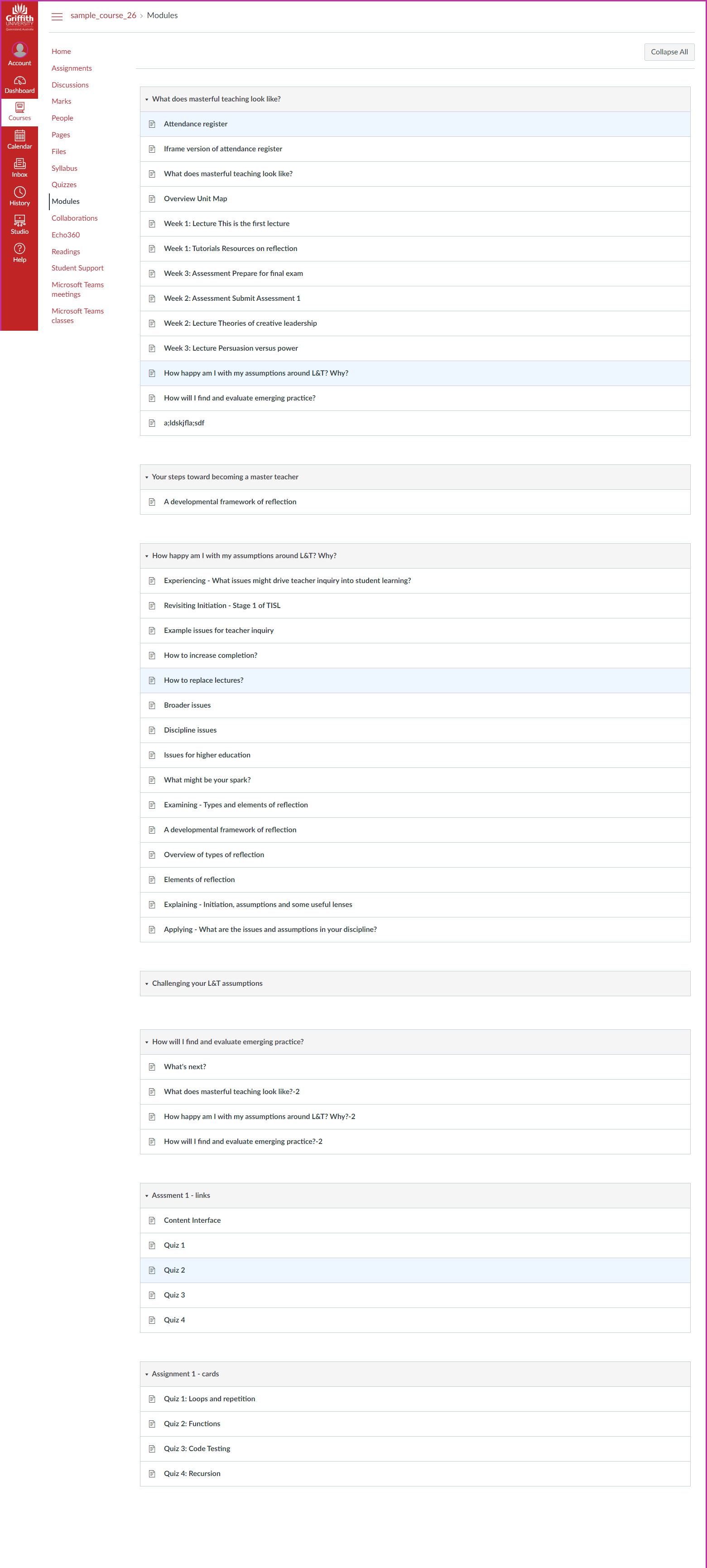
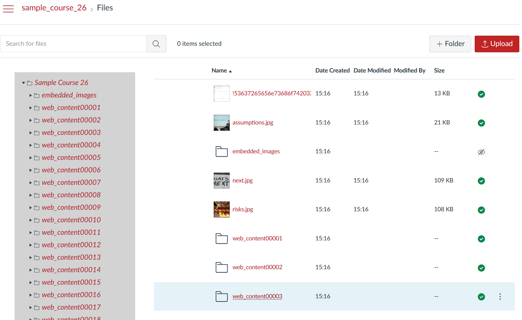
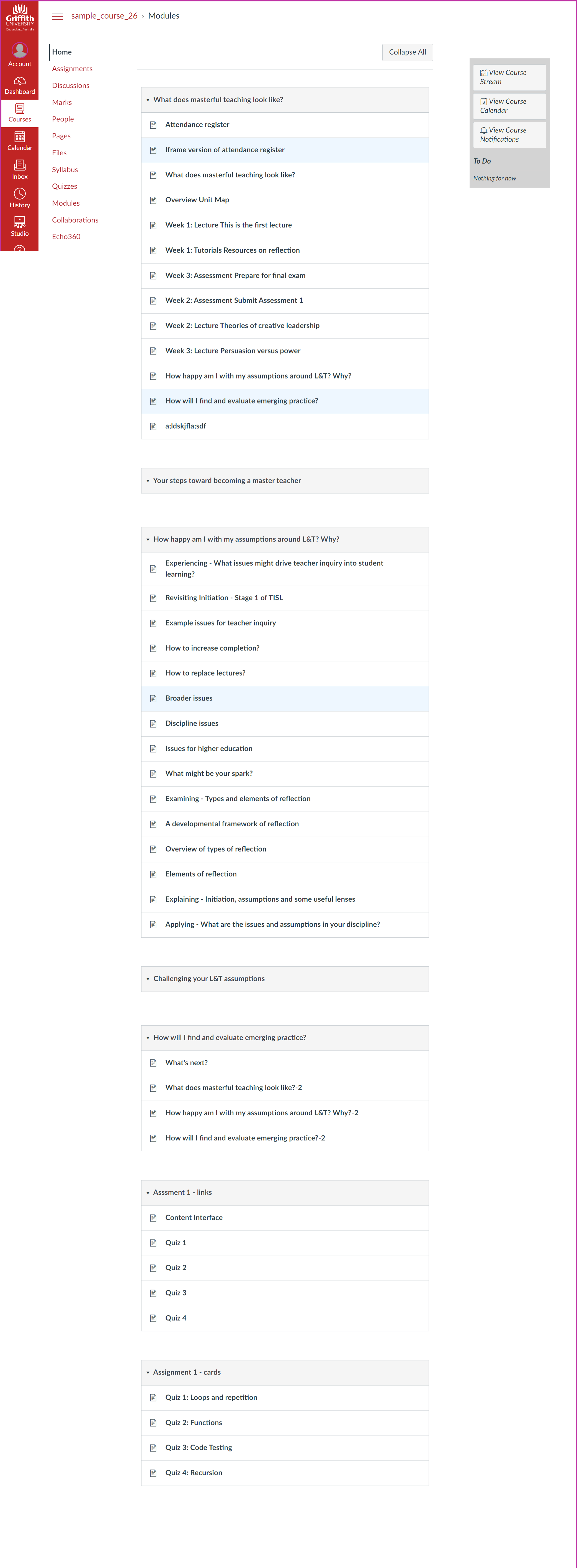
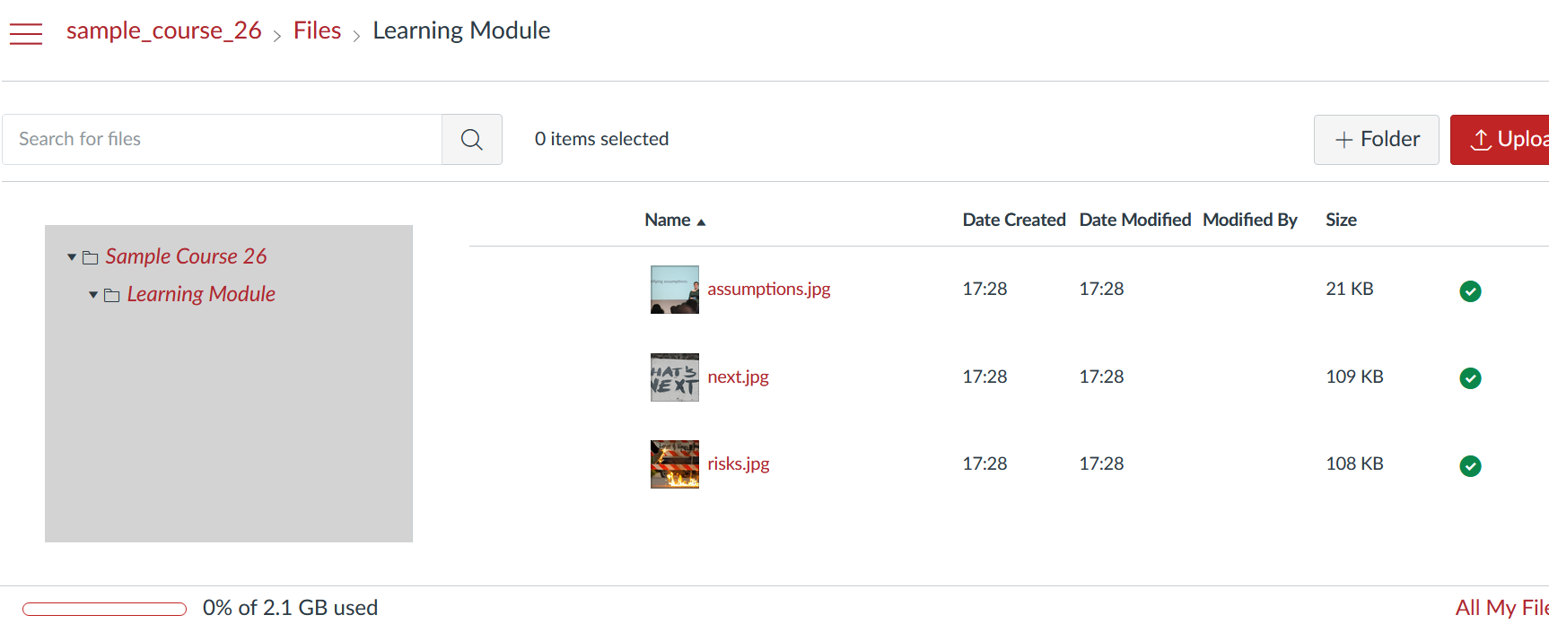
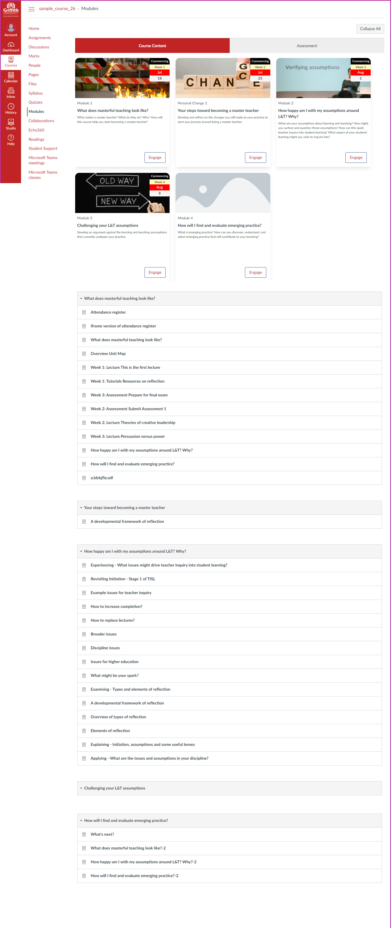
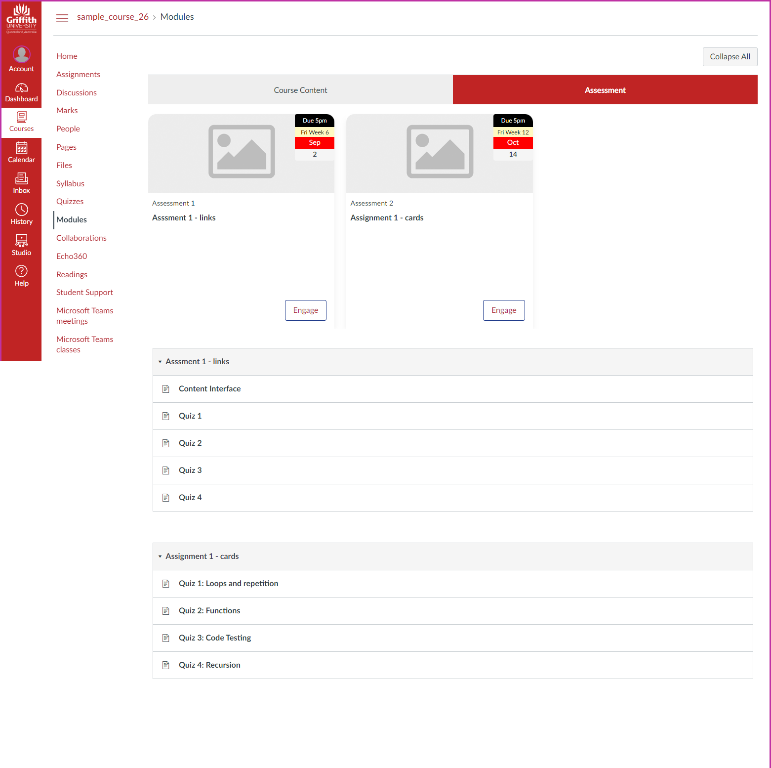
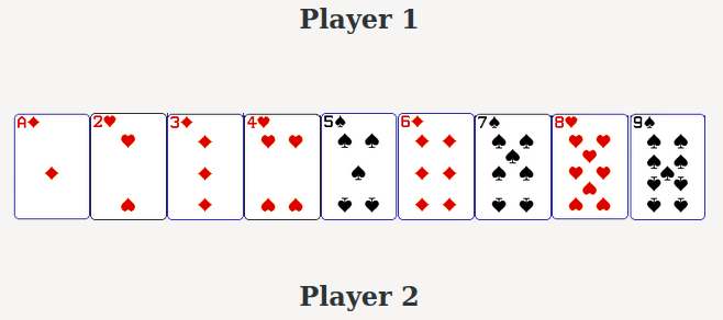


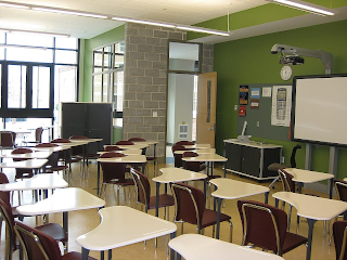


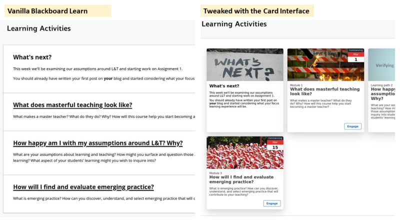
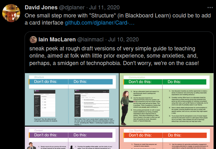

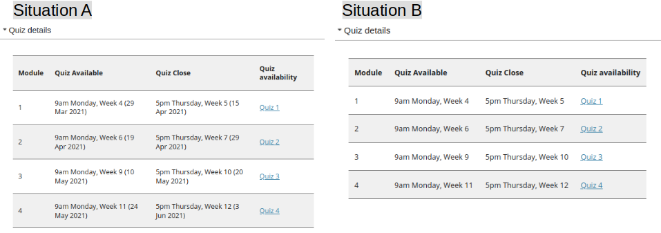


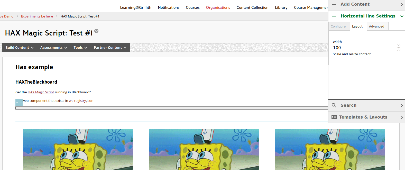

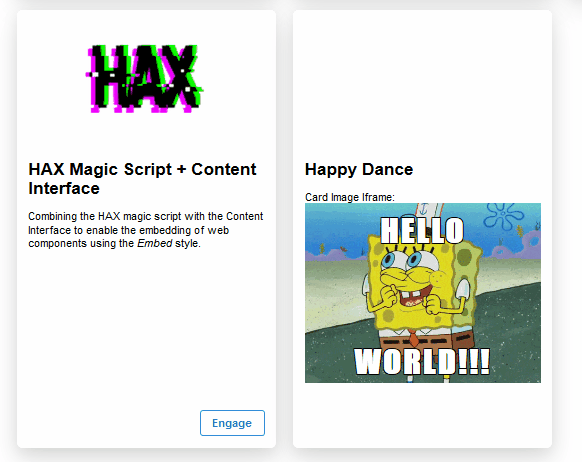
