Assembling the heterogeneous elements for (digital) learning

Month: September 2016

Exploring Moodle Book usage – part 9 – Strange courses

Time to explore some of the strange courses that have been identified.  There are currently two types:

  1. courses with many individual Book resources; and
  2. courses with huge Book resources.

Strange books

Courses with many books

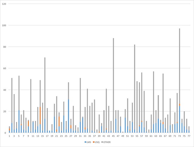
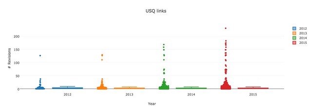
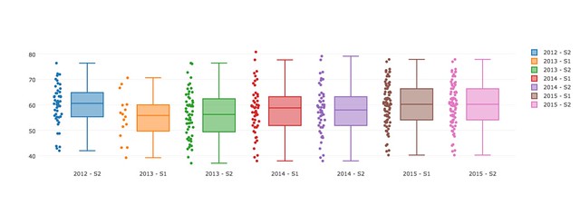
Back in part 2 there appear to be a number of courses that have more than 50 individual book resources.  That seems a bit excessive.  Wonder what that indicates? What are these courses (one of mine might be part of this group)? Is there something wrong hidden in these figures (e.g. are some of them hidden)?

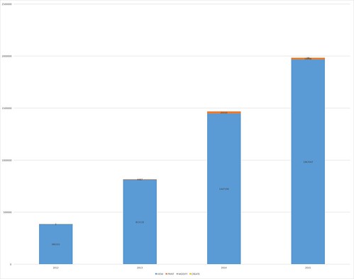
There are 15 course offerings with more than 30 Books.  7 of these are offerings of the course I teach.  The remaining 8 are split between 3 different bridging/preparation courses.

If the line is drawn at 20 books, then there are 23 course offerings drawn from another 2 education course , a nursing course, and another 2 bridging courses.

Courses with huge books

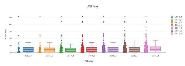
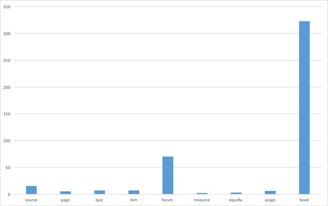
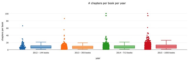
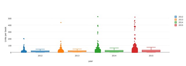
In part 6 it was discovered that there are books with 100 chapters (individual web pages). Most of the books had less than 20.

There are 51 offerings with books with greater than 26 chapters (25 is the upper limit for 2015).  This converts into 20 courses with a number being offered multiple times.

Further stats about these courses – as per the Word doc

Imported books

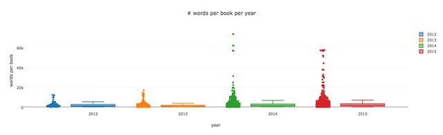
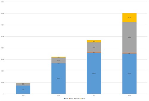
Part 6 in the series also outlines details of the number of books that were imported – only 9.8% of chapters imported, from 10.2% of books, from 11.8% of courses.

Comparisons

The aim now is to take a closer look at these strange course to learn more about them.  The following graphs will report different stats about the courses that fall into the three different categories

  1. IMPORT – courses that have used the Book import facility
  2. BIG – courses that include big books (greater than 26 chapters)
  3. MANY – courses that have many books (greater than 20 books)

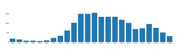
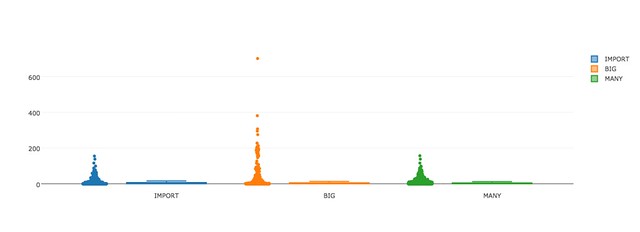
% of online only students

The institutions has a number of different types of student, including online only. The following graph shows the % of online students in each course.

It shows that the IMPORT courses tend to have a higher concentration of online students, with the MANY courses next. The BIG courses, tend to include more courses that have no online student.  There is online 1 MANY course with no online only students. Only 3 IMPORT courses with no online students.
Percent online only

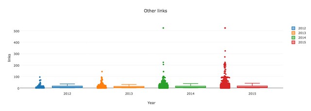
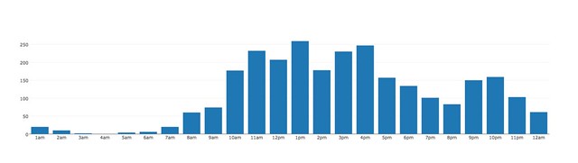
# of revisions per book

On the other hand, the following graph shows that the BIG courses, tend to have more revisions, including one that has 701 revisions.  That has to be explored a bit more – most of the BIG courses with high revisions are from the same allied health discipline. They are all – except from 2 (100% and almost 20%) – on-campus courses.

Revisions

When they are read by students

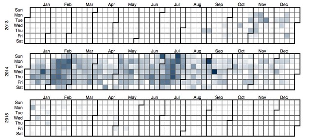
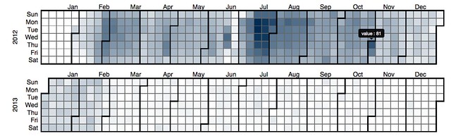
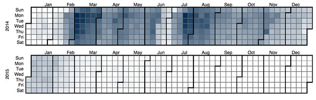
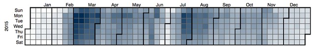
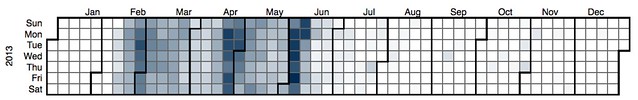
The following heatmaps aim to represent when these books are read.
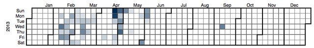
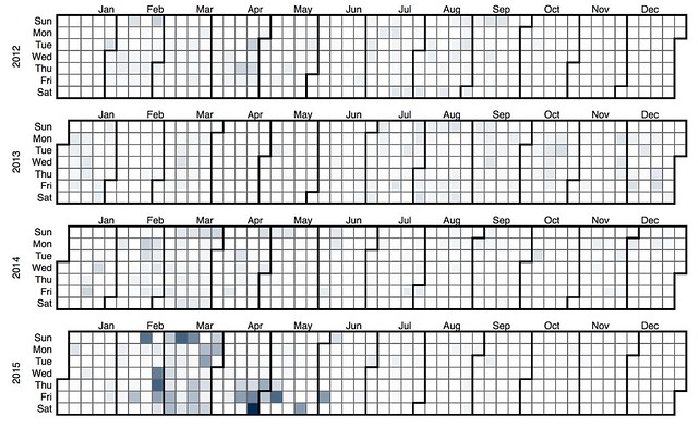
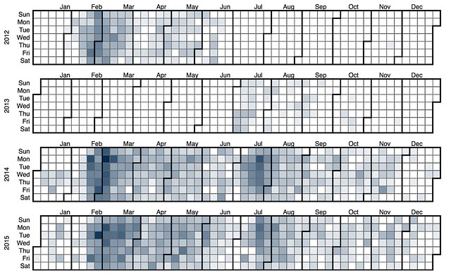
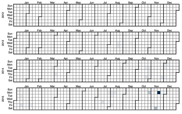
Import books

The following heatmap shows when books in courses that used the IMPORT facility were read by students. It seems to suggest that the IMPORT facility was really only heavily used in 2015.
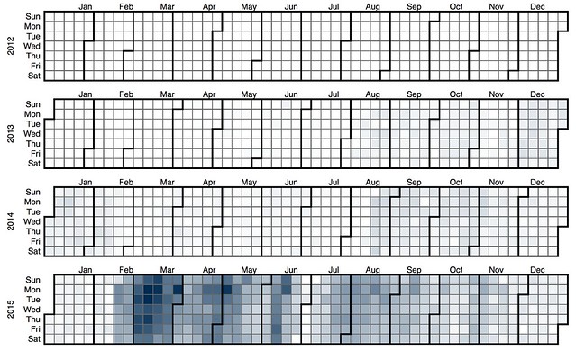
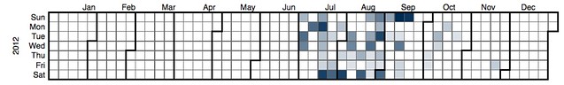
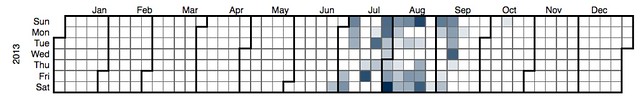
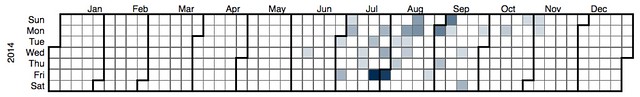
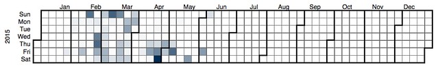
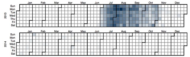
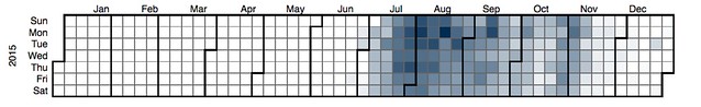
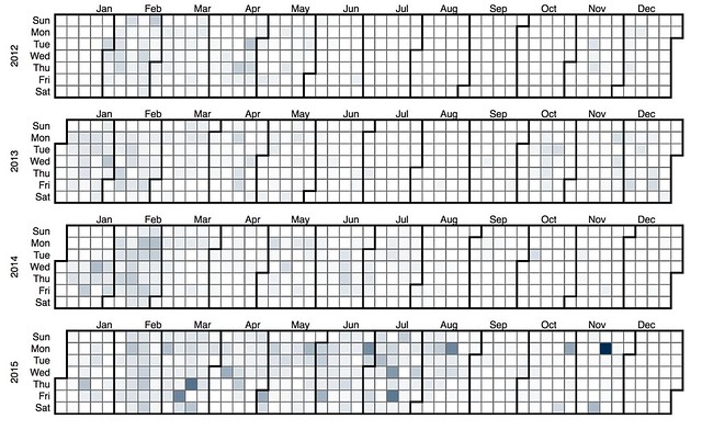
Import heatmap - student view/print

Big Books

The next images shows that courses with BIG books started a bit earlier and tend to be first semester occurrence.  Perhaps suggesting – like my course – a big offering in the 1st semester and a smaller repeat in the 2nd?

It also seems to suggest a tendency for the books in these courses to be read more earlier in the semester and also to be read on week days. In the first half of 2015, there’s even a trend for reading more on Monday and Tuesday.
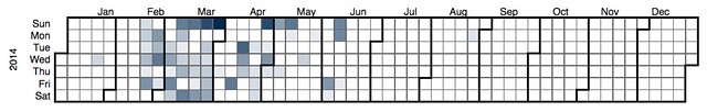
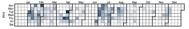
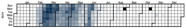
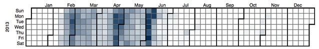
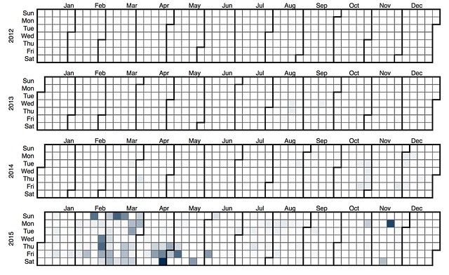
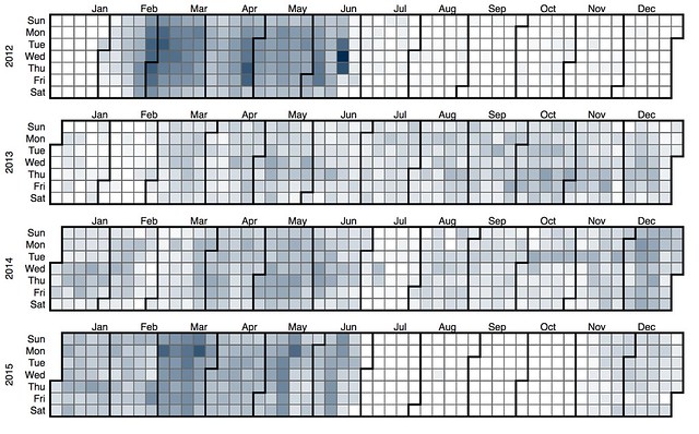
Big heatmap  - student view/print

Many Books

Many heatmap - student view/print

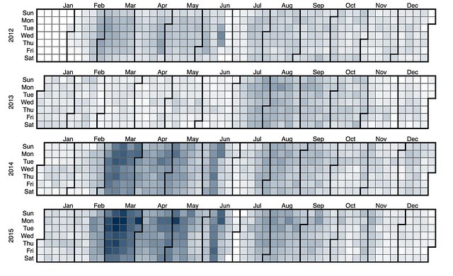
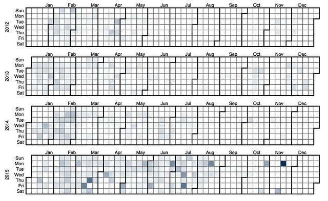
When are they modified

The next set of heatmaps are for the same collection of courses, however, these show when there were modify/create events. How often and when were they changed.
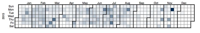
Import

The import courses align somewhat with the above.  Really only seeing action in 2015.

And much of that importing in 2015 is taking place on the weekends – I have a suspicion that this might be my course having an influence.
Import modify heatmap

Big

The BIG courses have modify/create spread over the years. However, it does appear that there’s a tendency to modify/create happening earlier in the semester

Big modify heatmap

Many

The MANY courses are – overall – showing a bit less activity. The pattern in the first half of 2015  suggests that a single course is having a fair impact. If this is my course, then it might be worthwhile taking it out and running these again.
Many modify heatmap

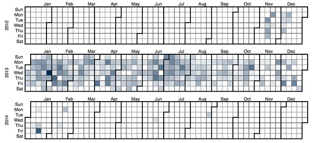
Remove EDC3100 – students viewing and printing

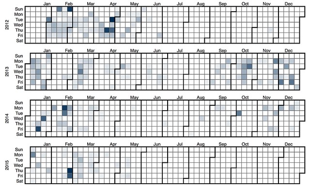
The next 6 heatmaps repeat the 6 from above, but with any of the offerings of the course I teach removed. This appears to radically change the picture.

Import

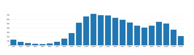
Reveals the drawback of the combined heatmap approach. It appears that my course offering has a great deal of activity, which in the above Import heatmap “overwhelmed” some of the other courses.  This map shows that use of the import facility starting earlier and being used. It shows in S1 2015 quite a lot of activity toward the end of semester.
Import no3100 student view heatmap

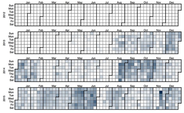
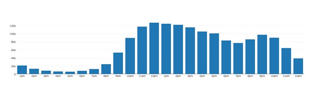
I was interested in the balance between viewing and printing.  The following heatmap is for the same set of courses as the above, but shows only the events associated with printing out a chapter or book.  It is suggesting that these courses are rarely printed

Many no3100 student print

Big

As mentioned below, this map appears no different with my course removed. Identifying that my course isn’t a BIG course. Big no3100 student heatmap

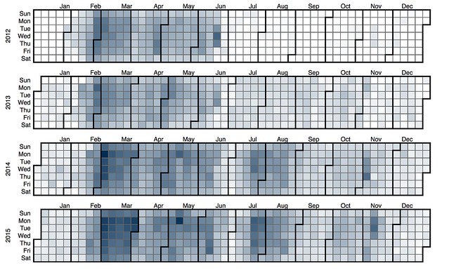
The following heatmap is for the same courses, but only the print actions. When compared to the other groups of courses, it suggests that the BIG courses have more print actions. Suggesting the bigger the books, the more likely students are to print them.

Big no3100 student print heatmap

Many

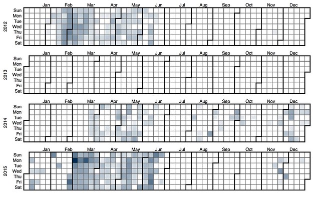
However, my course is one of the MANY.  Removing my course here allows the activity of the other courses to come through, in particular the small number of courses in first semester 2012 that had fairly consistent student usage throughout semester.
Many no3100 student heatmap

And the following again shows just the print actions. It suggests that the MANY courses print a bit, but not as much as the BIG.

Import no3100 student print heatmap

Remove EDC3100 – when modified

Import

It appears that the modifications occur toward the start of the semester and rarely continue during semester (Late Feb – S1; Late Jun/Jul – S2; Late Oct – S3)
Import no3100 heatmap

Big no 3100

This appears to be pretty much the same map as above – indicating that perhaps my course is not one of the BIG courses.

Big no3100 heatmap

Many 3100

A more major change here. Major reduction in modifications during semester, limiting modifications largely to the start of semester. With an exception in S1, 2012. Is this the course that had students doing it?
Many no3100 heatmap

Student updates – no edc3100

There are 2 course offerings that have students modifying Book resources. The following heatmaps foll

Exploring Moodle Book usage – Part 8 – linking to and from

Natalie writes about how she’s working a new practice into how she responds to student queries. It’s a process in which she attempts to model an approach to answering the query and including links to relevant sites. This is a practice that I use a fair bit, especially with the Moodle Book resources in my undergraduate course. This post seeks to explore my own practice, but also how wide spread that practice is in others.

This post picks up on work and ideas from an earlier post. The Moodle Book module helps create/manage collections of web pages. My interest is to explore how much people are using them as web pages, rather than just dumping grounds for print material. One of the main affordances of the web is links. The prior post found that around 15% of the book resources contain no links. It also found that the median number of links per book has grown from 11 through 17. It also shows that there are some books with hundreds of links. It also showed how the number of links in the book resources I produce has grown with the median hitting about 25.

This post will seek to refine and expand this exploration a bit, including

  • Looking more closely at what the book resources are linking to: other book resources, multimedia, other institutional resources etc.
  • Whether or not book resources are being linked to from course forum posts — this will become the topic for another post.

Link break down by destination

First, lets break down links by three destination categories:

  • LMS – to within the institutional LMS
  • USQ – other non-LMS links for the institution; and,
  • OTHER – everything else.

EDC3100 2015 2

The following graph shows the breakdown between the three categories for each book resource in the most recent offering (for which I have data) of the course I teach. It shows that typically links to the broader web tends to be the largest category, followed by other links within the LMS, and finally links to the institution.

But there is also some variety depending on the purpose of the specific book.

The book with the largest number of links (almost 100) is also one of the longer books.  It is also the book that contains all of the assessment related information (what is required, where to submit, how to request an extension, how to query marking etc). It includes 25 links to other parts of the study desk and 70 links to other sites.

The book with the most LMS-based links is titled Conclusions Week 1. It provides a summary of what was learned that week and includes links back to the specific pages in the various books for that week.

The book with the second most number of links, also only has external links.  This book aims to show folk how to use resources out on the web and literature to learn how to use a new digital technology. Hence it has a large number of links out onto the broader web and that’s even before Diigo widgets that contain the most recent collection of links shared to the course Diigo group are rendered.

edc3100 2015 2 link by destination

Evolution over time – EDC3100

The next graphs show the evolution of links from the EDC3100 books over time.For each offering of the course it shows the number of links per book of each type: LMS, institutional, and other.

There is no graph for institutional links (NOT the LMS) because from 2013 S2 it flat lines indicating – apart from one – none have links to non LMS institutional resources.  I imagine this may well be very different in other courses.

The first graph shows the evolution of LMS links. The median starts and remains at about 4 LMS links per book. With a slight growth at the top end in recent years.

3100 LMS links from Books

The next graph is for links outside the institution. The growth in these links is a bit more evident. The median growing from around 9 to around 13 and the upper from 40 to 50

3100 Other links from Books

Evolution over time – All courses

The following graphs show how many links of each type (LMS, USQ and other) found in all book resources in each year. These graphs do not include EDC3100, the course I teach.

There is a broad common trend in all three.  The number of books with large number of links increases over the years. However, that number is largely insignificant as the vast number of books contain much fewer links.

The first graph shows the number of LMS related links in each book. It shows that in 2012 almost all of the books had no such links. 75% of books in 2012 has less than 5. 50% had 0. As the years progress there are a growing number of books with quite large numbers of links, with the maximum reaching 400. This corresponds to the appearance of some books that are very large. By 2015, 75% of books has less than 7. 50% less than 2.

LMS links not 3100

The next graph focuses on number of links to institutional resources (not in the LMS) in each book. The basic shape is much the same. Starting quite low and then having a number of books added in 2014/2015 with quite large numbers. However, the numbers involved fewer numbers of links than the LMS graph (e.g. the maximum gets to just over 200, rather than 400). It also shows that the overall trend is a bit down.

In 2012, 75% of books has less than 4 USQ links. By 2015, that had reduced to 3.

USQ links not 3100
The following graph focuses on links onto the broader web.  The numbers are higher.

In 2012, 75% of books had less than 17 links, 50% had less than 7. 2015 was largely the same.
Other links not 3100

What Moodle links exist?

Next step is to take a closer look at the Moodle links. What type of activities and resources are being linked to.

Will people be linking to anything? Mostly resources? Activities?

EDC3100 2015 2

Start with the latest version of the course I teach.

It shows that most of the links in the latest offering are to other Moodle book resources. Over time I’ve made an effort to link between books to show the interconnection of ideas.

Surprisingly, it also shows links to the discussion forums.  These are going to be offering specific since each offering of a course uses different forums.  Interestingly, take away the book links, and the forum links make up almost 61% of these links.

Would an analysis that divides links between activities and resources indicate anything interesting about learning design?

3100 2015 2 - Moodle links

All 2015 S2 – but EDC3100

So how do all the other courses use of Books form 2015 S2 compare?

Lots of resource focus – book, pluginfile, printing the book, equella.  But also links to the quizzes and forums.

Interestingly for me it highlights 3 other courses using BIM. 2 of which I don’t teach.

All 2015 S2

But how widespread is this?

As discovered above

In 2012, 75% of books has less than 4 USQ links. By 2015, that had reduced to 3.

Meaning that those 1000+ links to Moodle books above were found in a fairly small number of books. Perhaps a couple of the quite large books. More to find out

  • How widespread are these links? How many books?
  • What type of links are they?

Something for later.

OEP, institutions and culture

Some colleagues and I are embarking on a project exploring how teacher education might move toward adoption Open Educational Practices (OEP). A project that is currently being driven by a funding from one University, and which might lead to an application for funding from another institution. In part, we’re thinking about how teacher education in each of these two institutions can adopt OEP, what that might look like, what the barriers be, and how might we go about moving toward something like this that won’t fade away once the money runs out or we move on.

As it happens, over the last week or so there’s been an on-going discussion about the role of institutions and/or culture in OER. A discussion that started with Mike Caufield’s reflections and were then picked up by many, including Jim Groom, Stephen Downes and Tim Klapdor. A discussion that provides an interesting way of looking at what we’re thinking about. In the end, I think we may need to draw upon the following from David Wiley and Cable Green, which echoes a discussion Leigh Blackall and I had back in 2010.

Making stuff last – institutions

One of the first posts in this discussion by Mike arose out of a debate around the value of Open Educational Resources as a stepping stone to Open Pedagogy. The idea being that increasingly universities are creating policies etc that are embedding OERs (typically in the form of open textbooks) into organisational practice. However, while all this has been happening open pedagogy (I’ll label this OEP here) has been waiting, waiting for its turn. That waiting has made the people more interested in OEP a touch cranky with the focus on OER and they’re heading off to do their own thing.

The problem Mike identifies comes from his personal experience

But here’s what I know. The death of the Persona Project was the norm, not the exception. It happens all the time. Where I work right now had a great student and teacher wiki up in 2008. But it got nuked in a transition. The Homelessness Awareness wiki I worked on with Sociology students (and demo’d with Jim Groom in 2011) is ghost-towned. The disability research one has been slammed by spam. And even more than that, each time I work with a professor on these things (most recently on a Colonial Theory wiki) we spin up from scratch, and leave it to rot afterwards.

And leads to the following

People make things possible. And we have such great, great people in Open Pedagogy….But institutions, they are what make these things last.

And in a another post, to the question

How can we re-architect our institutions to bring open practice into the center of them, rather see it as a bolt-on?

Making stuff last – culture

Stephen Downes response is

You can’t depend on institutions. And in a sense, you don’t need them. Institutions aren’t what make tests and exams happen year after year. Institutions aren’t what guarantee there will be course outlines and reading lists. What makes this last – the only thing that makes this last – is culture.

And in a more detailed post he adds

I’m not saying we should never build things. What I am saying is that we cannot count on institutions – organized economic and political units – to ensure the lasting value of these things is preserved…Because sooner or later someone is going to object (or forget, or simply retire), and the good work goes down the drain.

Local institutional experience

So how does local institutional experience match up with this discussion.

Institutional moves to be open

Peter brings up the experience of our local institution. An institutional early adopter of open within an Australian context. Peter sums up the situation as

In principle being open is acknowledged as a good thing but in practice it seems not to happen much and to be not easy to accomplish within the institutional processes.

And suggests that at least part of the problem is

It seems likely that is linked to concerns about reputational effects….Thus the interests of the institution seem to be best served by ensuring that what is made open is carefully managed and quality assured to present the best possible impression.

Perhaps indicating that our institution hasn’t yet been successful at achieving what Mike observes

is that OER has done the hard work of bringing OER work to the center of the institution, rooting it in institutional policy and practice in a way that Open Pedagogy hasn’t been able to do

But also highlighting Downes point in that these moves for the institution to be open have been driven by people at the senior levels of the institution. However, that high level interest has resulted in a number of different bolt-on projects, but have yet to translate into changes into organisational policy or practice.

For example, institutional policy still does not make it easy (or even possible) for an academic to place a Creative Commons license on their teaching materials and release it. Institutional policy is such that the university retains copyright. In addition, any such sharing seems to require using the institutional version of Equella. A system not conducive to easy, widespread sharing and discoverability.

My moves within institutions to be open

Archisuit example from Sarah Ross

The 2010 discussion around open and how to get there between Leigh Blackall and I arose out of my work on BIM. A Moodle module that aids teachers manage use of individual student blogs. BIM is perhaps the ed tech equivalent of an Archisuit. An example of a response to a hostile architecture. An example that Mike uses as an example of the sort of workarounds that open pedagogy people have been working on for ages. But then argues that

Being against the institution may be necessary, but it is not where you ultimately want to be. If you want real change, styrofoam padding isn’t going to cut it. Eventually you have to remove the damn bars from the bench.

The difference with BIM is that it is part of the LMS. It’s an accepted part of the institution. Perhaps indicative of how while my current institution hasn’t yet succeeded with embedding open into the policy of the institution. There are glimmers of it within the infrastructure.

However, that still hasn’t encouraged vast swaths of adoption. 8 of the 10 course offerings that have used by BIM in 2014/2015 were courses I taught. On the plus side, I was surprised to find the other two courses and I believe they have continued using BIM this year.

The Moodle Open Book project is another “archisuit” example. The aim is to connect the Moodle Book module (used to manage/display collections of web pages within Moodle) to GitHub and thus enable production of OER and more interestingly OEP. There’s even some “working” code.

But as I talk about both of these workarounds, what I’m struck by is the huge “cultural” leap required to go from not using blogs/github to thinking about how blogs/github might be leveraged in an interesting OEP way. Even the initial development and application of BAM (the non-Moodle predecessor) of BIM was driven by a fairly uninspired pedagogical application – address the student corruption of a “reflective journal” assignment using Word documents.

The impact of culture

That said, I think the adoption of BIM in two other courses at my institution is potentially largely down to a change in broader culture. In this case, not the idea of open, but instead the movement of blogs into a common (even passe) part of contemporary culture. My understanding is that the person who has adopted BIM in their teaching has embarked on projects that have used blogs.

Blogs in 2016 aren’t as strange and unknown as they were in 2007 when the ELI Guide to Blogging came out. In 2006, when I tried to explain BAM, most of the time was spent trying to get people’s head about blogs, blogging, and RSS feeds. In 2016, most people are familiar with the idea of a blog and blog posts. Though I’m guessing they are probably still a bit uncertain about RSS feeds.

If blogs hadn’t caught on like they did, BIM would be dead. Culture plays a part.

Removing the bars from the bench: easy for OER, harder for OEP

As Mike points out “the assumption of the textbook is baked into every nook and cranny of our institutions”. A bit earlier he identifies the proprietary textbook as “the largest structural barrier to open pedagogy”. He congratulates the Open Textbook folk for having “willing to engage on the fronts of policy and practice at once” and suggests that the open pedagogy folk need to engage more in “issues of policy, law, funding, architecture, institutional support” in order to “remove the bars from the bench”. I think it’s going to be much harder for OEP to do this, perhaps even leaning more towards the impossible end.

Textbooks are a core part of universities. Everyone is familiar with them. The institution can talk and deal with textbooks at a general level. Whether they be proprietary or open. They have a collection of pages, making up chapters, making up the book. There are headings, images, activities, etc. They are a model that is understood across all parts of the institution. Hence textbooks are something that can be easily discussed at an institutional level. Sure those strange folk in the Arts will have different content than the Engineers, but the notion of a book is general.

OEP on the other hand is – I think – incredibly more diverse and contextual. My initial experiments with BAM took place almost 10 years ago in another institution in a different discipline. Today I use BIM – the functionality of which is a direct translation of BAM into Moodle (hence the acronym BIM) – at a different institution in a different discipline. I don’t use the BIM functionality. I have a army of kludges that I employ to support the OEP I think works better for my current students. ds106 makes perfect sense in it’s context and purpose, but engineers at my institution are not likely to understand it at all. The type of OEP we might engage in with pre-service teachers is likely to be very different from nursing students. In particular, if our aim with OEP is for the pre-service teachers to engage more with the teaching profession.

The novelty and diversity of OEP would appear to be in stark contrast to the familiarity and standardisation of textbooks and OER. I don’t think institutions (or many people) will deal well with that combination. I’m not sure continuing to ride in the back seat will be sufficient.

That said, if we’re going to do anything around OEP within an institution, we’re going to have to consider Mike’s question, if we want that work to have a chance of surviving.

How can we re-architect our institutions to bring open practice into the center of them, rather see it as a bolt-on?

Both/and, not either/or

But at the same time, I think we also need to ask ourselves a similar question about the culture of teachers and teacher education. While there’s been a significant increase in sharing online amongst edubloggers, Twitter, online resource sharing etc. This still seems to be the minority. There are still schools that constrain the use of online technologies and sharing. There are schools where it is assumed that the school retains copyright of teacher-produced material. In an era of standardised testing and concerns about teacher quality, there are issues around sharing resources, and especially sharing the messy processes involved figuring out how to teach these learners effectively.

Even if (and a big if) we’re able to embed OEP into our courses within our institutions, unless we can connect that work sustainably into teacher practice the full benefits won’t flow.

Which has me wondering, where are the sweet spots in teacher practice and our courses where it would be easier to introduce OEP and make the connection between practice and ivory tower?  What about in your teaching, where are those sweet spots? Is there any overlap?


What if our digital technologies were protean?

On Friday the 30th September 2016 I will present the paper – What if our digital technologies were protean? Implications for computational thinking, learning, and teaching – co-written by Elke Schneider and I at the ACCE’2016 conference.

Other resources include:

  • A 1 question poll; and
    An attempt to explore whether people experience their organisational information systems as protean or not.If you haven’t already, do please take the time to complete the poll.
  • Stories of digital modification.
    A copy of the Google doc we originally used to gather the data for the paper. This data was then analysed for themes.

Abstract

Not for the first time, the transformation of global society through digital technologies is driving an increased interest in the use of such technologies in both curriculum and pedagogy. Historically, the translation of such interest into widespread and effective change in learning experiences has been less than successful. This paper explores what might happen to the translation of this interest if the digital technologies within our educational institutions were protean. What if the digital technologies in schools were flexible and adaptable by and to specific learners, teachers, and learning experiences? To provide initial, possible answers to this question, the stories of digital technology modification by a teacher educator and a novice high school teacher are analysed. Analysis reveals that the modification of digital technologies in two very different contexts was driven by the desire to improve learning and/or teaching by: filling holes with the provided digital technologies; modelling to students effective practice with digital technologies; and, to better mirror real world digital technologies. A range of initial implications and questions for practitioners, policy makers, and researchers are drawn from these experiences. It is suggested that recognising and responding to the inherently protean nature of digital technologies may be a key enabler of attempts to harness and integrate digital technologies into both curriculum and pedagogy.

Exploring Moodle Book usage – Part 7a) – when are they modified

In a previous post I generated various representations of when Moodle Book resources were being used and some indications of when they were being created. What I didn’t do in that post was generate a calendar heatmap of when the Book resources were being create and modified. This is of interest because I’m wondering whether or not these resources (web pages) are being modified throughout the semester, or just at the beginning.

The following corrects that. It starts with calendar heatmaps showing when I’ve edited/created the Book resources in my course. I’ve tended – or least eventually developed – a practice of developing and changing the books as the semester progresses. I think I’m strange – turns out that I’m apparently not that strange at all.

EDC3100

Each of the following shows some level of change prior and during semester. Some even show changes after the end of semester.

For most of the semester, the weekend are the days that tend to be busiest in terms of edits. Showing an unhealthy practice of using weekends to catch up.

In S1 I also teach on-campus students, which is typically done during the week. Perhaps that limits the edits that happen during the week in S1.

S1 typically starts early March and finishes late June/July. S2 typically starts late July and finishes early November.

2012 S2

Fair bit of work before semester and on-going.  Fair bit of work on saturday and sunday.

2012 S2 EDC3100 modify heatmap

2013 S1

Lot of work in the leadup. Not so much during the early part of the semester.

2013 S1 EDC3100 modify heatmap

2013 S2

More front ended activity before and early in semester.  Late in the semester not much.

2013 S2 EDC3100 modify heatmap

2014 S1

More weekend editing.

2014 S1 EDC3100 modify heatmap

2014 S2

A generally lighter collection of updates.

2014 S2 EDC3100 modify heatmap

2015 S1

More before semester, lightish during.  Much of the work during is occurring late in the week.

2015 S1 EDC3100 modify heatmap

2015 S2

A more even spread across the week.

2012 S2 EDC3100 modify heatmap
Courses other than EDC3100

So what about updates in all the other courses?

Well, that is a surprise.  Indications are that at least someone is modifying a Book resource most days throughout the year.  Even in some circumstances well before or well after the year.

The question with these now is whether this spread is due to the number of book resources or number of courses using the book.  A topic for further exploration.  Perhaps by doing a heat map showing the % of courses that have books being modified?

2012

2012 all courses modify heatmap

2013

2013 modify - all courses

2014

2014 all courses modify heatmap

2015

2015 all courses modify heatmap

Your experience of organisational digital technology?

What is your experience of the digital technologies provided by the organisations for which you work?

If you’d like to share, please complete the poll below, more detail below.

About the poll

The poll is a semi-serious attempt to gather the perceptions of how people perceive organisational digital technologies. The idea (and the text from the two poll options) comes from this conference paper. The presentation will be on Friday 30th September with additional presentation resources coming to this blog soon.

Exploring Moodle Book usage – Part 7 – When are they used?

The last post in this series looked briefly at the contents of Moodle Book resources. This post is going to look at when the book resources are used, including:

  • What time of day are the books used?
  • When in the semester are they used?

By the end I spent a bit of time exploring the usage of the Book resources in the course I teach.

What time of day are they used?

This is a fairly simple, perhaps useless, exploration of when during the day. More out of general interest and laying the ground work for the code for the next question.

Given the huge disparity in the number of views versus print versus updates, there will be separate graphs for each. Meaning 3 graphs per year.  For my own interest and for the sake of comparison, I’ve included a fourth graph which is the same analysis for the big 2015 offering of the course I teach.  This is the course that perhaps makes the largest use of the Book and also the offering in which  I did lots of updates.

The graphs below show the number of events that occurred in each hour of the day. 12pm to 1am, 1am to 2am,…and so on.  Click on the graphs to see expanded versions.

There is no graph for prints per hour for 2012 as there were none in the database. This appears likely to be a bug that needs to be addressed.

Overall findings from time of day

Growth – The maximum number of events has grown each year (as expected given earlier indications of growth).

  • max views per hour: 2012 just less than 35K to 2015 over 150K
  • max prints per hour: 2013 just over 400 to 2015 over 1500
  • max updates per hour: 2012 just over 500 to to 2015 over 6000.

Similarity – The overall of shapes of the graphs stay the same, suggesting a consistent pattern in interaction.

This is especially the case for the viewing events. Starting with a low number from midnight to 1am, a on-going drop in events until 5am when it grows until the maximum per hour between 11am and midday. Then there is a general drop away until 7pm to 8pm when it grows again until dropping away after 9pm

Views per hour each year

2012
2012 views per hour

2013
2013 views per hour

2014
2014 views per hour

2015

2015 views per hour

EDC3100 2015 S1

EDC3100 2015 1 views per hour

Prints per hour each year

2012

2012 prints per hour

2013

2013 prints per hour

2014

2014 prints per hour

2015

2015 prints per hour

EDC3100 2015 S1

EDC3100 2015 1 prints per hour

Updates per hour each year

2012

2012 updates per hour

2013

2013 updates per hour

2014

2014 updates per hour

2015

2015 updates per hour

EDC3100 2015 S1

EDC3100 2015 1 updates per hour

Calendar Heatmaps

A calendar heatmap is a fairly common method of representing “how much of something” is happening each day of the year. The following aims to generate calendar heatmaps using the same data shown in the above graphs. The plan is to use the method/code outlined on this page.

It requires the generation of a two-column CSV file. First column the date in YYYYMMDD format and the 2nd column the “how much of something” for that day. See the example data on the blog post.  Looks like it might be smart enough to figure out the dates involved.  Let’s see.

It is, but doing all of the years together doesn’t work all that well given the significant increase in numbers of courses using the Book as time progresses and the requirement for the heatmap to use the same scale for all years. As a result the 2012 usage doesn’t show up all that well. Hence each of the years were mapped on separate heatmaps.

The following calendar heatmaps show how often the Book resources were viewed on each day. The events counted are only those for Book resources from courses offered in the given year. In 2012, 2013 and 2014 this means that there is a smattering of views of a books early in the following year (semester 3 stretches from Nov to Feb). There is no similar usage for the 2015 books because the data does not include any 2016 events.

The darker the colour the greater the use. In the 2012 image below you should be able to see a tool tip showing a value of 81 (out of 100) that is quite dark, but not the darkest.

2012

The 2012 map seems to establish the pattern.  Heavy use at the start of semester with a gradual reduction through semester. A few upticks during semester and toward the end of semester.

I no longer have easy access to specific dates for 2012 and 2013. The 2014 heatmap has some specific dates which should broadly apply to these earlier years.
2012 Book usage

2013

2013 Book usage - calendar heatmap

2014

The institution maintains a web page that shows the important dates for 2014, it includes:

  • March 3 – Semester 1 starts.
    Course websites open 2 weeks before this date – 17th Feb
  • June 16 – Semester 1 exams start.
  • July 21 – Semester 2 starts
    Course websites open 2 weeks prior – 7th July.
  • November 3 – Semester 2 exams start.
  • November 17 – Semester 3 starts.

Screen Shot 2016-09-11 at 4.52.36 pm

2015

The semester 1 2015 offering of my course had the following due dates for its 3 assignments

  1. 30th March – which appears to coincide with a heavy usage day.
  2. 4th May – also a slightly heavy usage day, but not as heavy.
  3. 15th June – two somewhat heavy usage days before and on this date.

Raising the question of what the heatmap for that course might look like – see below

Screen Shot 2016-09-11 at 4.53.10 pm

EDC3100 – S1, 2015

Focusing just on my course the increase in usage just before the due date for the assignments is more obvious. One of the reasons for this is that all the Assessment information for the course is included in a Moodle Book resource.
EDC3100 S1 2015 book usage - calendar heatmap
Other time periods relevant to this course are:

  • April 6 to 17 – the two week mid-semester break; and,
    Which correspond to two of the lightest periods of usage of book resources.
  • May 18 to June 5 – a three week period when most of the students are on Professional Experience within schools.
    Which also corresponds to a light period of usage.

The two heaviest days of usage are the 9th and 10th of March. The start of Week 2 of semester. It’s a time when the pressure is on to get a blog created and registered and start completing learning paths.

After the peak of the first three weeks, usage of the Book resources drops to around 50% per day.

Questions to arise from this

  • Does the learning journal assessment item for EDC3100 change when students interact with the course site?
  • Is the pattern of usage (down to 50% a day) indicative of students turning off, or becoming more familiar with the approach?
  • Does the high level of usage indicate

It also begs the question about whether particular offerings of the course show any differences.

2012 – S2

The 2012 S2 pattern is quite a bit different. It is a bit more uneven and appears to continue well after the semester is finished.  This is due to this being the first semester the course used the Book module and also because there was a semester 3 offering of the course for a few students that used the same resources.
EDC3100 2012 2 - Book usage

The 2012 heatmap also shows a trend that continues. i.e. usage of the Book resources continue well past the end of semester. It’s not heavy usage, but is still there.

Question: is that just me, or does it include students?

2013 – S1

2013 S1 is a bit different as well. Lighter use at the start of semester. A bit heavier usage around assignment due dates. My guess is that this was still early in the evolution of how the Book was being used.

EDC3100 2013 S1 - Book usage

2013 – S2

This map seems to be evolving toward the heavy use at the start of semester.
EDC3100 2013 S2 - Book usage

2014 – S1

And now the pattern is established. Heavy use at the start of semester and in the lead up to Assignment 1. A slight uptick then for Assignments 2 and 3. With the light usage around Professional Experience evident.

EDC3100 2014 S1 - Book usage

2014 – S2

EDC3100 2014 S2 - Book usage

2015 – S2

  EDC3100 2015 S2 - Book usage
What about just the students?

The following shows just the student usage for the 2013 S1 offering. Not a huge difference to the “all role” version above suggesting that it is students who are doing most of the viewing. But it does confirm that the on-going usage of the Book resources past the end of the semester are students who appear to have found some value for the information post the course.

EDC3100 2013 1 - Just students

Which comes first? Pedagogy or technology?

Miranda picks up on a common point around the combination of technology and pedagogy with this post titled Pedagogy First then Technology. I disagree. If you have to think in simple sequential terms, then I think pedagogy should be the last consideration, not the first. The broader problem though is our tendency to want limit ourselves to the sequential

Here’s why.

The world and how we think isn’t sequential

The learning and teaching literature is replete with sequential processes such as ADDIE, Backwards Design, Constructive Alignment etc. It’s replete with such models because that’s what academics and experts tend to do. Develop models. The problem is that all models are wrong, but some of them are useful in certain situations for certain purposes.

Such models attempt to distill what is important from a situation to allow us to focus on that and achieve something useful. The only trouble is that the act of distillation throws something away. It’s an approach that suffers from a problem identified by Sir Samuel Vimes in Feet of Clay by the late Terry Pratchett

What arrogance! What an insult to the rich and chaotic variety of the human experience.

Very few, if any, human beings engage in anything complex or creative (such as designing learning) by following a sequential process.  We are not machines. In a complex task within a complex environment you learn as much, if not more, by engaging in the process as you do planning what you will do beforehand.

Sure, if the task you are thinking about is quite simple, or if it is quite complicated and you have a lot of experience and expertise around that task, then you can perhaps follow a sequential process. However, if you are a teacher pondering how to transform learning through the use of digital technology (or using something else), then your task is neither simple, nor is it complicated, nor is it something you likely have experience or expertise with.

A sequential process to explain why technology first

Technologies for Children is the title of a book that is designed to help teachers develop the ability to help learners engage with the Australian Curriculum – Technologies learning area. A curriculum that defines two subjects: Design and Technologies, and Digital Technologies. In the second chapter (Fleer, 2016) the author shares details of how one year 4/5 teacher integrates this learning area into her class. It includes examples of “a number of key statements that reflected the technological processes and production skills” (Fleer, 2016, p. 37) that are then turned into learner produced wall charts. The following example wall chart is included in Fleer (2016, p. 37). Take note of the first step.

When we evaluate, investigate, generate designs, generate project plans, and make/produce we:

  1. Collaboratively play (investigate) with the materials.
  2. Evaluate the materials and think about how they could be used.
  3. Generate designs and create a project plan for making the item.
  4. Produce of make the item.
  5. Evaluate the item.
  6. Write about the item and talk with others.
  7. Display the item.

Before you can figure out what you are going to do with a digital technology, you need to be fully aware of how the technology works, what it can do, what are the costs of doing that, what it can’t…etc. Once you’ve got a good handle on what the digital technology can do, then you can figure out interesting and effective ways to transform learning using the technology. i.e. pedagogy is the last consideration.

This is not to suggest that pedagogy is less important because it comes last. Pedagogy is the ultimate goal

But all models are wrong

But of course all models are wrong. This model is (arguably) only appropriate if you are not familiar with digital technology. If you know all about digital technology or the specific digital technology you are considering, then  your need to play with the digital technology first is lessened.  Maybe you can leap straight to pedagogy.

The trouble is that most teachers that I know have fairly limited knowledge of digital technologies. In fact, I think many of the supposed IT experts within our institutions and the broader institution have somewhat limited understandings of the true nature of digital technologies. I’ve argued that this limited understanding is directly impacting the quality of the use of digital technology for learning and teaching.

The broader problem with this “technology first” model – as with the “pedagogy first” model – is the assumption that we engage in any complex task using a simple, sequential process. Even the 7 step sequential process above is unlikely to capture “the rich and chaotic variety” of how we evaluate, investigate and generate designs for using digital technology for learning and teaching. A teacher is just as likely to “play (investigate)” with a new digital technology by trying out in a small safe to fail experiment to see how it plays out. Perhaps this is repeated over a few cycles until the teacher is more comfortable with how the digital technology works in the specific context, with the specific learners.

References

Fleer, M. (2016). Key ideas in the technologies curriculum. In Technologies for Children (pp. 35–70). Cambridge University Press.

Making course activity more transparent: A proposed use of MAV

As part of the USQ Technology Demonstrator Project (a bit more here) we’ll soon be able to play with the Moodle Activity Viewer. As described the VC, the Technology Demonstrator Project entails

The demonstrator process is 90 days and is a trial of a product that will improve an educator’s professional practice and ultimately motivate and provide significant enhancement to the student learning journey,

The process develops a case study which in turn is evaluated by the institution to determine if there is sufficient value to continue or perhaps scale up the project.  As part o the process I need to “articulate what it is you hope to achieve/demonstrate by using MAV”.

The following provides some background/rationale/aim on the project and MAV. It concludes with an initial suggestion for how MAV might be used.

Rationale and aim

In short, it’s difficult to form a good understanding of which resources and activities students are engaging with (or not) on a Moodle course site. In particular, it’s difficult to form a good understanding of how they are engaging within those resources and activities. Making it easier for teaching staff to visualise and explore student engagement with resources and activities will help improve their understanding of student engagement. This improved understanding could lead to re-thinking course and activity design. It could enhance the “student learning journey”.

It’s hard to visualise what’s happening

Digital technologies are opaque. Turkle (1995) talks about how what is going on within these technologies are hidden from the user. This is a problem that confronts university teaching staff using a Learning Management System. Being able to identify what resources and activities within a course website students are engaging with,which resources they are not, and identifying which students are engaging can take a significant amount of time.

For example, testing at USQ in 2014 (for this presentation) found that once you knew which reports to run on Moodle you had to step through a number of different reports. Many of these reports include waiting for minutes (in 2016 the speed is better) with a blank page while the server responds to the request. After that delay, you can’t actually focus only on student activity (staff activity is included) and it won’t work for all modules. In addition, the visualisation that is provided is limited to tabular data – like the following.

EDC3100 2016 S1 - Week 0 activity

Other limitations of the standard reports, include:

  • Identifying how many students, rather than clicks have accessed each resource/activity.
  • Identify which students have/haven’t accessed each resource/activity.
  • Generate the same report within an activity/resource to understand how students have engaged within the activity/resource.

Michael de Raadt has developed the Heatmap block for Moodle (inspired by MAV) which addresses many of the limitations of the standard Moodle report. However, it does not (yet) enable the generation of a activity report within an activity/resource.

The alternative – Moodle Activity Viewer (MAV)

This particular project will introduce and scaffold the use of the Moodle Activity Viewer (MAV) by USQ staff. The following illustrates MAV’s advantages.

MAV modifies any standard Moodle page by overlaying a heat map on it.  The following image shows part of a 2013 course site of mine with the addition of MAV’s heatmap. The “hotter” (more red) a link has been coloured, the most times it has been clicked upon. In addition, the number of clicks on any link has been added in brackets.

A switch of a MAV option will modify the heatmap to show the number of students, rather than clicks. If you visit this page, you will see an image of the entire course site with a MAV heatmap showing the number of students.

EDC3100 S2, 2013 - heat map

The current major advantage of MAV is that the heatmap will work on any standard Moodle links that appear on any Moodle page. Meaning you can view a specific resource (e.g. a Moodle Book resource) or an activity (e.g. a discussion forum) and use the MAV heatmap to understand student engagement with that activity.

The following image (click on it to see larger versions) shows the MAV heatmap on a discussion forum from the 2013 course site above.  This forum is the “introduce yourself” activity for the course. It shows that the most visited forum post was my introduction, visited by 87 students. Most of the other introductions were visited by significantly less students.

This illustrate a potential failure for this activity design. Students aren’t reading many other introductions. Perhaps suggesting a need to redesign this activity.
Forum students

Using MAV

At CQU, MAV is installed and teaching staff can choose to use it, or not. I’m unaware of how much shared discussion occurs around what MAV reveals. However, given that I’ve co-authored a paper titled “TPACK as shared practice: Toward a research agenda” (Jones, Heffernan, & Albion, 2015) I am interested in exploring if MAV can be leveraged in a way that is more situated, social and distributed.  Hence the following approach, which is all very tentative and initial.  Suggestions welcome.

The approach is influenced by the Visitor and Resident Mapping approach developed by Dave White and others. We (I believe I can talk with my co-authors) found using an adapted version of the mapping process for this paper to be very useful.

  1. Identify a group of teaching staff and have them identify courses of interest.
    Staff from within a program or other related group of courses would be one approach. But a diverse group of courses might help challenge assumptions.
  2. Prepare colour print outs of their course sites, both with and without the MAV heatmap.
  3. Gather them in a room/time and ask them to bring along laptops (or run it in a computer lab)
  4. Ask them to mark up the clear (no MAV heatmap) print out of their course site to represent their current thoughts on student engagement.
    This could include

    • Introducing them to the idea of heatmaps, engagment.
    • Some group discussion about why and what students might engage with.
    • Development of shared predictions.
    • A show and tell of their highlighted maps.
  5. Handout the MAV heatmap versions of their course site and ask them to analyse and compare.
    Perhaps including:

    • Specific tasks for them to respond to
      1. How closely aligned is the MAV map and your prediction?
      2. What are the major differences?
      3. Why do you think that might be?
      4. What else would you like to know to better explain?
    • Show and tell of the answers
  6. Show the use of MAV live on a course site
    Showing

    1. changing between # of clicks or # students
    2. focus on specific groups of students
    3. generating heatmaps on particular activities/resources and what that might reveal
  7. Based on this capability, engage in some group generation of questions that MAV might be able to help answer.
  8. Walk through the process of installing MAV on their computer(s) (if required)
  9. Allow time for them to start using MAV to answer questions that interest them.
  10. What did you find?
    Group discussion around what people found, what worked, what didn’t etc.  Including discussion of what might need to be changed about their course/learning design.
  11. Final reflections and evaluation

University digital technology: problems, causes, and suggested solutions

The level of support provided by digital technologies to broad learning and teaching tasks within my little part of my current institution is extremely limited. The following is one explanation why this is the case, and one set of suggestions for what might be done, both immediately and longer term.

The problems and a cause

There are lots of possible explanations for poor level of support offered by institutional digital technologies. The one I’m using here goes like this

  1. Activities that are easy to do get done, activities that are hard to do are not apt to get done.
  2. Learning, teaching and the activities that support learning and teaching are situated – context matters.
    For example, the most effective ways for 3rd year pre-service teachers to develop their abilities as teachers, are not likely to work effectively for 1st year mechanical engineers. The activities that someone teaching pre-service teachers wants to engage in, will not be entirely the same as someone teaching engineers, nurses, accountants, musicians etc.
  3. The implementation of institutional digital technologies explicitly de-values context and specificity.
    For example, a fundamental principle of Enterprise information technology architecture is (emphasis added) “provide maximum benefit to the enterprise as a whole“. Here’s that principle expressed by a UK university, and where it is (see principle #2) mentioned in “The Open Group Architecture Framework”. Principle #5 adds this “Development of applications used across the enterprise is preferred over the development of similar or duplicative applications which are only provided to a particular organization”. Check your organisation’s enterprise architecture framework, you may well see a copy and paste of those principles.

While there is a logic behind those principles, these principles also create at least two problems:

  • Lowest common denominator, or the if all you have is hammer problem; and,
  • Starvation.

Lowest common denominator

If you work for my institution and you need to create a website for some purpose then you have two options: Moodle or Sitecore. Moodle is the LMS and Sitecore is the content experience (really sitecore, experience?) management system used by marketing to manage the corporate website. This is what we have, so every request to have a website must use one of these.

This has lead to a huge number of Moodle courses sites being created for purposes that are so far removed from the intent of Moodle (or sitecore). Not surprisingly these sites tend to be largely inactive, largely because Moodle (or sitecore) does not make it easy to complete the sort of activities that the purpose required. Those activities become too hard, so they don’t get done. They work as well as using a hammer to open a boiled egg.

Choice1

The focus on the whole organisation means that enterprise IT suffers from a version of the reusability paradox. As they focus more and more on making a digital technology reusable across the entire organisation, they must remove from that digital technology anything that provides value within specific contexts. Anything that helps pre-service teachers learn, gets removed because they don’t represent the whole organisation.

Starvation

Any attempt to develop/adopt/use a digital technology that is not common across the whole organisation (i.e. a digital technology that actually provides value) suffers from starvation. The resources to develop/approve a digital technology within an organisation are limited. Priorities have to applied. A digital technology of value to a subset of the organisation is always going to be placed at a lower priority than a digital technology of value to the entire organisation. It will always be starved of resources.

This starvation is made worse by the observation that the people charged with supporting the use of digital technology within organisations tend to become experts in, and even employed explicitly to support specific digital technologies.  Whenever a requirement is raised, it can only ever be understood/responded to within the context of existing organisational digital technologies and thus returning to the “hammer” problem.

Enterprise IT has become too much about how “we can help you use the digital technologies we already have” and not enough about “what is important to you and how can we make it easier for you to do it well”.

Context specific solutions

Based on the above, if we want to actually add real value to what we do, then we have to figure out how to adopt/develop/use digital technologies that make it easy for us to do what is important. We have to figure out how to adopt/develop/use digital technologies that are more contextually specific.

The following suggestions a “simple” two-step process

  1. Identify the activities that are important to use and are currently too hard.
  2. Figure out how we can adopt/develop/user digital technologies that will help make those activities easy.

What follows is an attempt to illustrate what this might look like. It will have limitations due to my limited knowledge of both the activities and the digital technologies.

This two-step process and the suggestions below open up all sorts of research opportunities.

Important, but difficult activities

What follows is a list of potentially important, but currently difficult to accomplish activities around Initial Teacher Education (ITE) at my institution. Some or all of them could be arguable, and there are likely far more important activities.

  1. Program-level activities: Ensuring that students in our ITE programs
    • successfully complete specific tasks (e.g. have a valid Blue Card);
    • have a space to socialise with others within the programs;
    • start to develop their sense of professional identity as a teacher;
    • identify information about learners, courses etc at program level.
  2. Professional Experience: All aspects of organising and supporting the placement of pre-service teachers on Professional Experience.
  3. Know thy students: Have some idea about how and what are students are doing during semester in our own courses and beyond, and be able to respond appropriately based on  what we know.
  4. Learning and teaching: Like most university e-learning our courses do not include widespread effective use of digital technology to amplify and transform student learning (not at all surprising if we’re using generic tools).
  5. Standards, portfolios and outcomes: Understand how well our students and the students learning maps against the APSTs.
  6. Program and course development: Plan and manage the development of the proposed new programs and the raft of new courses those programs will require. Support the on-going evolution and management of those courses. For example, being able to see and query due dates or other details across the program.
  7. Teacher specific activities: Teachers (and thus our pre-service teachers) have to develop and demonstrate capabilities around teacher specific activities (e.g. lesson and unit planning). Increasingly these activities should (but generally aren’t) actively supported by digital technologies (a Word template for lesson planning is not active support by digital technologies).

Below there are some initial suggestions about how each of the above might be addressed.

How we might support these activities

Important: The addition of digital technology will not magically help make these activities easier. It’s only when the digital technology is integrated effectively into how we do things, that the magic will happen. Achieving that goal is not easy. The following are not magic silver bullets.

There are three broad strategies that can be used

  1. Make use of existing organisational processes and technologies and push them further.
    e.g. the ICT Technology Demonstrators project, digging deeper into the capabilities of Moodle for learning and teaching.
  2. Complement, workaround, or replace existing organisational processes and technologies.
    e.g. existing use of cloud-based technologies (Google docs etc) and other forms of digital technology modification. (Jones, Albion & Heffernan, 2016).
  3. Explore how and if digital technologies used by teachers, related organisations, and beyond can be leveraged.
    20 years ago Universities provided banks of dial-up modems to provide Internet access to staff and students. We don’t need to do this anymore. Increasingly there are more and better digital technology in society, than in universities. Not only in broader society, also in teaching. For example, Scootle, the Australian Curriculum site, AITSL, and The Learning Place are used to varying levels. If we wish to better prepare our pre-service teachers within the profession, then using the technologies used by teachers and broader society is important.

Personally, I believe the best outcomes will arise if we’re able to creatively intermingle all three of these strategies. The problems will arise if we try to follow one or the other.

Existing processes and technologies and push it further

Moodle now has support for outcomes. It is possible that these could be used to map student activities and assessment against APSTs and contribute toward Standards, portfolios and outcomes. If the program(s) wanted to take a more coordinated approach, there might be some value in this.

In terms of Program-level activities and, in particular, students one solution might be to request BEdu/BECH specific functionality in UConnect. UConnect is the portal which students use to gain access to USQ and its various other systems. UConnect is implemented using Drupal. Drupal is a content management system and thus it should be technically possible for it to be modified to present a BEdu/BECH specific view. Such a specific view could be used to present specific information (e.g. expiry date of the Blue card etc) and other functionality.

There are a lot of smart people in institutional IT (and elsewhere). Bringing that knowledge closer to use and our needs could result in lots of interesting ideas. Hence, something like a hackathon could be useful.

The current ICT Technology Demonstrators project is one existing process that can be leveraged to produce more specific outcomes.We should be looking being more aware of and leveraging existing work from this project, and also more actively identifying work that would be important for our part of the organisation.

For example (know thy students), I’m currently involved in a demonstrator project that should be bringing MAV to USQ for at least a short time. Using MAV to explore how students are engaging with course Study Desks could be beneficial. This use of MAV is connected to the Digital QILTers project, which arose out of the school 2015 planning day.

Related to this would be engagement with Hazel’s PhD study, which would help leverage existing capabilities within Moodle to know thy students.

Also related to analytics and MAV is the potential introduction of CQUni’s EASI system at USQ. EASI would help both know thy students and program-level activities.

Existing enterprise IT have yet to fully grasp, let alone respond to, the changing nature of digital technologies. Yoo et al (2012) give one view of the changing nature of digital technologies, which they label as pervasive digital technologies. Organisations and their IT departements are still operating from the perspective of digital technologies being scarce, not pervasive.  Yoo et al (2012) identify three traits of pervasive digital technologies

  1. the importance of digital technology platforms;
    i.e. “the proliferation of dig- ital tools or digital components allows firms to build a platform not just of products but of digital capabilities used throughout the organization to support its different functions” (p. 1400)
  2. the emergence of distributed innovations; and,
    i.e. “Not only are innovations increasingly moving toward the periphery of an organization, but the distributed innovation spurred by pervasive digital technology increases the heterogeneity of knowledge resources needed in order to innovate” (p. 1401)
  3. the prevalence of combinatorial innovation.
    i.e. “Increasingly, firms are creating new products or services by combining existing modules with embedded digital capabilities. Arthur (2009) notes that the nearly limitless recombination of digital artifacts has become a new source of innovation” (p. 1402)

Our institution has yet to even think of developing a university platform that would support distributed innovations and combinatorial innovation. It is distributed innovations that offer the potential to solve the dual problems of lowest common denominator and starvation.

The MAV and “more student details” projects mentioned below are primitive first steps in developing an institutional (perhaps even teacher education) digital platform upon which to build truly interesting ideas. For a number of years Universities have been developing applications programming interfaces (APIs) that are made available to students, teachers and others. This is one list of related resources. Here’s a description from a US student titled “How personal APIs let students design their universities”.

Pushing the institution out of its comfort zone into this area is important longer term and might actually allow the institution that it has the digital acumen that is seen as “a critical enabler” (CAUDIT, 2016).

Complement, workaround, replace org systems

In terms of Program and course development, which at some level is a project management task, then a tool like Trello might be a good match. It allows groups of people to collaboratively visualise and manage tasks and progress. Using it conjunction with Google Drive or similar could offer a way to manage the development of the new programs.  Not to mention, Trello is also being used in education (schools) in a variety of different ways.

In terms of Program-level activities and  promoting social connections amongst students a system like UCROO potentially offers functionality more in line with social media (think Facebook) than current approaches that rely on using the LMS.

In this paper (Jones et al, 2016), Peter, Amanda and I share a range of different digital modification strategies we’ve undertaken to make it easier to do what we need to do as teachers. A project that actively identifies what others are doing, shares that work, and then seeks how we can distribute those practices across the school’s courses would be interesting.

The “more student details” workarounds I use could potentially be expanded and customised to other courses.  Especially if MAV sticks around (it’s based on the same technology and infrastructure).

As mentioned above, MAV and “more student details” are primitive steps toward providing a platform that enables distributed innovation. The platform offers the chance to move beyond generic tools to specific tools. Pedagogical skins are an idea that seek to put the context and the value back into the LMS to increase the pedagogical value and thus improve the quality of Learning and teaching.

Integrate with teacher digital technologies and beyond

Perhaps the most immediate example of this from the Standards, portfolios and outcomes activity. Currently students are encouraged to have a USQ-hosted e-portfolio.  This is such a hackneyed approach of which I’ve long been critical. A more contemporary approach is offered by the Domain of One’s Own (DoOO) project from UMW – (see here for some background or here for a broader view). It’s an approach that is spreading across multiple institutions in the US and Charles Sturt has been starting to play.

Beyond more general technologies, there is the idea of working more closely with teacher specific digital technologies such as Scootle etc. One possibility might be to develop processes by which our students are engaging with renewable assessments (more here).

It might mean integrating a lesson/unit planning tool that actively integrates with the Australian Curriculum.

References

CAUDIT. (2016). CAUDIT 2016 Top Ten Issues. Retrieved from https://www.caudit.edu.au/system/files/Media library/Resources and Files/Strategic Initiatives/CAUDIT Top Ten Report 2016 WEB.pdf

Jones, D., Albion, P., & Heffernan, A. (2016). Mapping the digital practices of teacher educators: Implications for teacher education in changing digital landscapes. In Proceedings of Society for Information Technology & Teacher Education International Conference 2016 (pp. 2878–2886). Chesapeake, VA: Association for the Advancement of Computing in Education.

Yoo, Y., Boland, R. J., Lyytinen, K., & Majchrzak, A. (2012). Organizing for Innovation in the Digitized World. Organization Science, 23(5), 1398–1408.

Exploring Moodle Book usage – Part 6 – What do they contain?

Part 6 of this series diverges a bit from the last post and moves away from what people are doing with the Book resources to focus on the contents of the Book resources themselves.  Questions I’m hoping to explore in this post include:

  • How long are the Book resources?
    Measured perhaps in number of chapters, bytes, and perhaps textual word count.
  • Are the Book’s web or print documents?
    Do they include links? To other books in the course? To external sites? Which sites? Do they include multimedia?
  • What does one book with 500+ links actually link to?
  • How readable is the text?

NOTE: Click on the graphs below to see larger versions.

How long are the Book resources

A Moodle Book resource is a collection of “chapters” and “sub-chapters”, which are essentially web pages. The following starts looking in more detail at these chapters and their contents.

Where did they come from – import or create?

Looking more closely at the chapters provides an opportunity to find out how they were created.

Each chapter has a field importsrc which specifies the name of a file from which the content was imported.  Indicating that the chapter was created by uploading a already written file, rather than using the Book online editing interface.

Analysis shows that only

  • 9.8% (2397 out of 24408) of chapters are imported;
  • these belong to 10.2% (287 out of 2801) of books; and,
  • 11.8% (44 out of 374) of courses.

i.e. ~ 90% of chapters, books and courses are created by using the online Book interface.  Not a great way to create.

How many chapters per book?

The next step is to have a look at how long each book is based on the number of chapters. This isn’t a great indication of length because each chapter is simply a web page, it could be quite short, or quite long.

The following graph shows the number of chapters in every book grouped by year. Overall the number of chapters stays pretty much the same.  However, there are a couple of strange outliers tending toward 100 chapters in a book. The median number of chapters per book has increased from 6 in 2012 to 8 in 2015.

chapters per book per year

The total number of books shown in the above graph for each year is a bit out from earlier data. I will need to come back to these analysis and nail down what courses/books are counted in each analysis.

How many words in each book?

To get a better idea of the size of books the aim here is to convert the chapter content to plain text and do some analysis of the text.  This is where the beauty of Perl (confirmation bias) comes to the fore.  There’s a module for that.

The following graph maps the number of words for each book by year.  It shows that in 2014 and 2015 the number of words per chapter/book was certainly getting longer.  The median went from 1157 words per book to 1718 per book (with a dip in 2013 back to 1004 words per book). The upper limit moved from 5282 words in a book to 6930 words per book. Scarily, there are outlier books that are approaching (and in some cases bypassing) 60,000 words in length.

To give you some idea of read time, I’ll use Medium’s method for calculating read time (ignoring images) to convert the numbers into minutes to read:

  • Around the median word count – 1700 words – equates to about 6.1 minutes.
  • The maximum upper word count – 6930 words – equates to about 25.2 minutes.
  • The outliers – around 60,000 words – equates to about 218.2 minutes, which is approaching 4 hours.

Adding to this is that I’m not sure the typography and design of your typical Moodle Book is going to match what you might expect on Medium. Not to mention that Medium don’t mention if their average adult reading spead (275 words per minute) is for words on print or screen.

words per book per year

Readability?

The module that calculates words also does readability tests, including the Flesch reading-ease test. The following graph shows the results on that test for each of the books grouped by year.

Grain of salt – The graph does exclude a number of books that achieved negative results on the test. Initially, it appears that this may be due to the conversion to text only not handling some special characters which worsen the readability.  (Apparently it is possible to get a negative value on the test). This may also be decreasing the “reading ease” of other books.  This will be examined more closely later.  But then again, quoting Wikipedia

While Amazon calculates the text of Moby Dick as 57.9,[9] one particularly long sentence about sharks in chapter 64 has a readability score of −146.77.

The median moves between 43.7 and 47.3, which is apparently around the 45 that Florida law requires for life insurance policy (thank you again Wikipedia).  However, the lower bound loiters around 5 suggesting very difficulty to read.  Wikipedia suggestions 30 to 50 as being the range for “college” and being difficult to read.

flesch per book per year

And my books?

Which has me wondering about mine. I think I’ve developed a tendency to reading difficulty.  The following graph shows the distribution for the latest offering of my main course that is contained in the data set.

That’s a nice-ish surprise.  Median at 60. Worst is 40 and best is 77. With better than 75% of the books above 50 which is the lower bound of the 10th  to 12th grade boundary.

However, I believe these results may be a little padded by the fact that I write most of my books in straight HTML. Meaning there’s no increase in complexity because of the difficulty of converting it into clean text.
EDC3100 S2 2015 readability
Which has me wondering about the evolution of readability.  The following graph shows the results from all offerings of the course that use the Book. A bit of a dip at the start with a small upward trend over time.  Not bad – but then of limited use given the limitations of this type of thing.

edc3100 readability through the ages

What about links – links per book?

One of the questions I’d like to answer is whether or not the people using the Book are using it as a poor-man’s replacement for a collection of paper, and how many are using it as a collection of web pages.  First exploration of this question is the rough indicator of how many links per book?

The following graph shows the number of links per Book per year. “Link” is defined here as any type of link, excluding a link to a style sheet. That means links to images, youtube videos etc are all counted as links.

As the graph shows there are a large number of books that have no links.  The median number of links is increasing each year. Starting at 11 in 2012 and moving through 13, 14, and finally 17 in 2015.  As the graph shows there are some major outliers with some Books having hundreds of links, including some with over 500 links.  These might include some of the very long books included above, but it might also include other books that contain huge numbers of links

In terms of books with very few links in 2012, 15.4% of the books had less then 3 links (remember that includes images, links, embedded videos etc) with 2014 having 16.1% and 2015 having 15.3%

num links per book per year

Links per book in EDC3100?

For a quick comparison, the following graph shows the number of links per Book for EDC3100 (the main course I use the Book in). Over time I  have been trying explicitly to think of the Book resources as collections of web pages.

The median # of links per book for all courses moved from 11 to 17. In EDC3100, the median has moved from 14 at its lowest (2013 S2 – a bad semester for links) up to 30 in 2015 (both semesters).  Similarly, the upper range for all courses ranged from 46 to 74 (driven by some truly large link numbers), for EDC3100 the upper range went from 43 in (2013 S2) up to 111 in 2015.

EDC3100 books links

Exploring types of links a bit more

The above couple of link graphs are limited because I really haven’t yet explored the diversity of link types that are included.  I had removed CSS links, but not script links.  I also haven’t split apart the different types of links. An examination which might shed some light on those strange books with 500+ links. Time than to explore.

Will try to identify the different types of links, generate stats for all the types, but when counting links, limit to more standard types (img/a)

Types of link to exclude from the count of links: iframe, embed, object, meta – handle link better.

The presence of <tag meta=”generator” looks like being one way of identifying chapters coming from Word.

Cleaning up the links does bring the numbers down a bit. e.g. the media for 2015 goes from 17 to 15, but the other medians stay the same. The upper for 2013 onward comes down by 1 to 3.

What about the 500+ books? What are those links

I’m interested in the books that have 500+ links.  What are they linking to?

One with 517 links has 510 <a links and 7 <img links. What are those 517 <a links?

Lots of internal links and all sorts of other links – other book chapters, readings. Looks like it might be a large book, is it?

29 chapters and 32,871 words – so a big, all in one book.

Exploring Moodle Book usage – Part 5 – more staff and student use

Continuing the exploration of how the Moodle Book module is being used, this post picks up from the last and will

  • Revisit the who is updating/creating posts, including data from the second half of 2015.
  • Explore the balance of all actions (print/view/update) by staff.
  • Explore the balance of all actions by students.

Who is updating/creating posts

The last post included a graph that showed generally (apart from two course offerings) that the core teaching staff appear to be doing the creation of books.  That graph had a few problems, including

  • Limited data from the 2nd half of 2015.
    Due to the switch in how Moodle logged events.  Need to handle the new log format.
  • Didn’t handle all roles.
    Appears there are some non-standard Moodle roles that the previous query didn’t handle.
  • Handling deleted books and chapters.
    I believe this is an issue for the new logging process which has connections back into the book and book chapters table. Which works nicely until books/chapters are deleted.

With those changes fixed, the following graph emerges show how many times each of the roles updated a Book resource in every course.  The changes between the following and the same graph in the last post, includes:

  • Significant increase in the number of updates for most roles (e.g. examiner up from 21968 to 31343; assistant examiner has almost doubled from 5144 to 10708)
  • Addition of the UNKNOWN role not in the previous graph

It should be noted that the following graphs do not include ~20K updates that I did in one course in one semester.

All book updates by role

And I thought it would be interesting to break down the updates by year to see what if there was any growth. Given the growth in the number of courses using the Book (17 in 2012 to 152 in 2015) there should always have been some growth.

Book updates by role by year

The graph above shows examiners making 2152 updates in 2012 and 13649 in 2015.  That’s a 6.3 times growth in number of updates for 12.6 times growth in the number of updates. Or, alternatively in 2012 a course examiner (on average) made 179 updates. In 2015 a course examiner (on average) made 90 updates.

Suggesting that the examiners are making less updates. Perhaps farming out the updating to other staff. The growth in edits by moderator and assistant examiner roles in 2014 and 2015 suggest that.  But more exploration is required.

Role balance of actions

Updating/creating is not the only action that can be done with a Book, you can also view and print parts or all of a Book resource. This step aims to explore what balance of actions each of the roles are involved with

For this purpose I’ve grouped log events into the following actions someone can perform on a Book

  • view – view a chapter or the entire book online
  • print – print a chapter or entire book
  • modify – delete or update a chapter/book
  • create – create or add a chapter or book
  • export – use the export to IMS option

The above updating/creating graphs including both modify and create actions.

The table shows the total events on all books by all roles from 2012 through 2015. It shows how viewing the book is by far the most prevalent action, accounting for 97.6% of actions.

Interestingly, at least for me, is that the percentage of modifications (1.1%) exceeds the percentage for printing (0.9%). I assume this is due to my outlier behaviour in 2015 in modifying a huge number.  Indeed it does.  The numbers in brackets in the table indicate a recalculation taking out that outlier.

Action # actions %
View 5040285 97.6  (98)
Print 46162 0.9 (0.9)
Modify 56754 (35867) 1.1 (0.7)
Create 18537 0.4 (0.4)
Export 1 1.9373E-05

Given the preponderance of viewing, the graphs tends to be a little less than useful by role. But the following look at usage by students and examiners.


Student usage

The graph below shows the spread of actions by students with the books. It shows that the most common action performed by students is viewing books. The table following the graph provides the raw data for the graph.

Student actions by year

Both this table and the one below for examiners show no print actions.  This suggests a bug in the analysis.

Another interesting point is the dip in printing between 2014 and 2015.  Even though the number of courses using books, and the number of views by students on books increased from 2014 to 2015, the number of print actions dropped. I wonder if this has anything to do with the large number of modify/create actions by students in 2015. Were the students creating the books/books created by students less likely to be printed?

Year View Print Modify Create
2012 386101 41 2
2013 812133 4487
2014 1447190 20310
2015 1967047 15198 1335 28


Examiner usage

The graph below shows the spread of actions by examiners with the books. The table following the graph provides the raw data for the graph.

The relative increase of modify/create actions by examiners between 2014 and 2015 is another indication of the 20000 updates I performed in 2015.

Examiner actions by year

The views and prints by examiners drop between 2014 and 2015

Year View Print Modify Create
2012 7193 2072 80
2013 26774 105 4850 495
2014 35855 647 8364 1833
2015 35185 452 26790 7746


Further questions to explore

  • What are the UNKNOWN roles?
  • How are the updates and other actions shown above distributed between users? Are there a small number of users making up the lion share of the actions (e.g. me and updates in 2015; and the one or two courses that had students updating books).
  • How many chapters do each student read? What about printing? Do they print and read online?
  • What is happening with print actions in 2012? Was there really no-one printing books?
  • Were the books created by students less likely to be printed? Did this account for the drop in print actions by students between 2014 and 2015? If not, what did?
  • Remove my 2015 outlier actions from the examiner actions graph and see what changes are made.

Exploring frameworks to understand OER/OEP

Some colleagues and are re-starting an exploration of OEP in Initial Teacher Education (ITE). A first task is an attempt to get a handle on what has been done/is known about OEP/OER. Yes, we’re looking for spectrums/frameworks/models etc that help map out what might be done with OEP/OER.  We’re interested in using this to understand what’s been done around OEP within ITE and also what we’ve already done.

The following is a summary of a quick lit review. No real structure and includes a range of strange notes.

OER adoption: a continuum for practice

Stagg (2014) offers the following continuum of practice

The proposed model seeks to acknowledge the complexity of applied knowledge required to fulsomely engage with open education by examining practitioner behaviours and the necessary supporting mechanisms. This conceptual model aims to be of use to both practitioners and also those responsible for designing professional development in an educational setting.

A continuum of practice - OEP

A Google Scholar search reveals some use this continuum.

Including Falconer et al (2016), which includes

We view our fourth category, enhancing pedagogy, as fundamentally different to that of producing high quality materials efficiently or cost effectively, in that it is underpinned by altruistic positions rather than a business model approach. It puts its emphasis on the value of the OER development process, rather than on the value of the OER content produced. (p. 99)

Through our analysis, some fundamental tensions have become apparent that will need to be resolved if the purposes of OER release are to be realised. (p. 101)

This limits imposed by a reputation-building motive are exacerbated at present as higher education institutions are encouraged to become increasingly competitive, elevating the importance of brand recognition. The consequence is a move away from risk-taking, towards a demand for predictable quality outcomes. This discourages innovation unless direct benefits can be proven in terms of new markets, student numbers, or shared costs of development and teaching. The benefits of OER in terms of institutional showcasing and attracting potential students, may prove attractive to institutional managers and gain institutional support for OER, but unless culture changes, they place inherent limitations on efficiency gains and the adoption of more open practices which are ultimately founded on a commitment to academic commons. (p. 102)

And develops some frameworks/continuums

Framework for assessing OER implementation strategies

and

A continuum of openness

Assessing the potential for openness

Stagg (2014) is also cited by Judith and Bull (2016)

While this literature has been significant in driving forward the open agenda, there has been relatively little published about the practicalities of implementing openly licensed materials in higher education courses (p. 2)

which raises the question of just how much more difficult the idea of implementing open educational practices are going to be. i.e. if sharing materials is hard enough.

OER engagement ladder

Masterman and Wild (2013) bring in the OER engaement ladder, which is talked more about in this blog post. (Interestingly the institutional repository URL for the full research report is now broken, but blog posts and slideshare resources remain)

OER engagement ladder

References

Falconer, I., Littlejohn, A., McGill, L., & Beetham, H. (2016). Motives and tensions in the release of Open Educational Resources: the JISC UKOER programme. Australasian Journal of Educational Technology, 32(4), 92–105. doi:10.14742/ajet.2258

Judith, K., & Bull, D. (2016). Assessing the potential for openness: A framework for examining course-level OER implementation in higher education. Education Policy Analysis Archives, 24(42). doi:10.14507/epaa.24.1931

Masterman, L., & Wild, J. (2013). Reflections on the evolving landscape of OER use. Paper presented at OER13: creating a virtuous circle, Nottingham, UK

Stagg, A. (2014). OER adoption: a continuum for practice. Universities and Knowledge Society Journal, 11(3), 151 – 164. doi:10.7238/rusc.v11i3.2102

Powered by WordPress & Theme by Anders Norén

css.php