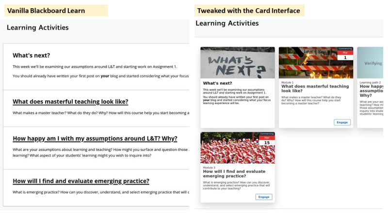
In late 2018 I started work at an institution using Blackboard Learn. My first project helping “put online” a group of 7 courses highlighted just how ugly Blackboard sites could be and how hard it was to do anything about it. By January 2019 I shared the solution I’d developed – the Card Interface. Below is a before/after image illustrating how the Card Interface ‘tweaks’ a standard Blackboard Learn content area into something more visual and contemporary. To do this you add some provided Javascript to the page and then add some card meta data to the other items.

Since 2019, the work has since grown in three ways:
- The addition of the Content Interface as a way to design and maintain online content and refinement of both the Card and Content Interfaces.
- Conceptually through the development of some design principles for this type of artefact (dubbed Contextually Appropriate Scaffolding Assemblages – CASA).
- Uptake of the Card Interface (and to a lesser extent the Content Interface) within my institution and beyond.
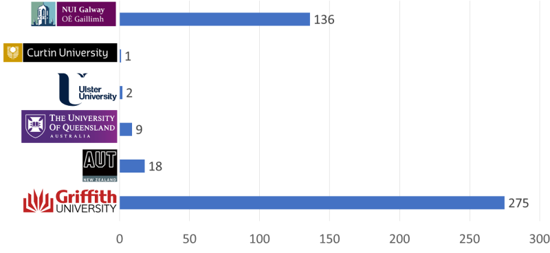
The spread – Card Interface Usage – Jan-March 2021
The following graph illustrates the number of unique Blackboard sites that have requested the Card Interface javascript file in the first few months of 2021. In the same time frame, the Content Interface has been used by a bit over 70 Griffith University sites.

The heaviest use is within the institution where this all started. Usage this year is up from the original 7 courses at the same time in 2019. What’s surprising about this spread is that this work is not an officially approved technology. It’s just a kludgge developed by some guy that works for one of the L&T areas in the institution. Uptake appears to have largely happened through word of mouth.
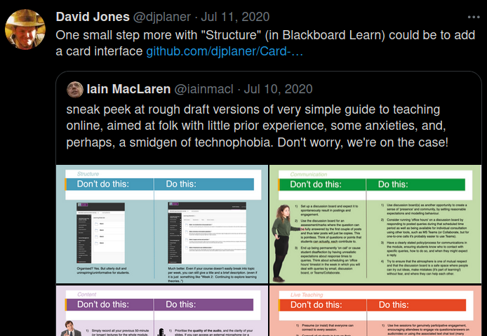
Adoption beyond the original institution – especially in Ireland – was sparked by
this chance encounter on Twitter (for the life of me I can’t figure out to embed a good visual of this tweet, it used to be easy). Right person, right time. More on that below.

Reflections
So why has it played out this way?
What follows are my current reflections bundled up with the CASA design princples.
Would be interesting (to me at least) to actually ask and find out.
1. A CASA should address a specific contextual need within a specific activity
The Card Interface address an unfulfilled need. The default Blackboard Learn interface is ugly and people want it to look better. And there isn’t much help coming from elsewhere. The Irish adoption of the Card Interface that this isn’t a problem restricted to my institution.
The Content Interface isn’t as widely used. I wonder if part of that is because the activity it helps with (design and maintain online content) is diversely interpreted. e.g. People differ on what they think is acceptable/good online content, if/how it should be developed, and thinking about it beyond just getting some “stuff” online for Monday. Meaning a lot more effort is required to see the Content Interface as a solution to a need they have.
2. CASA should be built using and result in generative technologies
First, to give Blackboard Learn its due. It is a generative platform. It allows just about anyone to include Javascript. This generative capacity is the enabler for the Card and Content Interfaces and numerous other examples. Sadly, Blackboard have decided generativity is not important for Blackboard Ultra.
Early versions of the Card Interface didn’t do much. But over the years its evolved and added features. They’ve been responding to evolving local needs. Perhaps making it more useful?
I think a key point is that the Card Interface is generative for the designer. It provides some scope for the designer to change how it works. The most obvious example being the easy inclusion of images.
It would be interesting to explore more if and how people have used the Card Interface in different and unexpected ways. Or, have they stuck to the minimum.
The Content Interface can be generative, but requires expert knowledge and isn’t quite as easy. What choice is available is not that attractice. I suspect if it were more mearningfully and effective generative that would positively impact adoption.
3. CASA development should be strategically aligned and supported
Neither of these tools are institutionally aligned. They have become fairly widely adopted with the team of educational designers I work with and more of a part of our strategic processes. But not core or genral. There’s been some spread beyond into other groups but not at the institutional level. There is talk that the Card Interface has had some level of approval by one of the more central groups. It would be interesting to analyse further.
But these tools remain accepted but not formally recognised.
4. CASA should package appropriate design knowledge to enable (re-)use by teachers and students.
To paraphrase Stephen Downes this is where a CASA does things right thereby “allowing designers to focus on the big things”. Just the ability to implement a card interface is a good first start, but I also wonder how much some of the more contextual design knowledge built into the Card and Content Interface influence use? e.g. the university date feature of both.
It would be good to test this hypotheses. Also to find out what impact this has on the designer/teacher and the students.
5. CASA should actively support a forward-oriented approach to design for learning
It appears that the University date feature of the cards is used a fair bit. It’s the main “forward-oriented” design features. But there’s perhaps not much more of this focus in the Card Interface.
The Content Interface is conceived of as a broader assemblage of technologies to design and mantain online content. It can make use of O365 to enable more collaborative discussion amongst the teaching team and enable version control. But I’m not sure many teachers currently think about a lot more than what they are putting up this study period, or this week.
6. CASA are conceptualised and treated as contextual assemblages
i.e. it’s not just the LMS or any other technology. It’s more about how easily and effectively each teacher is able to integrate these tools into their practices, tools and context.
The Card Interface is a simpler and more generic tool. It’s easier to integrate and achieve a positive outcome. Hence great adoption within the institution and beyond.
The Content Interface is itself a more complex collection of technology and also attempting to integrate into a more complex set of practices, tools and context.
It would be very interesting to see if, how, and what assemblages people have constructed around each of these tools.

Leave a Reply